For the Coordination of a Social Culture.
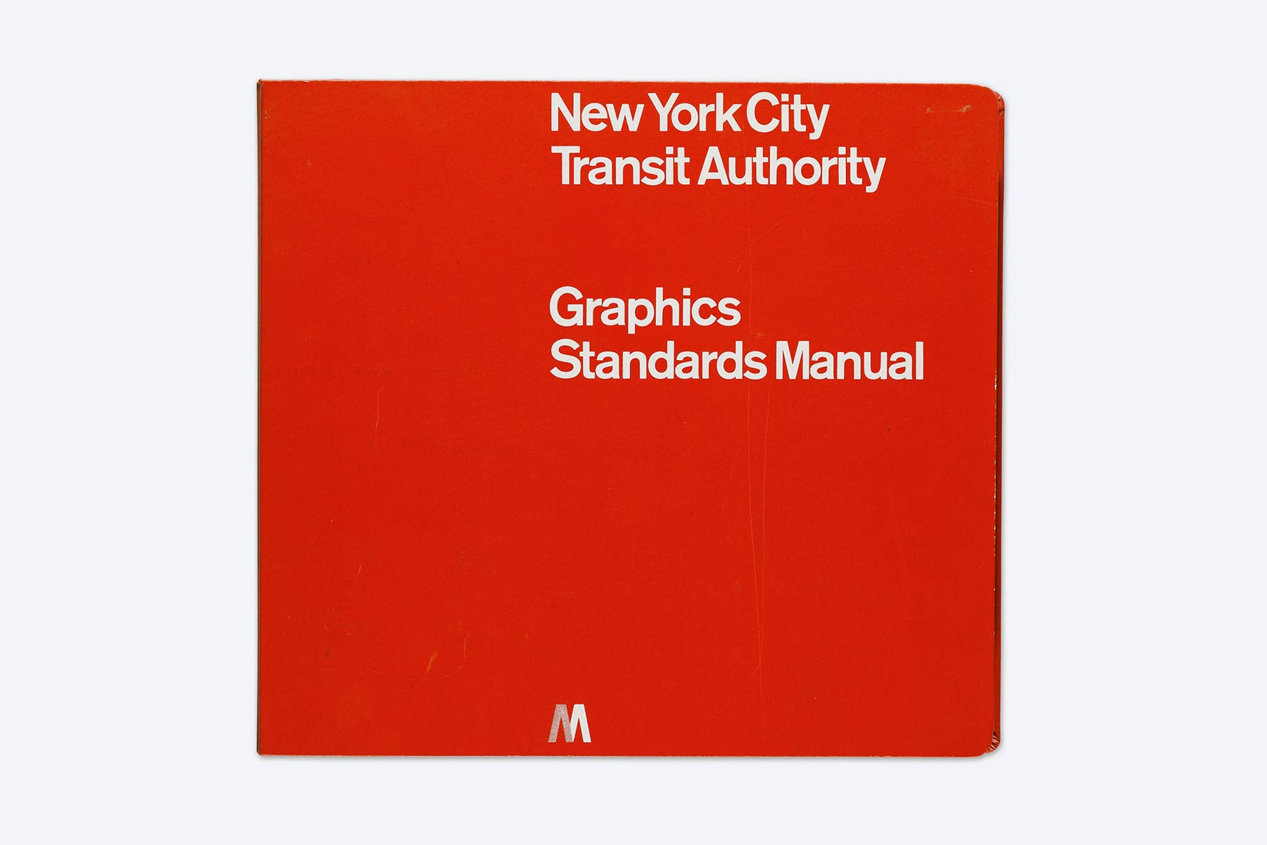
The legendary NYC Subway Graphics
Standards Manual, designed in
1970 by Massimo Vignelli at Unimark International.
Ph. © Sotheby’s
Standards Manual, designed in
1970 by Massimo Vignelli at Unimark International.
Ph. © Sotheby’s
New York City Subway
Graphics Standards Manual
In 2014 a crowdfunding campagin was officially launched with the purpose of reprinting the legendary New York City Subway’s Graphics Standards Manual.
Released in 1970 by the New York City Transit Authority (NYCTA), the manual is a huge ring binder containing 176 pages that illustrate every element in the subway’s signage—from colours to typeface, from symbols to sign panels, up to every technical detail including hooks, screws, holes, flanges and bolts.
Designed at Unimark International by Massimo Vignelli (1931-2014) with the collaboration of Bob Noorda (1927-2010), the manual was conceived to rationalise the production and installation of the countless signs that still help every day nearly 6 million passengers finding their way in New York’s underground.
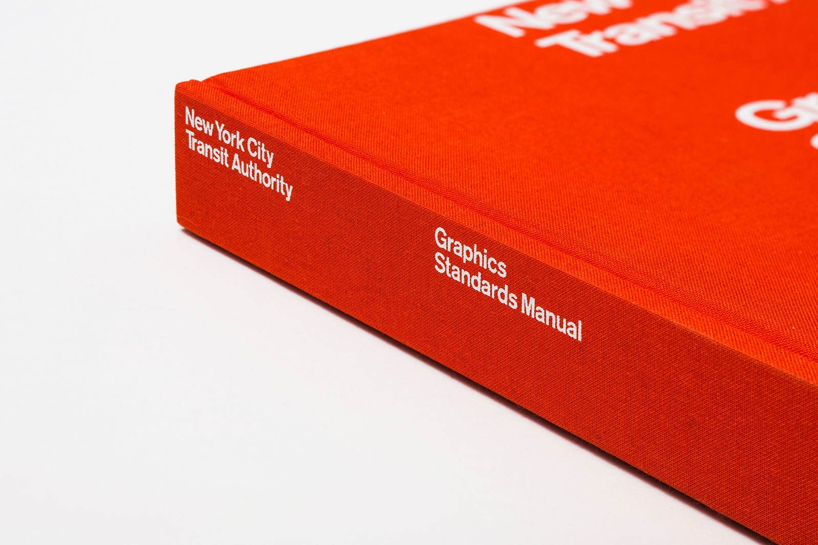
The reprint of the subway manual,
first published in 2014 following
a successful crowdfunding campaign.
Ph. © Standards Manual
first published in 2014 following
a successful crowdfunding campaign.
Ph. © Standards Manual
The Success of the Reprints
The goal of the crowdfunding campaign was receiving $100,000 in order to reprint 1,000 copies, that were considered enough to satisfy the appetite of collectors. But in a few days, more than $800,000 were received from almost 7,000 people from all over the world, both professionals and enthusiasts, who supported the initiative.
The clamor caused by the figure attracted the attention of the media and the news was published in newspapers, blogs and social networks. In a short time the reprinting projects of old graphic manuals from the 1960s and the 1970s multiplied, generating a millionaire turnover.
Many people initially doubted the attention given to the reprints of these old relics, but the repetition of their success prompted to wonder about the reasons for this phenomenon, that was made even more curious by the fact that many of the buyers were not old nostalgics, but young designers who had nothing to do with the context in which the manuals were originally produced.
Why did these old technical manuals, forgotten by the same companies that commissioned them, still arouse such interest?
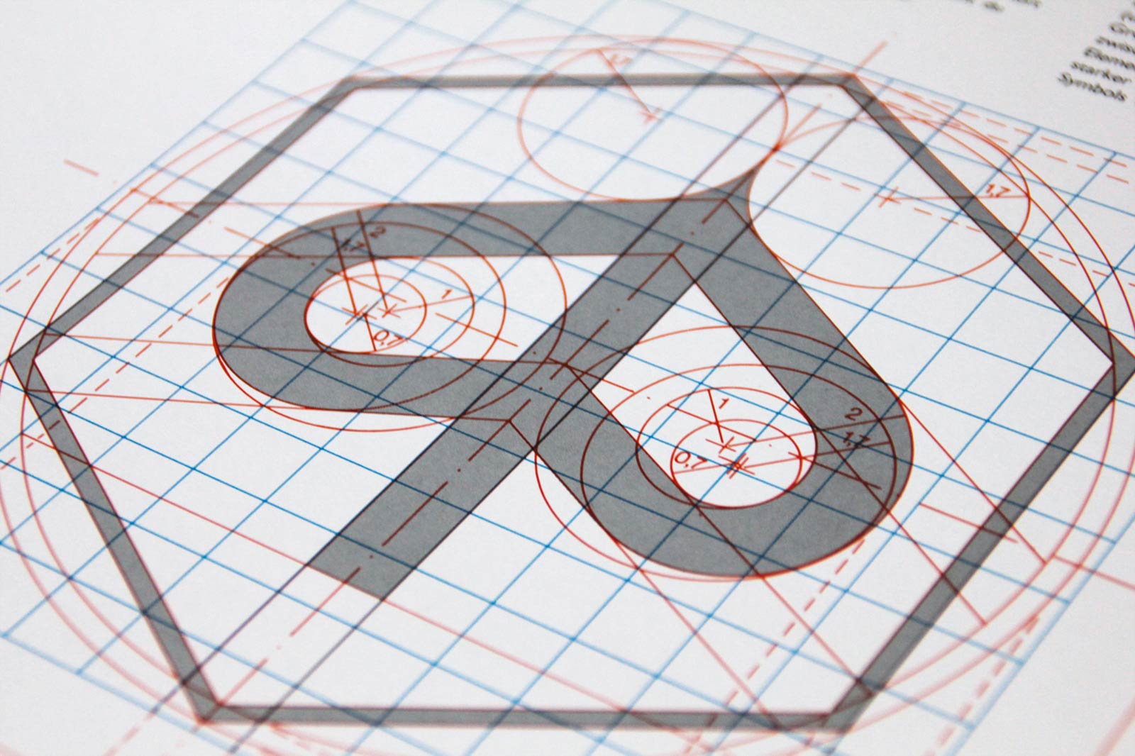
A detail illustrating the technical
drawing of the trademark from
Piaggio’s corporate identity manual.
Ph. © Nicola-Matteo Munari
drawing of the trademark from
Piaggio’s corporate identity manual.
Ph. © Nicola-Matteo Munari
A Visual Imagery
The aura of mystery surrounding graphics standards manuals is for sure one of the most fascinating aspects. Once inaccessible to externals because of strict corporate confidentiality rules, when you browse the pages of these old volumes you can enjoy an experience of discovery imbued of an archaeological flavor.
By discovering all the secrets that these manuals have kept for such a long time, they give shape and meaning to the images that have always populated our everyday life.
The graphics standards manuals, in fact, contain all the instructions for the production of many among the images, objects, and spaces that we see and live every day—from public signs to packaging of products, from uniforms of supermarket cashiers to book covers, from television titles to airplane liveries, from the architecture of service stations to the label on a bottle of wine.
 Ph. © Standards Manuals
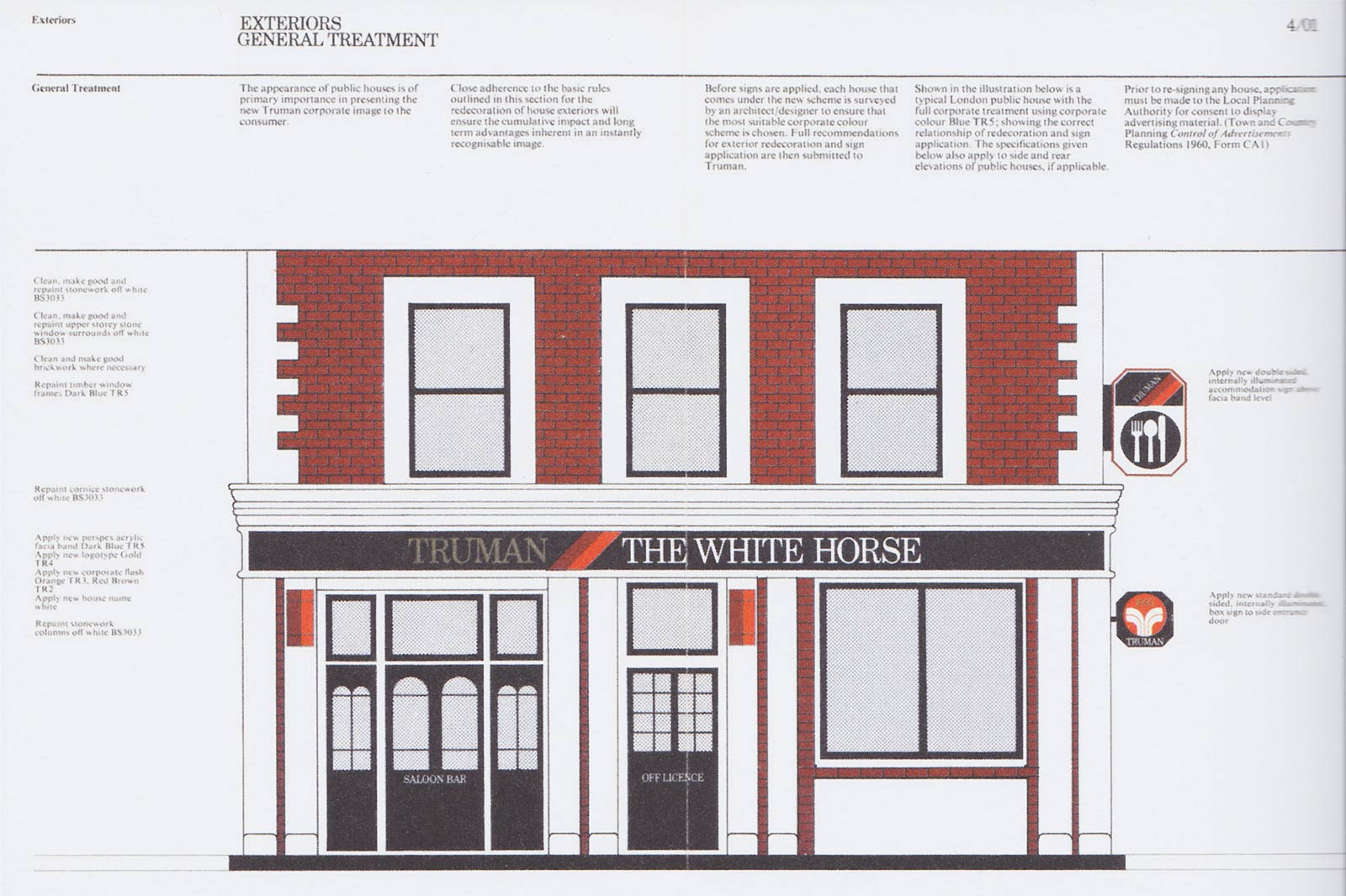 Ph. © All rights reserved
 Vocabulary and Grammar
The standards manuals define every aspect of all the elements in the communication of both private and public companies, so that they can be more easily identified, distinct from competitors and, above all, associated to specific values in the collective imaginary.
Through these manuals, companies and public agencies are able to build their own identity in the public imaginary, an identity that is defined by a communicative language of which the manual is both vocabulary and grammar.
As the famous graphic designer Massimo Vignelli, who was a fervent supporter of standards manuals, once wrote, “the purpose of a manual is to teach people a language. When you design an identity for a company, you are really creating a language. And that language,” in order to be understood and properly used, “has to be learned. (…) If you don’t learn the correct grammar and syntax, you won’t be able to speak the language.”*
* From Manuals 1, Unit Editions, 2014.
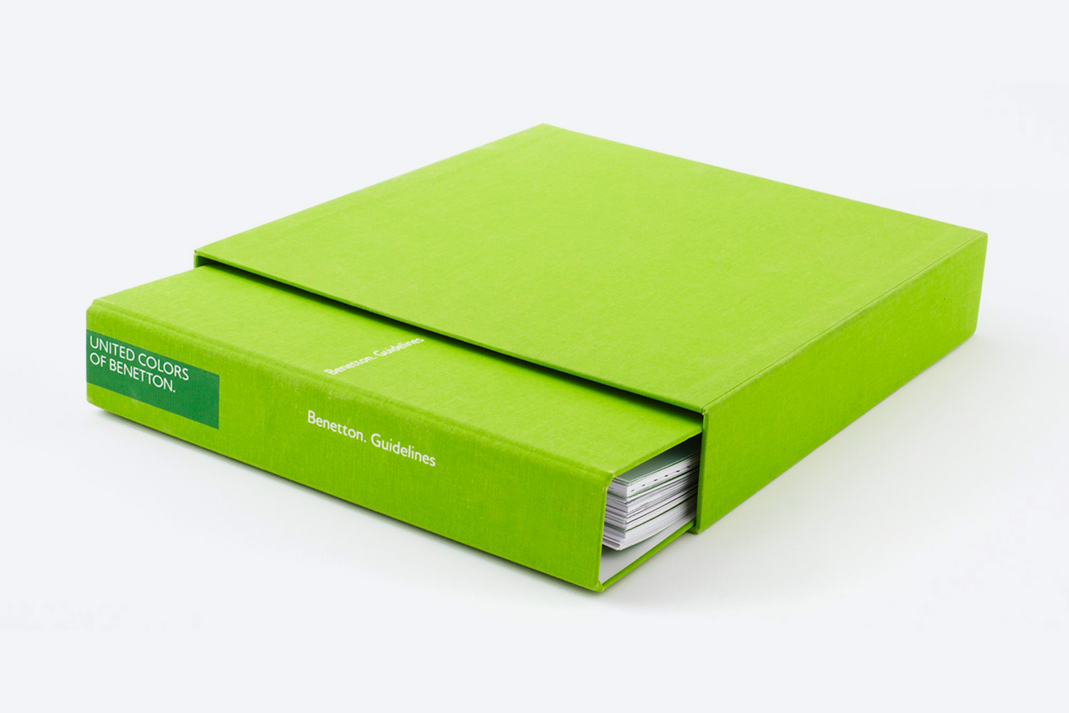
The corporate identity guidelines
of Benetton, designed by Pentagram
in 2011, after the manual designed
by Massimo Vignelli in 1996.
Ph. © Pentagram
of Benetton, designed by Pentagram
in 2011, after the manual designed
by Massimo Vignelli in 1996.
Ph. © Pentagram
Consistency of Communications
Browsing the pages of standards manuals, we have the opportunity to learn these secret languages, discovering that the familiarity that we have with certain forms or colours is not random at all, but carefully defined by designers and codified by the manuals.
We learn, for instance, that Benetton’s logo is always positioned along the right edge of advertisements, or that BMW’s slogans always end with a full stop, or that in Mercedes’s dealerships even the temperature of the rooms is standardised.
Such a consistency and uniformity in the communication of companies, as well as such a varied and extensive notion of communication, may seem obvious today but it was not obvious at all when the first manuals were produced.
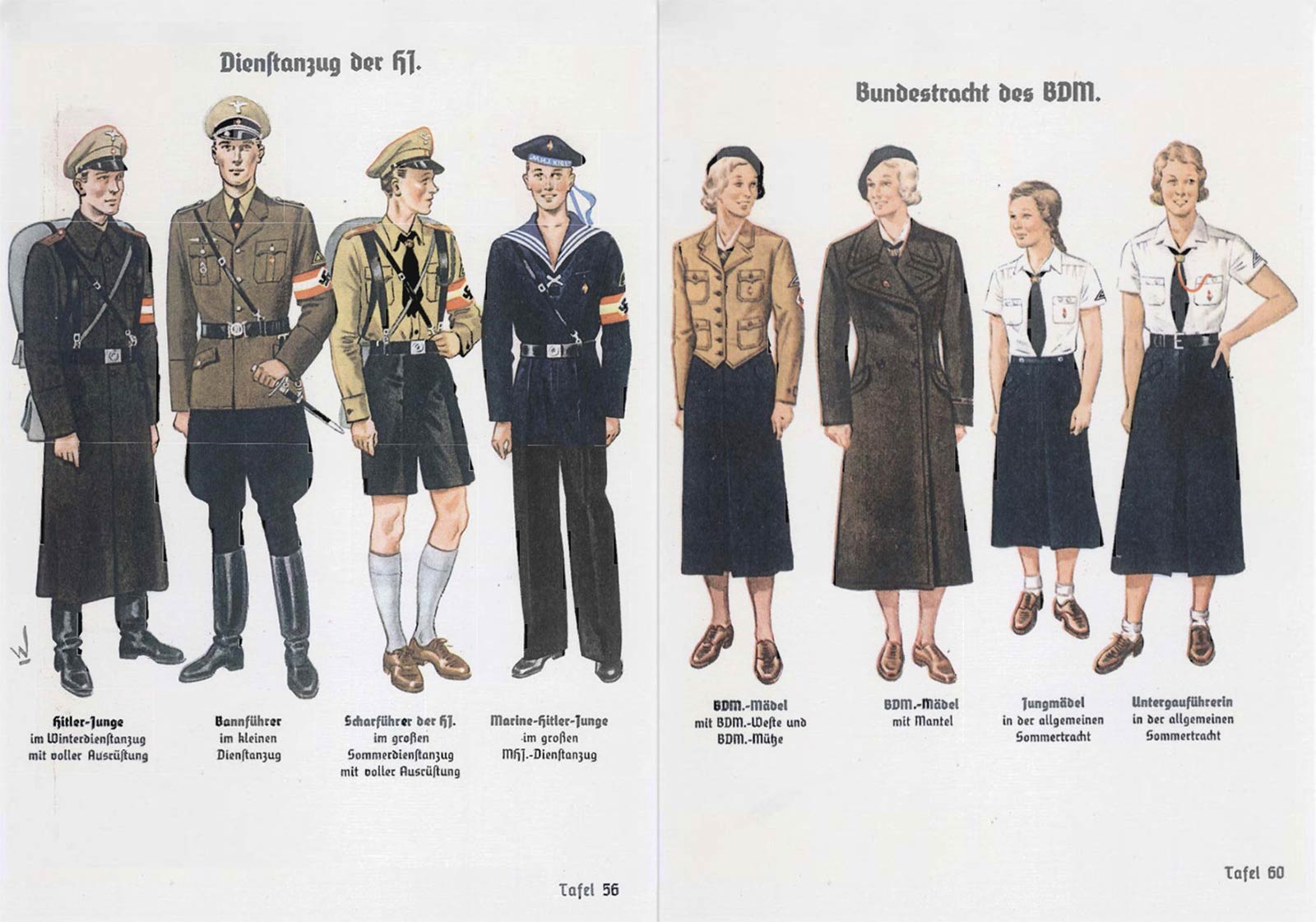
Two illustrations from the Nazi Party Manual from 1936, illustrating
military clothing for both adult and
young men and women.
Ph. © All rights reserved
military clothing for both adult and
young men and women.
Ph. © All rights reserved
An Archetype:
The Organisationsbuch der NSDAP
Although standards manuals are commonly considered to have been introduced in the 1960s, the archetypes were actually made in the 1930s. Early manuals were particularly representative of a typical 20th century’s rationality that was the expression of a world that was still strongly hierarchical, bureaucratic and disciplined.
It is not by chance that the first corporate identity programs were developed in the 1920s in the framework of the Prussian Germany’s Rationalisierung policy and that only a few years later the first standards manuals were produced by the Nazi Party.
The Organisationsbuch der NSDAP, in particular, is one of the best-known examples thanks to the essays published by the renowned American art director Steven Heller. Released in 1936 and updated every two years, the Organisationsbuch was a heavy volume, bound in a blood-red cloth, made of over 600 pages
Curated by official Robert Ley—the main promoter of the project for the people's car, the Volkswagen, who committed suicide while waiting to be tried in Nuremberg—the manual illustrated a multitude of emblems, coats of arms, badges, pennants, military and sports uniforms but also guns, swords, drums and entire military camps.
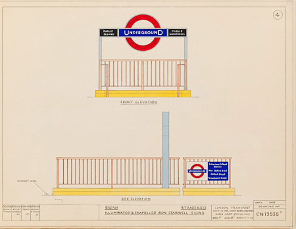
A page dedicated to exterior
signage from an early manual
of the London Underground.
Ph. © London Transport Museum
signage from an early manual
of the London Underground.
Ph. © London Transport Museum
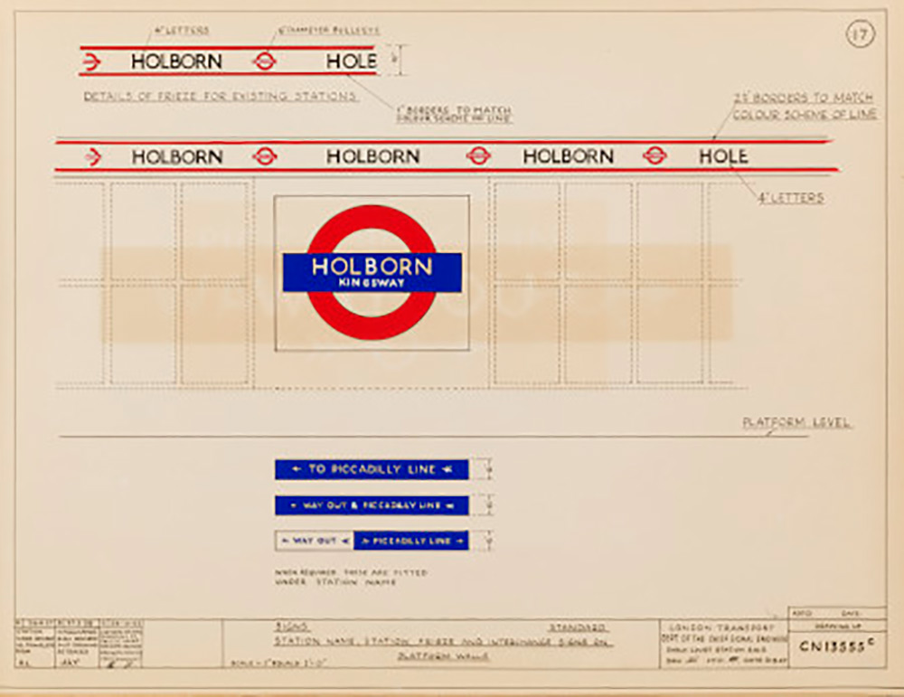
Another page dedicated to
interior signage to be positioned
in the Underground.
Ph. © London Transport Museum
interior signage to be positioned
in the Underground.
Ph. © London Transport Museum
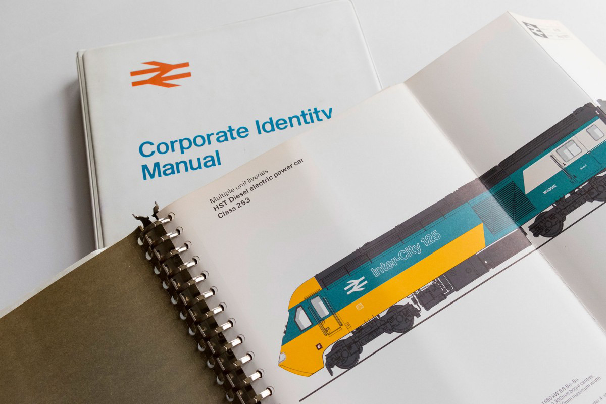
After the Sign Standards manual
of 1948, British Rail issued
a Corporate Identity Manual in
1965, reprinted in 2016.
Ph. © All rights reserved
of 1948, British Rail issued
a Corporate Identity Manual in
1965, reprinted in 2016.
Ph. © All rights reserved
Sign Standards:
The First Public Manuals
Both the Organisationsbuch—that was preceded in 1933 by a simpler manual titled ABC des Nationalsozialismus—and the fact that any change to the graphics of the party's identifying elements was reported in the periodical Reichsgesetzblatt, confirmed the increasing awareness of institutions towards their public image, a condition that will prove to be typically modern with the spread of the mass media.
Among the first manuals ever produced there are in fact those of two public companies—the Sign Standards Manual of the London Passenger Transport Board (LPTB) from 1938 and the homonymous manual published ten years later by the British Railways.
The British manuals, even more than the German ones, express the search for the standardisation that was typical of the Anglo-Saxon culture produced by the Industrial Revolution. Enriched with clear and understandable examples and illustrated in a similar way to the manuals designed in the following decades, these early Sign Standards manuals are still extraordinarily modern today.
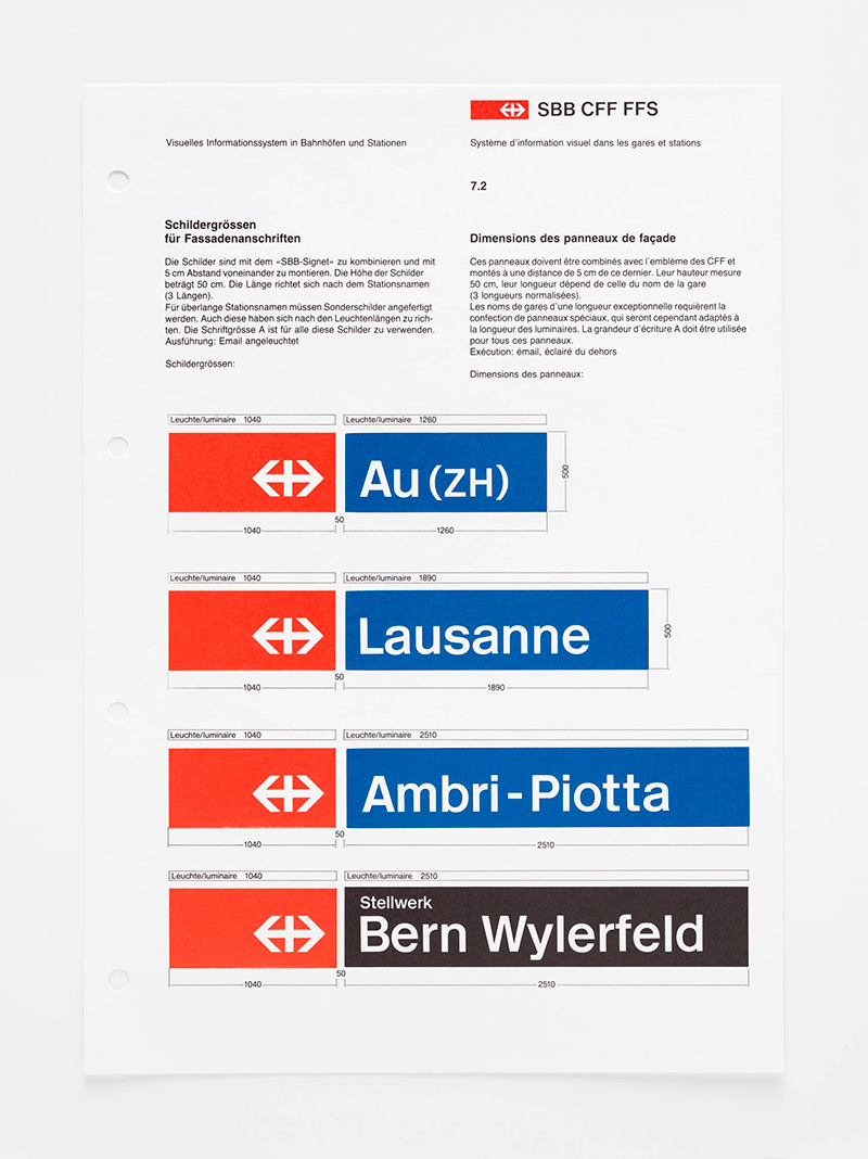
A page from the manual of the
Swiss Railway, designed in 1978
by Josef Müller-Brockmann.
Ph. © Museum für Gestaltung / ZHdK
Swiss Railway, designed in 1978
by Josef Müller-Brockmann.
Ph. © Museum für Gestaltung / ZHdK
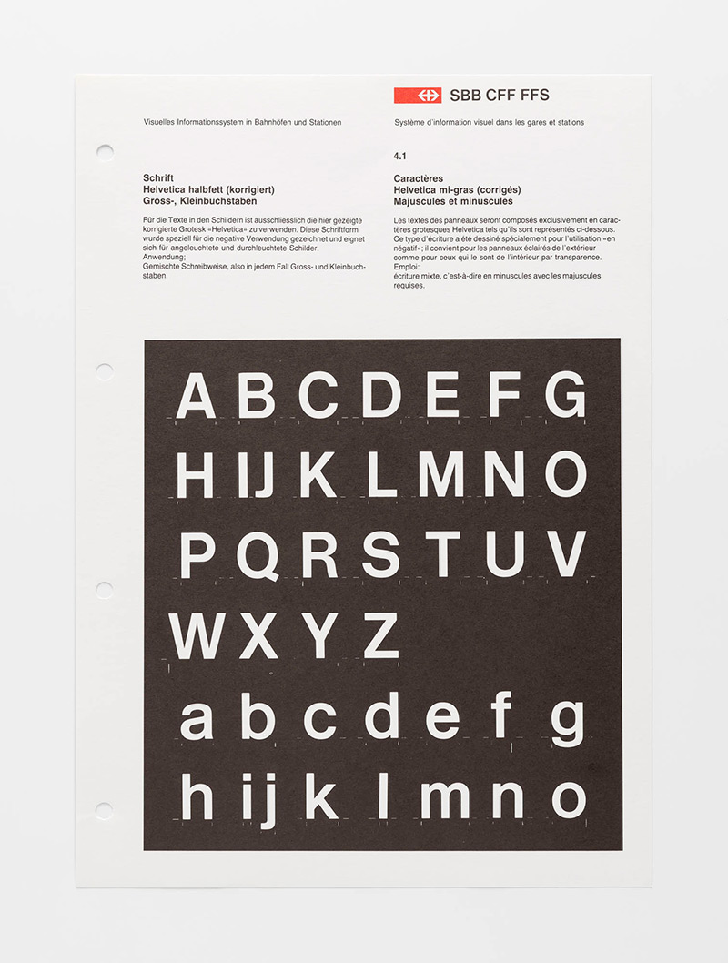
Another page from the same
manual, that was reprinted in 2019
by Lars Müller Publishers.
Ph. © Museum für Gestaltung / ZHdK
manual, that was reprinted in 2019
by Lars Müller Publishers.
Ph. © Museum für Gestaltung / ZHdK
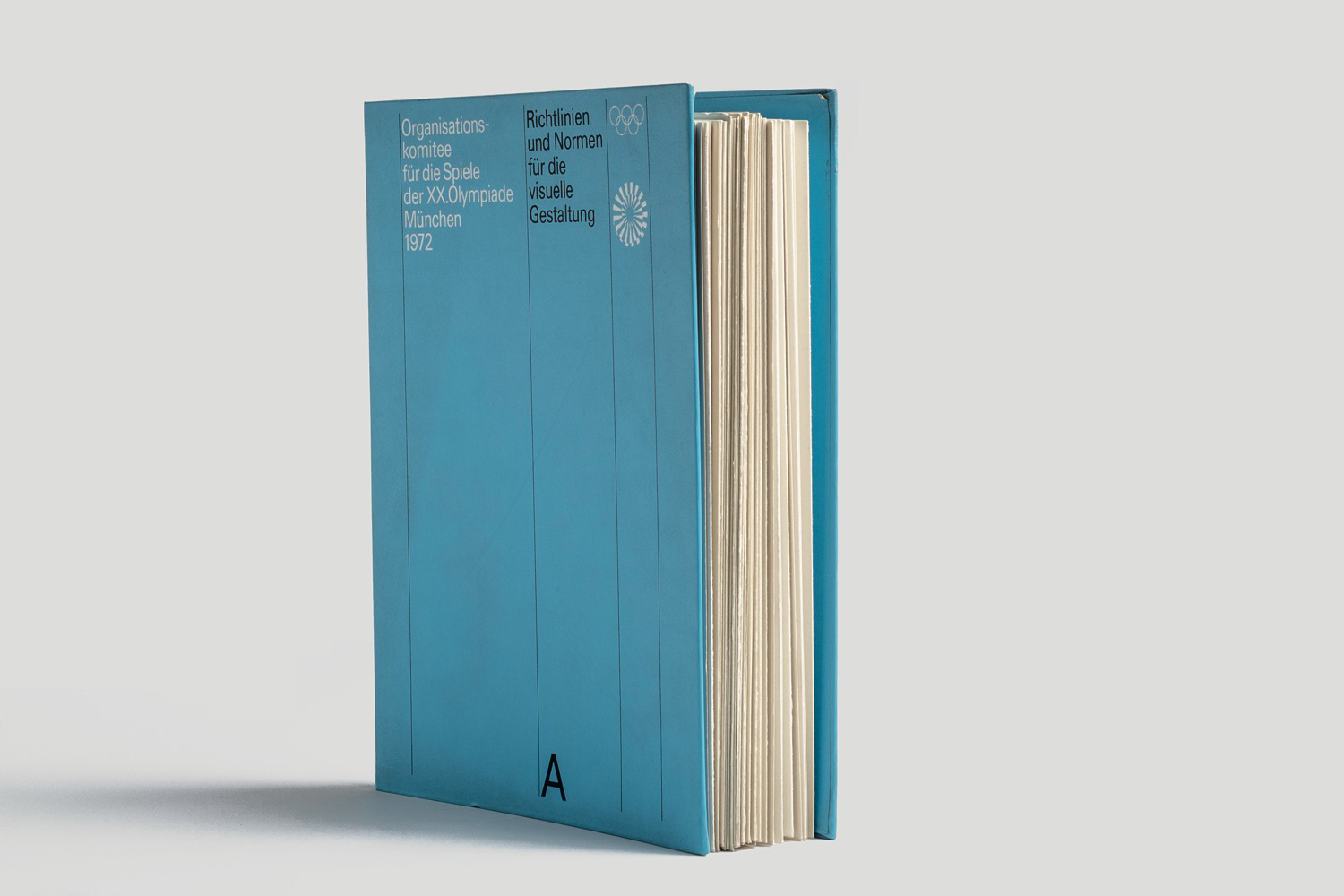
The manual of Munich 1972
Olympic Games has also been
recently reprinted.
Ph. © Niggli Verlag
Olympic Games has also been
recently reprinted.
Ph. © Niggli Verlag
The Social Role of Standards Manuals
The attention given by public companies to their own image is one of the most important and historically significant aspects in the history of graphics standards manuals.
It was no coincidence that the design of corporate identity programs and that of standards manuals incredibly increased after the Second World War, during a historic moment that was permeated by the spirit of the post-war Reconstruction.
In this perspective, the standards manuals are revealed as functional elements of this renewed sense of social responsibility that, in the field of visual communication, was expressed through the distribution and coordination of cultural identity elements.
And it is precisely the social role that is so clear in the manuals from the 20th century and their function as guarantors of an order that everyone could benefit from, what makes these manuals so interesting today, investing them with an almost epic aura.
Manuals of Olympic Games are instrumental in generating
a sense of belonging through
the coordination of identifying
cultural elements.
Ph. © All rights reserved
a sense of belonging through
the coordination of identifying
cultural elements.
Ph. © All rights reserved
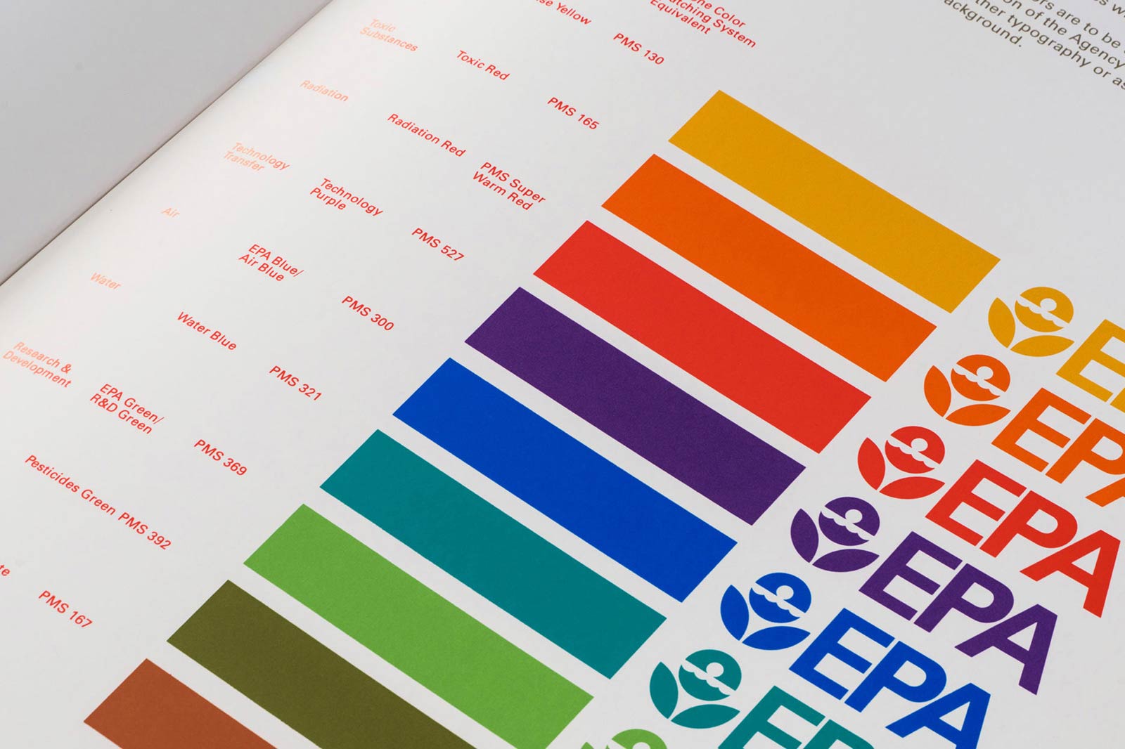
Olivetti and IBM
The golden age of corporate identity broke out with the American expansion of Italian company Olivetti, whose design was then unanimously considered to be the best in the world.
After the famous exhibition at New York’s Museum of Modern Art (MoMA) in 1952—titled Olivetti: Design in Industry—and the opening of the historic showroom on the Fifth Avenue in 1954, the so-called Olivetti style became internationally acclaimed and the number of companies trying to emulate its success through the adoption of a corporate identity program multiplied.
One of the most interesting examples is that of the International Business Machines (IBM), whose corporate image was impeccably coordinated by graphic designer Peretz Rosenbaum, known as Paul Rand (1914-1996), who intentionally coordinated the identity of IBM starting from that of its competitor, Olivetti.
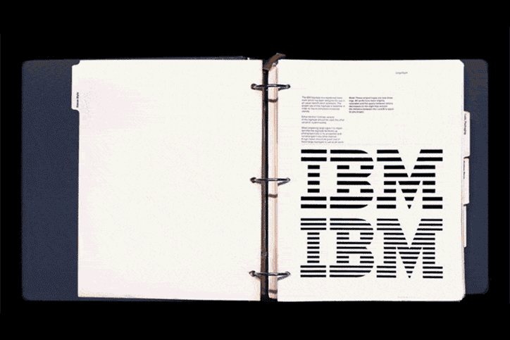
Pages from the IBM Graphic
Design Guide (1967-1987).
Originally designed by Paul Rand,
it was reprinted in 2018.
Ph. © Empire Editions
Design Guide (1967-1987).
Originally designed by Paul Rand,
it was reprinted in 2018.
Ph. © Empire Editions
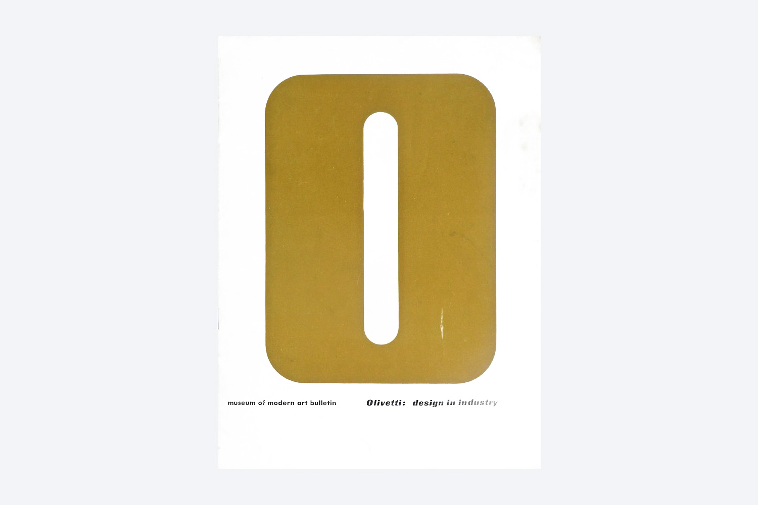
Catalogue cover of the exhibition
Olivetti: Design in Industry,
Museum of Modern Art, 1952.
Ph. © MoMA
Olivetti: Design in Industry,
Museum of Modern Art, 1952.
Ph. © MoMA
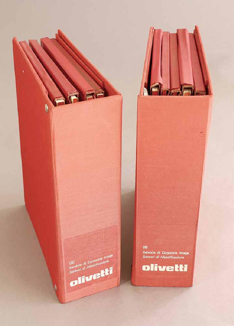
The so-called Red Books
(1971-1977), Olivetti’s legendary corporate identity manuals.
Ph. © All rights reserved
(1971-1977), Olivetti’s legendary corporate identity manuals.
Ph. © All rights reserved
The Great Manuals
of the 1960s
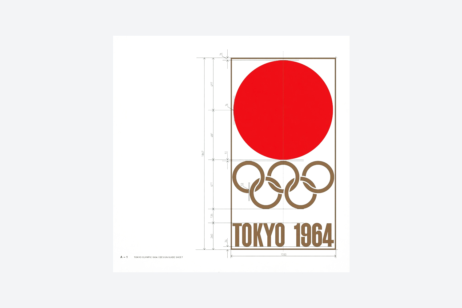
During the 1960s, corporate identity programs gradually started to be matched by standards manuals and it was precisely with the spreading of manuals that graphics evolved from an artistic activity to a design discipline, becoming graphic design in all respects.
Browsing the pages of the beautiful manuals designed at that time for companies like Braun or Lufthansa and events like the Tokyo Olympics or the Expo 1967, it is possible to discover that the appearance of the most disparate objects was meticulously calibrated—from graphics of petrol pumps to key rings, from matchboxes to cutlery, from road signs to shoe soles, up to space-shuttles and spacecrafts from the extraordinary NASA Graphics Standards Manual, designed in 1976 by Richard Danne and Bruce Blackburn.
of the 1960s
During the 1960s, corporate identity programs gradually started to be matched by standards manuals and it was precisely with the spreading of manuals that graphics evolved from an artistic activity to a design discipline, becoming graphic design in all respects.
Browsing the pages of the beautiful manuals designed at that time for companies like Braun or Lufthansa and events like the Tokyo Olympics or the Expo 1967, it is possible to discover that the appearance of the most disparate objects was meticulously calibrated—from graphics of petrol pumps to key rings, from matchboxes to cutlery, from road signs to shoe soles, up to space-shuttles and spacecrafts from the extraordinary NASA Graphics Standards Manual, designed in 1976 by Richard Danne and Bruce Blackburn.
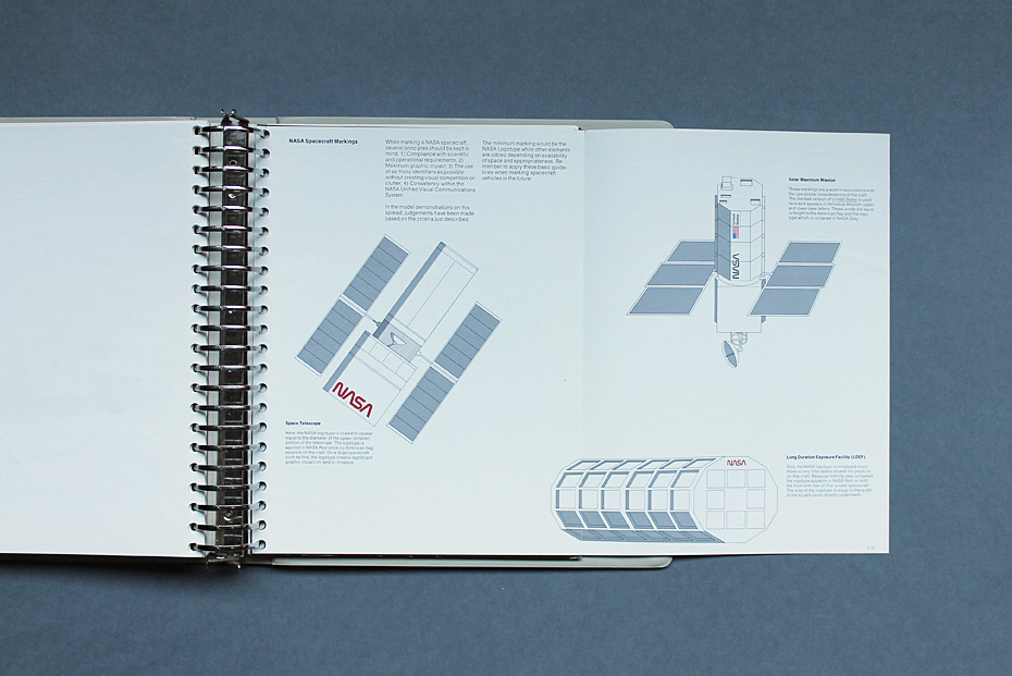
A page from the extraordinary NASA Graphics Standards Manual,
illustrating spacecraft markings.
Ph. © Kind Company
illustrating spacecraft markings.
Ph. © Kind Company

In 2015 the NASA Manual was reprinted thanks to a crowdfunding campaign launched by Standards Manual, who also reprinted the NYC Subway Manual.
Ph. © All rights reserved
Ph. © All rights reserved
Mega and Mini Manuals
Traditionally, printed manuals were made as huge ring binders in order to appear as authoritative publications and to make possibile removing pages easily. In fact, beyond reporting the norms of corporate communication, the pages of manuals were used as matrixes for the photo-reproduction of graphics.
Ring binders also demonstrated to be extraordinary practical when there was the need to update the manuals, allowing both to add or remove pages when contents were modified, without reprinting the entire manual. Thanks to their versatility, printed manuals were kept in use and updated for decades, demonstrating to be true long-lasting, sustainable objects. (There are manuals made of pages printed 25 years apart.)
Besides ring binders, there were also the so called mini-manuals, agile booklets that offered a more quick browsing. One of the most interesting is that of National Park Service (NPS), designed by Massimo Vignelli in 1977. From a single foldable poster it was possible to rationalise the design and production of almost 30 millions printed matter published by NPS every year, from 1978 to today.
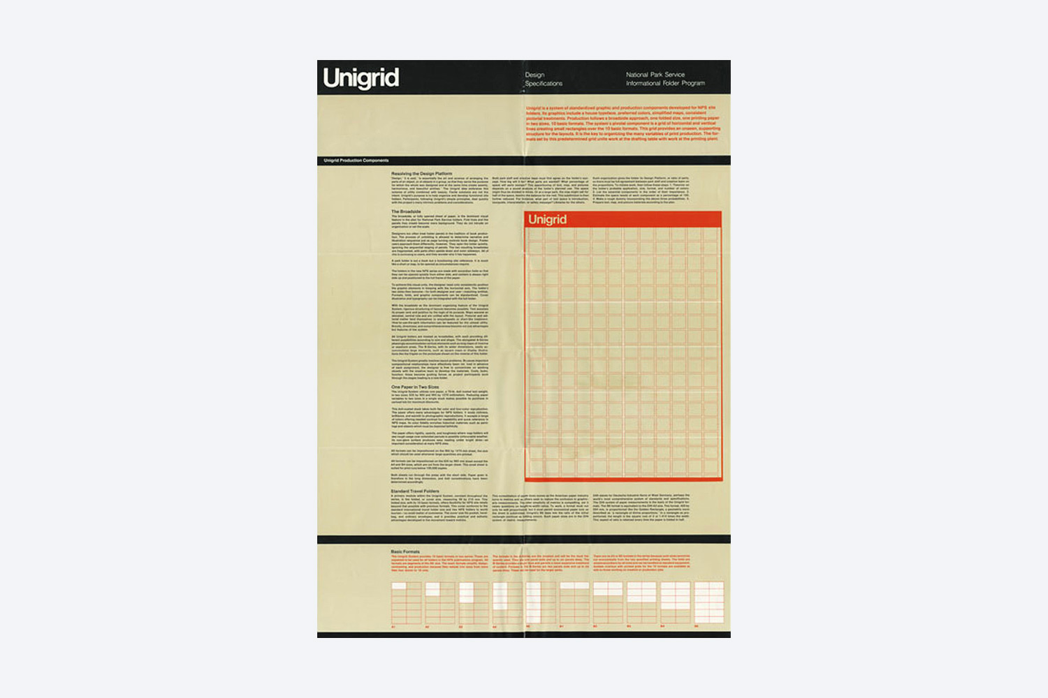
The manual of US National Park Service was made of a single foldable poster illustrating the Unigrid, the grid used to structure all the printed matter of NPS.
1977 © Massimo Vignelli
1977 © Massimo Vignelli
Towards the Ephemeral
The form of the manual remained unchanged until the 2000, when the first PDF manuals did appear, now replaced more and more often by web manuals, the so-called brand centers, centrals or platforms.
If on one hand these new forms of manuals have clear advantages, on the other hand they revealed to be extremely ephemeral. “It is harder to take (a PDF manual) seriously, especially when it is labelled on the cover as Version 1.0 or Version 1.5. What is the point of following this if it might just change next month?” (Armin Vit).
The ephemeral nature of the files push to continuously modify and substitute the manuals. In this way, contrary to what happened in the past, more than development and evolution of existing manuals and identities there is a continuous consumption and dismantling of both brand manuals and identity systems.
A manual designed by MunariDesign
for a global corporation. It is the latest from a series started in the 1980s by Unimark/Centro Pirelli and continued
in the 1990s by Pierluigi Cerri.
Ph. © Nicola-Matteo Munari
for a global corporation. It is the latest from a series started in the 1980s by Unimark/Centro Pirelli and continued
in the 1990s by Pierluigi Cerri.
Ph. © Nicola-Matteo Munari
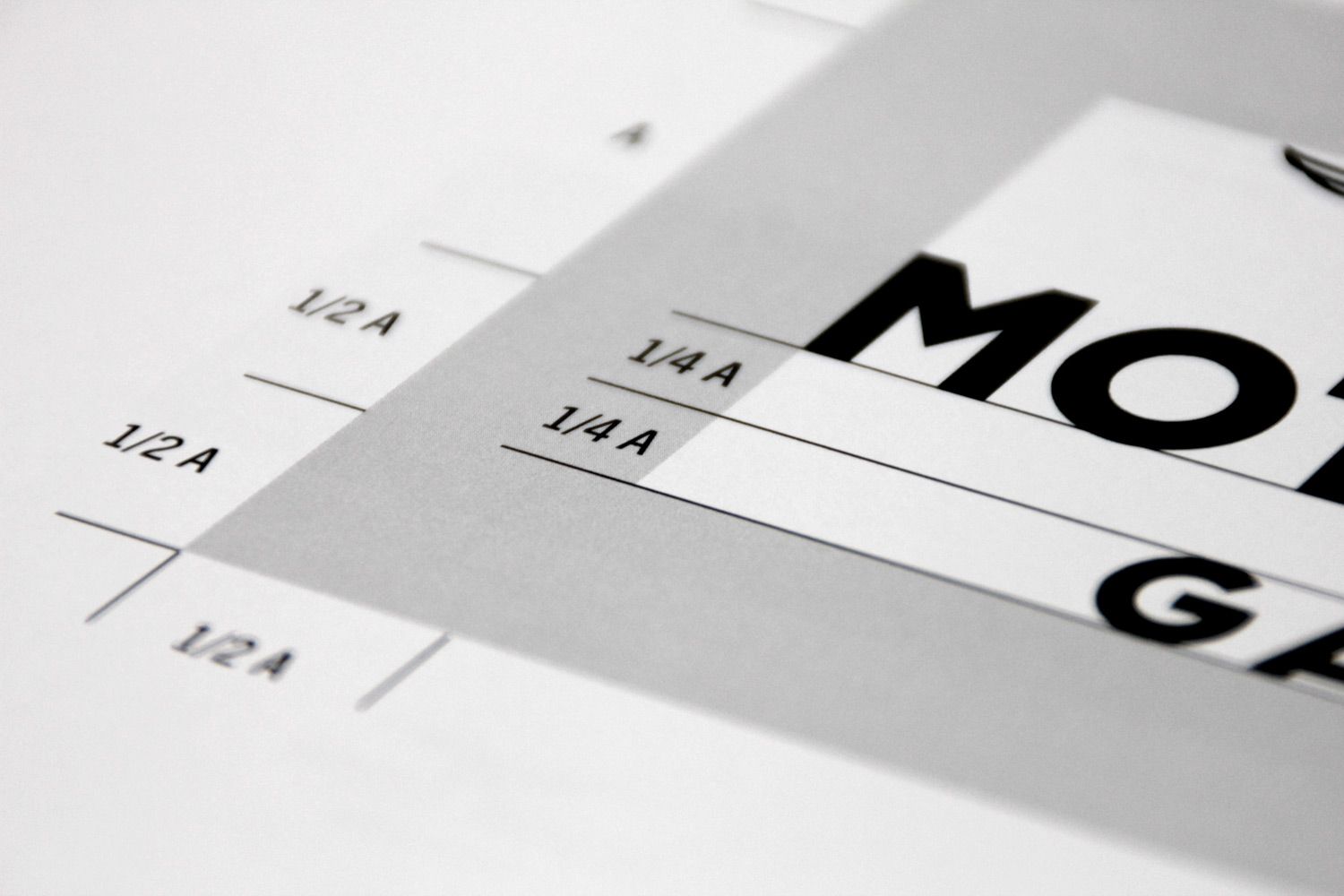
A detail from another manual
designed by MunariDesign illustrating
a logo’s exclusion zone.
Ph. © Nicola-Matteo Munari
designed by MunariDesign illustrating
a logo’s exclusion zone.
Ph. © Nicola-Matteo Munari
For a Culture of Good Design
The difference between the printed and digital manuals is for sure one of the main differences between the present and the past, when corporate identities were designed to last longer and manuals were the main guarantor of their longevity.
The physical and aesthetic qualities themselves of the printed manuals are representative of such a long term vision. The tactile quality and material strength, the intelligence of texts, the clarity of the layout, without considering the majestic physical presence, not only determine the respect that one spontaneously feels towards these objects, but above all the pleasure in browsing through the pages, looking at the illustrations, and reading the texts.
And it is precisely this pleasure which is the true reason for the success obtained by the reprints. A pleasure which is the result of that cultural approach towards the design that distinguishes the glorious manuals produced in the 20th century, representing true masterpieces and authentic expressions of good design.
© Nicola-Matteo Munari
Originally written,
January 2019
First published by PreText,
May 2019