Brand identity for one of Italy’s leading manufacturers of partition systems and office furniture.
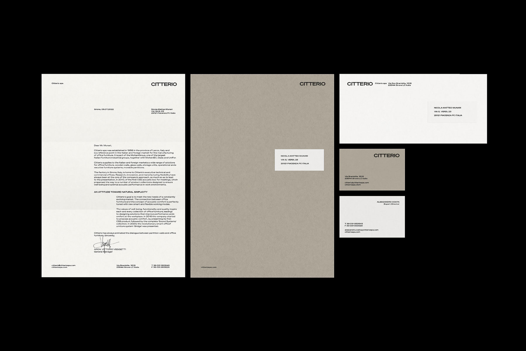
The coordinated stationery
designed for Citterio.
2022 © Nicola-Matteo Munari
designed for Citterio.
2022 © Nicola-Matteo Munari

The historical trademark of Citterio
was updated through the rationalisation of its geometry.
Ph. © Nicola-Matteo Munari
was updated through the rationalisation of its geometry.
Ph. © Nicola-Matteo Munari
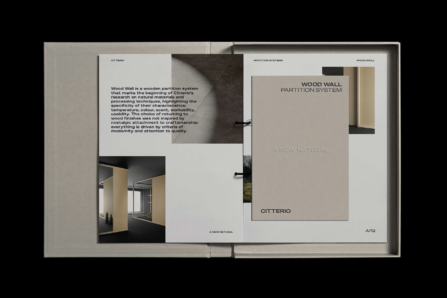
The salesman’s binder, a new tool
that was proposed to the company.
A binder where to organise, from
time to time, specific materials for specific prospective clients.
2022 © Nicola-Matteo Munari
that was proposed to the company.
A binder where to organise, from
time to time, specific materials for specific prospective clients.
2022 © Nicola-Matteo Munari
In 2022 we have been appointed the design and coordination of a new brand identity system for Citterio, a member of the prestigious Molteni Group and one of Italy’s leading companies operating in the fields of partition systems and office furniture design and manufacturing.
Although there is almost no literature about the Citterio brand, it represents a one of a kind example being the only company whose graphics was continuously designed by Unimark International—one of the earliest and greatest international graphic design agencies—for more than twenty years, from circa 1978 to 2000.
The rigorous design provided by Unimark throughout all that time, as well as the art direction performed by Unimark’s member Franco Mirenzi, allowed Citterio to enjoy one of the most consistent and highest quality corporate identities ever.
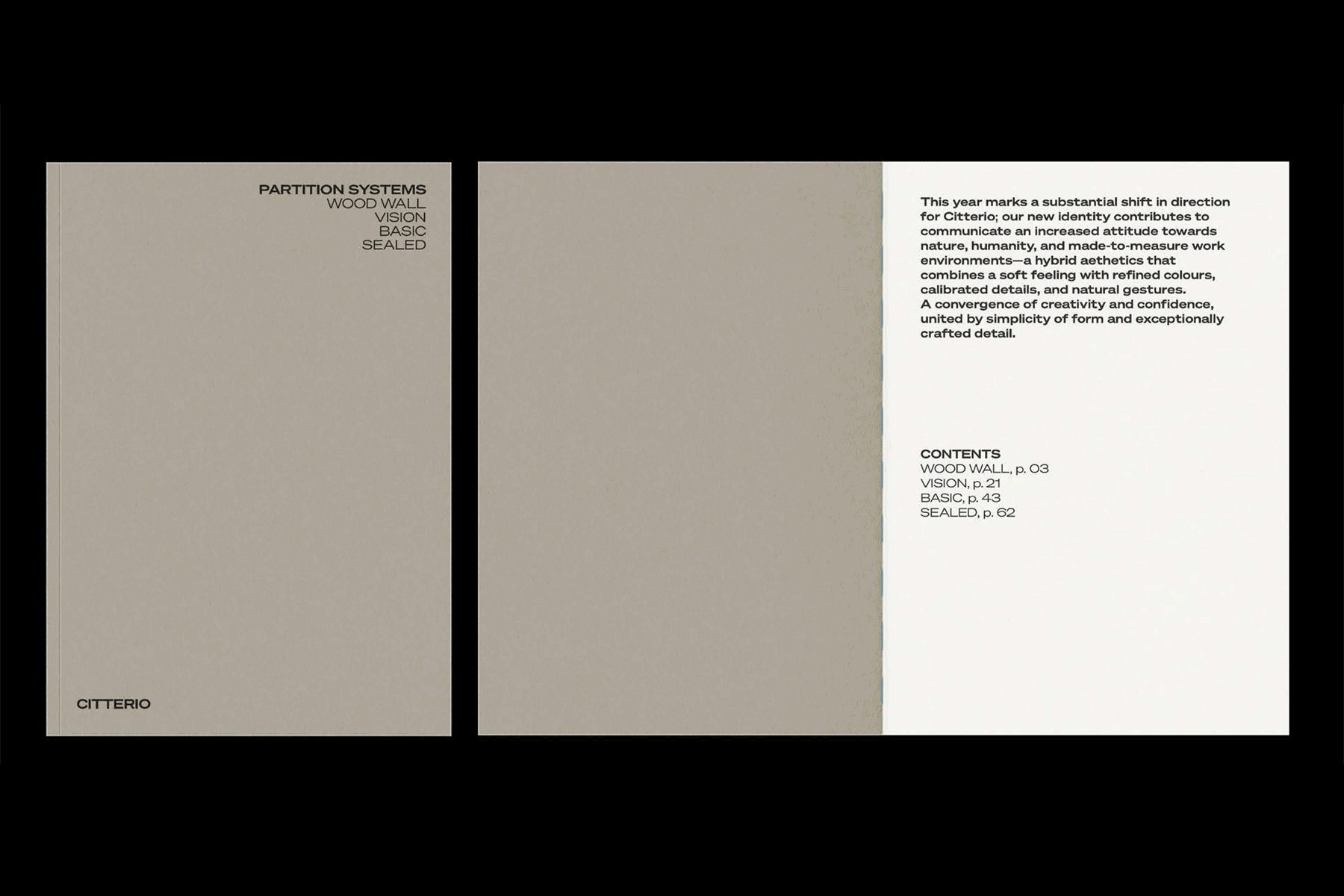
Cover and page-spreads
of a collection catalogue.
2022 © Nicola-Matteo Munari
of a collection catalogue.
2022 © Nicola-Matteo Munari
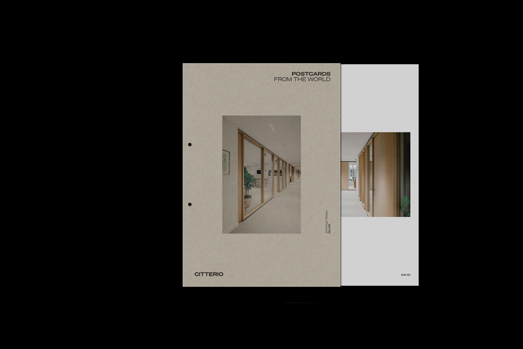
The Citterio Postcards—envelopes containing loose sheets dedicated
to single projects, that can be
added to the salesman’s binders.
2022 © Nicola-Matteo Munari
to single projects, that can be
added to the salesman’s binders.
2022 © Nicola-Matteo Munari
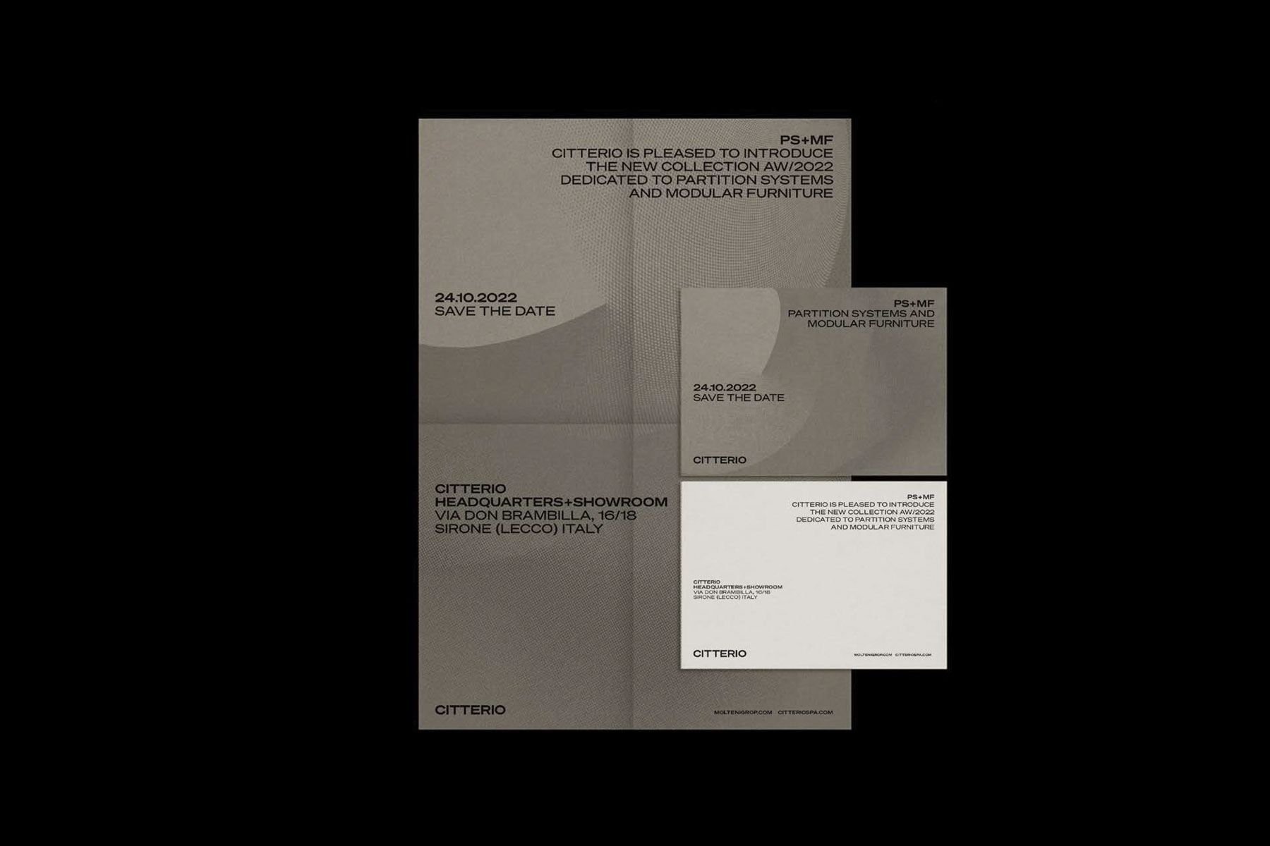
A promo kit comprising a folded
poster and an invitation card.
2022 © Nicola-Matteo Munari
poster and an invitation card.
2022 © Nicola-Matteo Munari
Trademark and Logotype
The design of the new identity started by focusing on the basic identity elements—the trademark and the logotype.
Despite the historical trademark of Citterio became somewhat obsolete—it represents an intertwined F and C which stand for Fratelli Citterio, the original name of the company—its consistent use throughout the years made it becoming an ubiquitous icon in the public imagination.
For this reason, after considering the possibility of a new trademark and developing hundreds of new designs, instead of dropping the original trademark we proposed to keep it but changing the way of using it, make it becoming a heritage symbol—not to be used anymore at the forefront of the company’s communication but as a sort of quality label, always to be used alone.
However, to make the trademark more functional its proportions were rationalised through the definition of a basic modular grid, thus improving its consistency and giving the symbol greater efficiency across all scales and applications.
Instead of the trademark, a new logotype was provided to be used as the main identification element of the company, bringing a more contemporary outlook to the brand thanks to its clarity and simplicity.
The Citterio Panorama—a concept
for a periodical journal to be distributed
at design fairs and exhibitions.
2022 © Nicola-Matteo Munari
for a periodical journal to be distributed
at design fairs and exhibitions.
2022 © Nicola-Matteo Munari
Back and front of invitations showing
the dialogue between technology
and nature—a key concept of the new brand identity strategy.
2022 © Nicola-Matteo Munari
the dialogue between technology
and nature—a key concept of the new brand identity strategy.
2022 © Nicola-Matteo Munari
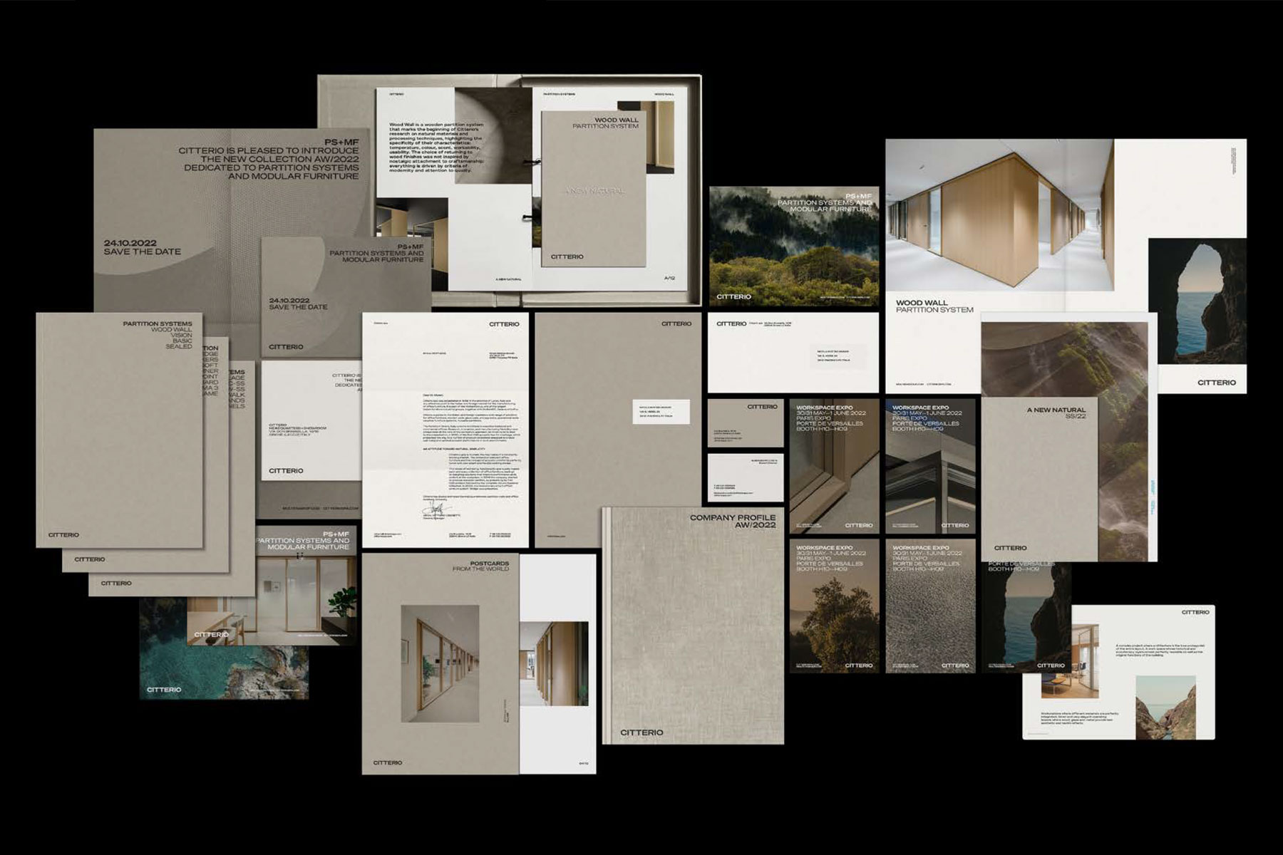
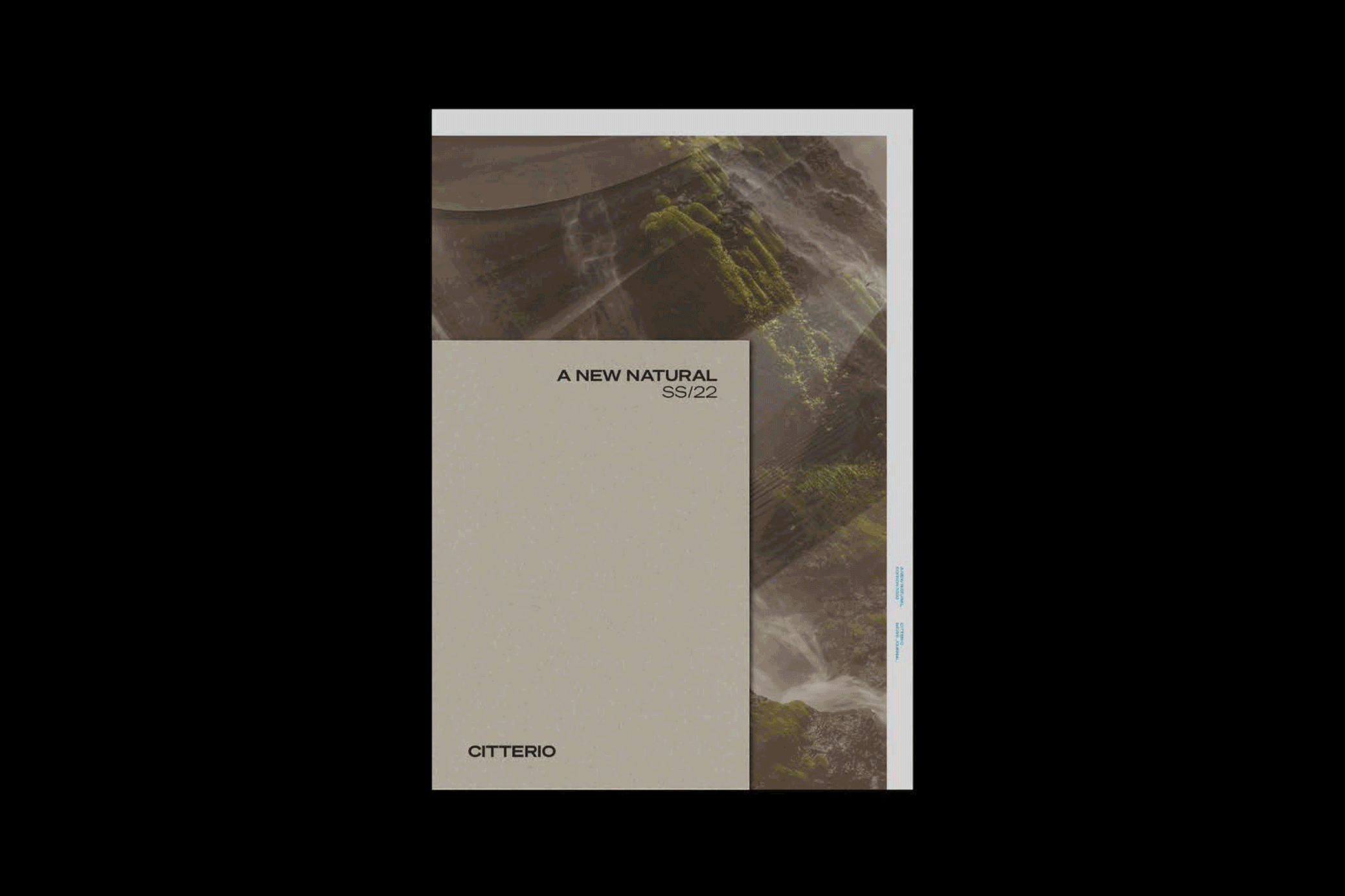
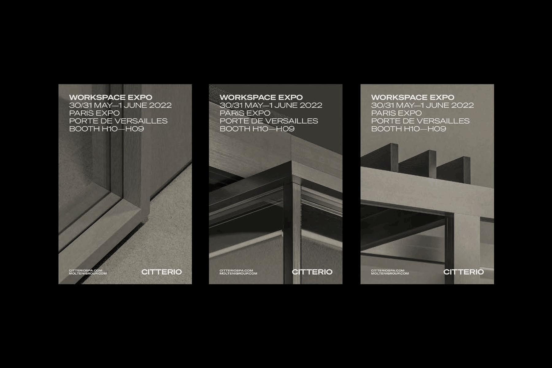
An overview of many among the
materials that were designed to present the new brand identity of Citterio.
2022 © Nicola-Matteo Munari
materials that were designed to present the new brand identity of Citterio.
2022 © Nicola-Matteo Munari
A New Understanding of Sustainability
The entire identity revolves around the unique approach of Citterio towards sustainability, which is based on the dialogue between technology and nature, expressed through the proprietary claim Tech by Nature.
Therefore, the colour palette plays with the contrast between the clay tone of a soft natural paper and details in vivid neon blue. While imagery is based on the contrast between images showing the technological features of the products and the natural elements used as their essential resources.
In this way it was possible to generate a visual dichotomy that communicates the attitude of Citterio towards design and sustainability in a bold and authentic way, at the same time elevating the brand perception and aesthetically integrating it into the brand scenario of Molteni Group.
The project of the new brand identity comprised the design and coordination of all the communication elements, including stationery, catalogues, folders, invitation and promotional cards, posters, magazine ads, journals, social media graphics and the company website, as well as the ideation of specific concepts and promotional tools.
The new identity was greatly appreciated by the company for its contribution in elevating the quality of the communication, enhancing the company’s historical assets and reinforcing its established brand equity.
—Nicola-Matteo Munari
Client
Citterio
Design+Strategy
Nicola-Matteo Munari
Assistant
Daniela Arabia
Art Direction
Studio Klass
Project Date
2022
Citterio
Design+Strategy
Nicola-Matteo Munari
Assistant
Daniela Arabia
Art Direction
Studio Klass
Project Date
2022