Symbol and logotype for one of Italy’s most respected partition systems and office furniture brands.

The trademark of Citterio,
a strong geometrical element communicating the ideas
of arrangement and modularity.
2022 © Nicola-Matteo Munari
a strong geometrical element communicating the ideas
of arrangement and modularity.
2022 © Nicola-Matteo Munari
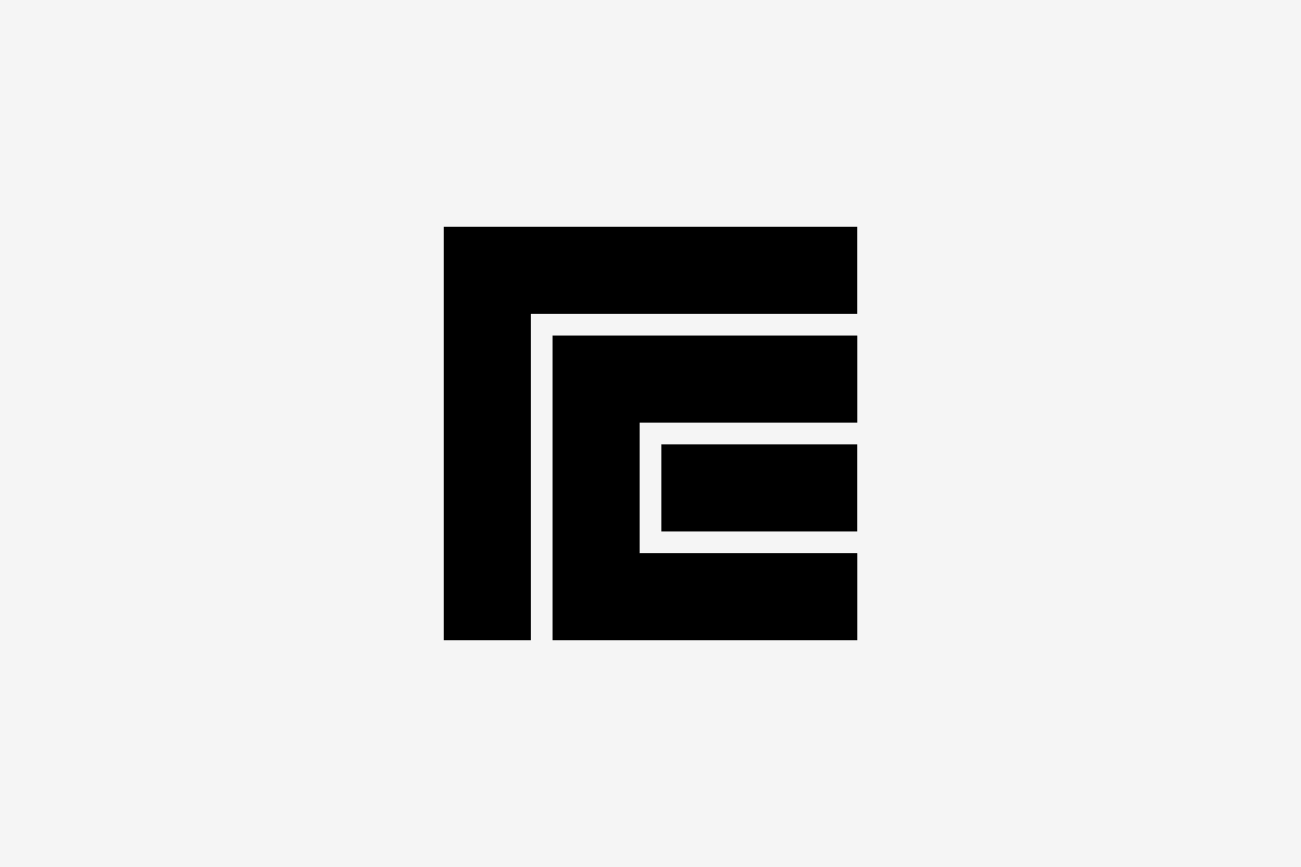
A basic grid of 19×19 square modules defines the new proportions of the symbol, making it more rigorous, consistent and functional at all scales.
2022 © Nicola-Matteo Munari
2022 © Nicola-Matteo Munari
The brand new logotype conveys
a more contemporary outlook
through its clarity, simplicity and
rounded shapes.
2022 © Nicola-Matteo Munari
a more contemporary outlook
through its clarity, simplicity and
rounded shapes.
2022 © Nicola-Matteo Munari
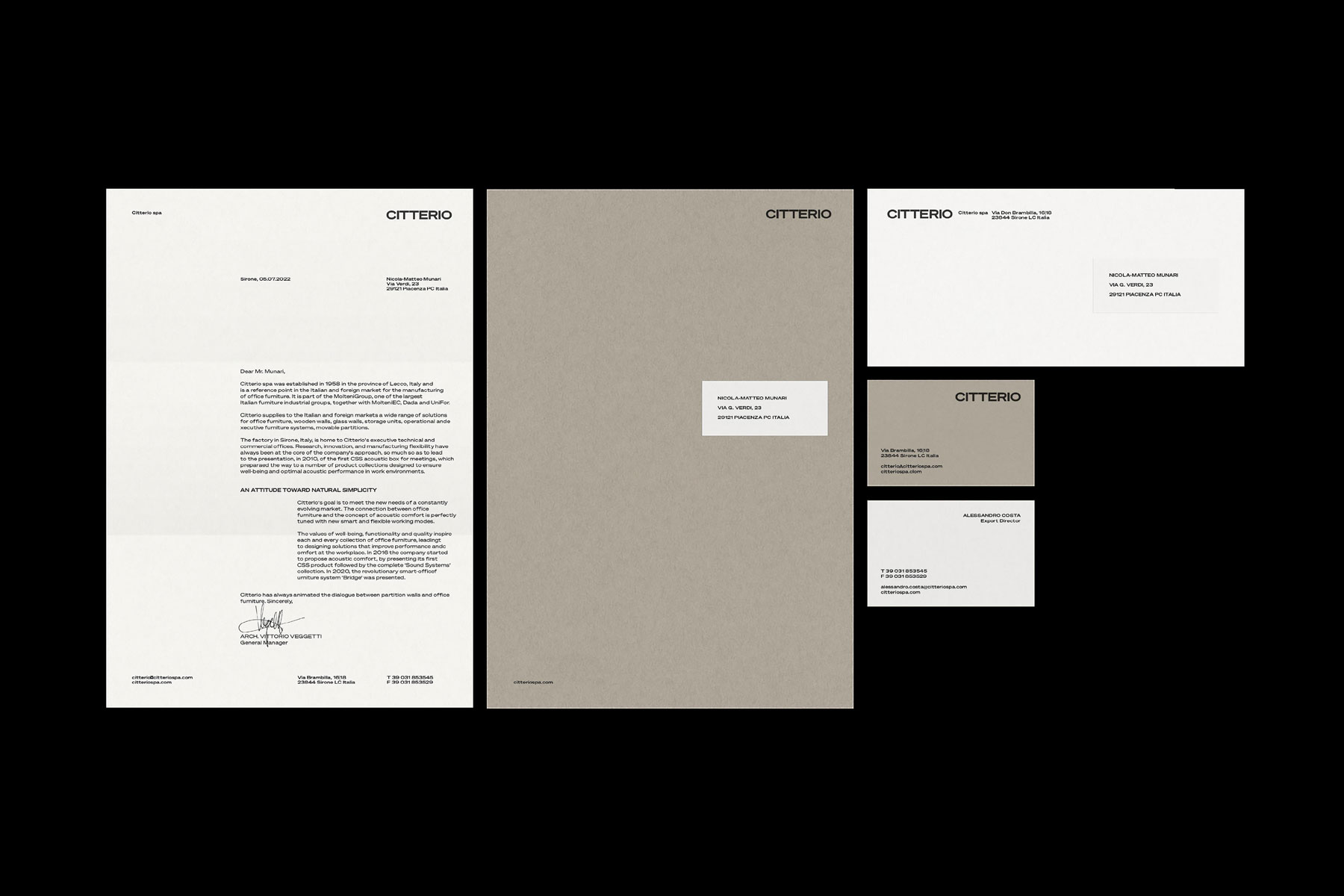
In 2022 we have been appointed the design of a new brand identity system for Citterio, one of Italy’s most respected partition systems and office furniture manufacturers, belonging to the prestigious Molteni Group.
Part of the task was the design of a new logo. The symbol, in particular, created a bit of disappointment to the client because it represented an intertwined F and C, the initials of Fratelli Citterio (Citterio Brothers), which was the original name of the company, now obsolete.
However, the symbol, originally designed in the 1960s by graphic designer Daniele Usellini, was consistently used during the past fifty years becoming a powerful icon in the public imagination, especially thanks to the rigorous corporate design direction performed by the legendary design agency Unimark International throughout that time.
So after extensive study and research, also designing hundreds of possible new logos, instead of changing the symbol we proposed to keep it but changing the way of using it, make it becoming a heritage symbol—not to be used anymore at the forefront of the company’s communication but as a more discreet and precious quality label, a sort of guarantee signature, always to be used alone, without the logotype.
The symbol was therefore kept but updated in its shape through a careful redesign process that saw the rationalisation of its proportions, thus improving its efficiency and functionality across all of its applications.
To be used instead of the symbol, as the main identification element of the brand, a new logotype was designed in order to bring a more contemporary outlook to the company’s visual identity through its simplicity, curved shapes, bolder weight and wider proportions.
The proposal was enthusiastically welcomed and greatly appreciated by the company for the ability of both enhancing a most important historical asset and reinforcing the company’s established brand equity.
—Nicola-Matteo Munari
Client
Citterio
Design
Nicola-Matteo Munari
Art Direction
Studio Klass
Project Date
2022
Citterio
Design
Nicola-Matteo Munari
Art Direction
Studio Klass
Project Date
2022