Communication Standards Manual for Bonelli, a winery of Colli Piacentini.
Ring Binder, 23.25x33.5 cm
112 pages
Ph. © Nicola-Matteo Munari
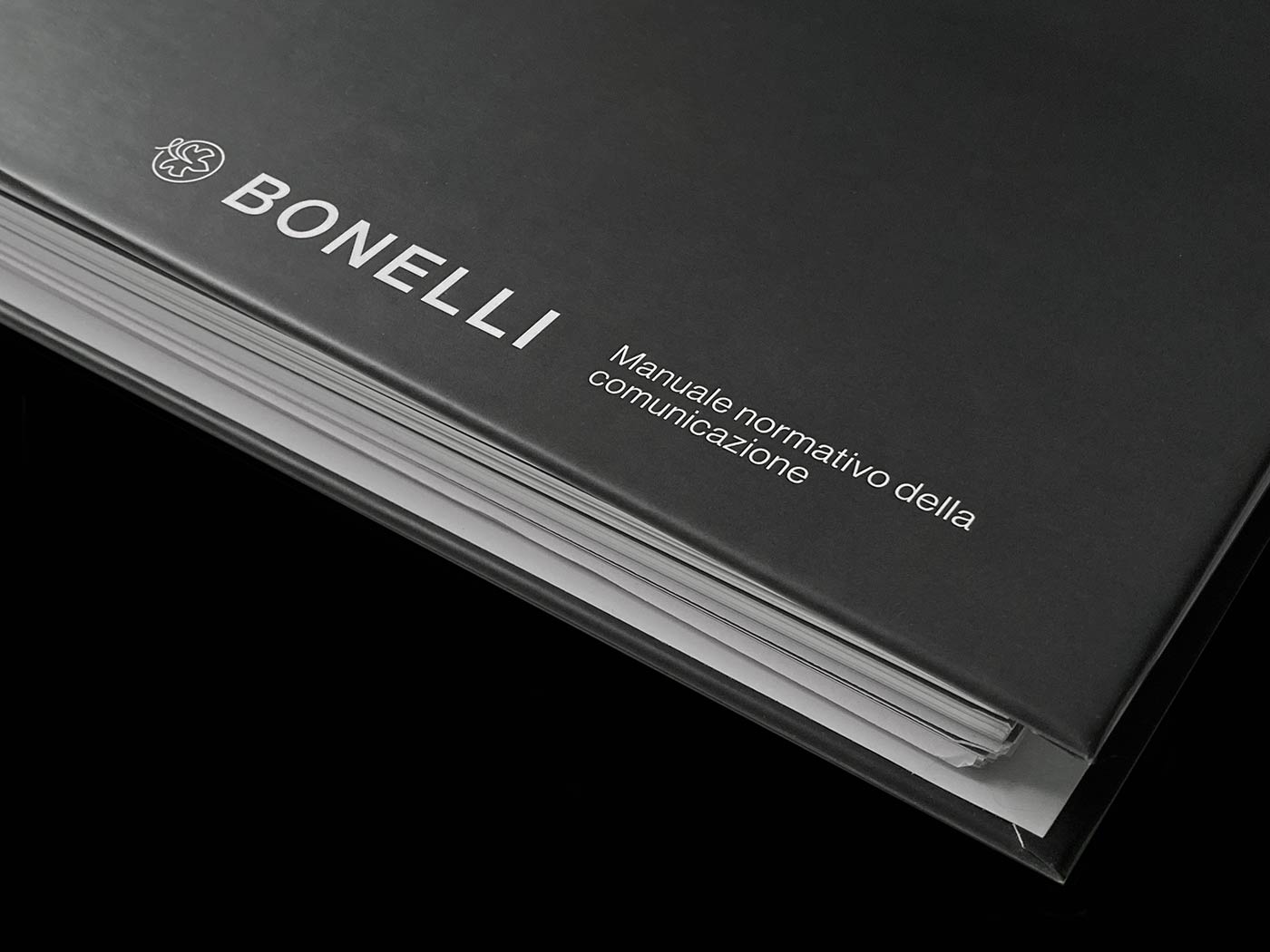
The binder is covered with a corporate grey matte paper, lined with a soft expanded padding that gives strength
and tactile quality to the document.
Ph. © Nicola-Matteo Munari
and tactile quality to the document.
Ph. © Nicola-Matteo Munari
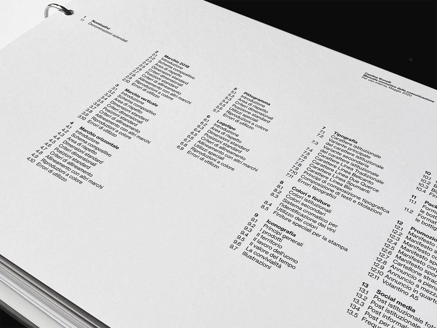
The table of contents reveals the extensiveness of the manual, which illustrates all the applications
of the company’s communication.
Ph. © Nicola-Matteo Munari
of the company’s communication.
Ph. © Nicola-Matteo Munari

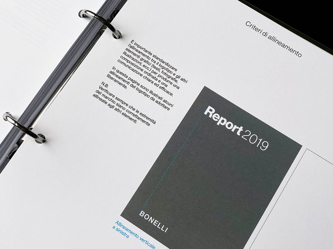
A rigorous and richly articulated modular grid system has been designed in order to consistently structure the composition.
2019 © Nicola-Matteo Munari
2019 © Nicola-Matteo Munari
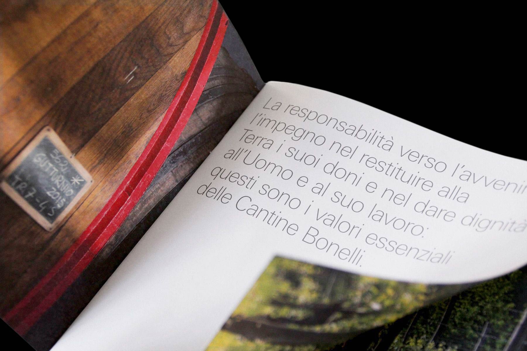
Founded in 1949 and based at the heart of the Trebbia Valley in the Colli Piacentini region, Bonelli is a distinguished winery now lead by the third generation of the family producing more than 1 million of bottles of wine every year.
After developing a few projects for Bonelli including a product catalogue and a new format for the advertising campaigns, a manual for the coordination of the corporate identity has been conceived, written and designed in order to allow the company to become more autonomous in the production and coordination of its communication.
After developing a few projects for Bonelli including a product catalogue and a new format for the advertising campaigns, a manual for the coordination of the corporate identity has been conceived, written and designed in order to allow the company to become more autonomous in the production and coordination of its communication.
 Ph. © Nicola-Matteo Munari
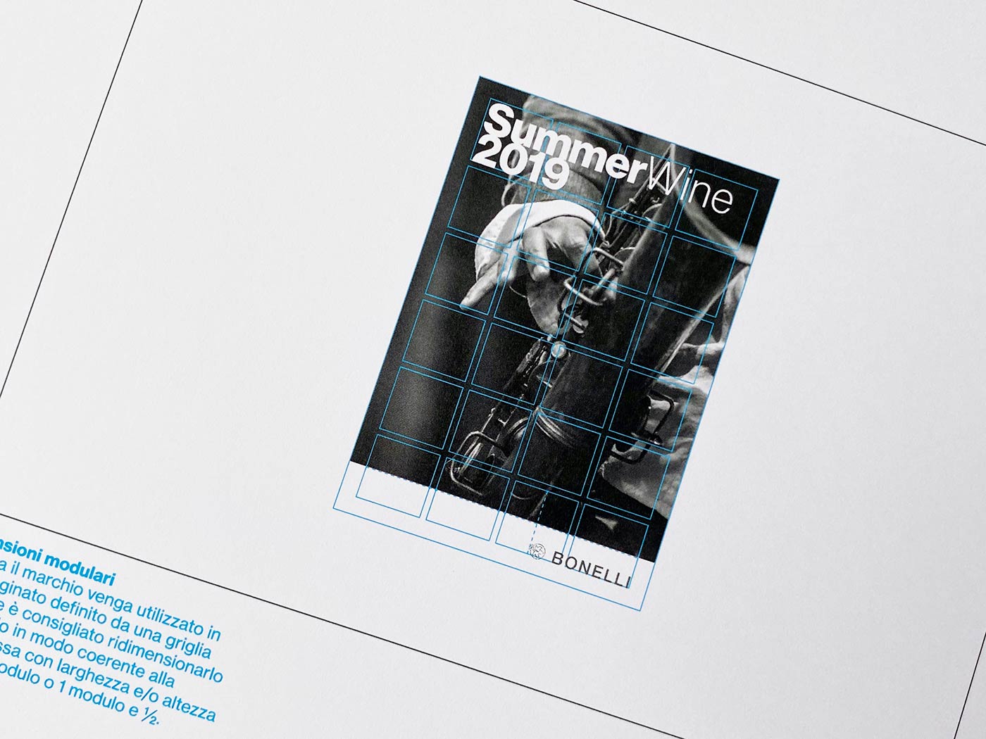
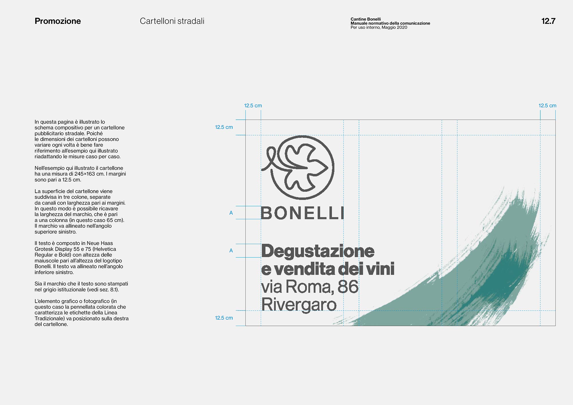
The manual shows a great number
of examples to illustrate possible design solutions with an identification and promotional purpose.
Ph. © Nicola-Matteo Munari
of examples to illustrate possible design solutions with an identification and promotional purpose.
Ph. © Nicola-Matteo Munari
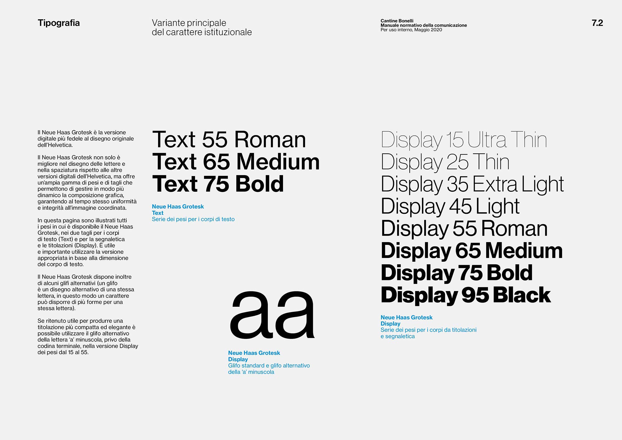
Type styles are widely illustrated
in the standards manual.
2020 © Nicola-Matteo Munari
in the standards manual.
2020 © Nicola-Matteo Munari
The manual has been purposely designed to be the most comprehensive and detailed possible in relation to the corporate identity’s basic elements and their applications, including the definition of company names, stationery, wine labels, posters, flyers, ads, billboards, and social media.
In this way, as often happens for this kind of assignments, the project determined at the same time the definition of the brand standards, the development of the manual and the design of a new corporate identity system.
In this way, as often happens for this kind of assignments, the project determined at the same time the definition of the brand standards, the development of the manual and the design of a new corporate identity system.
 Ph. © Nicola-Matteo Munari
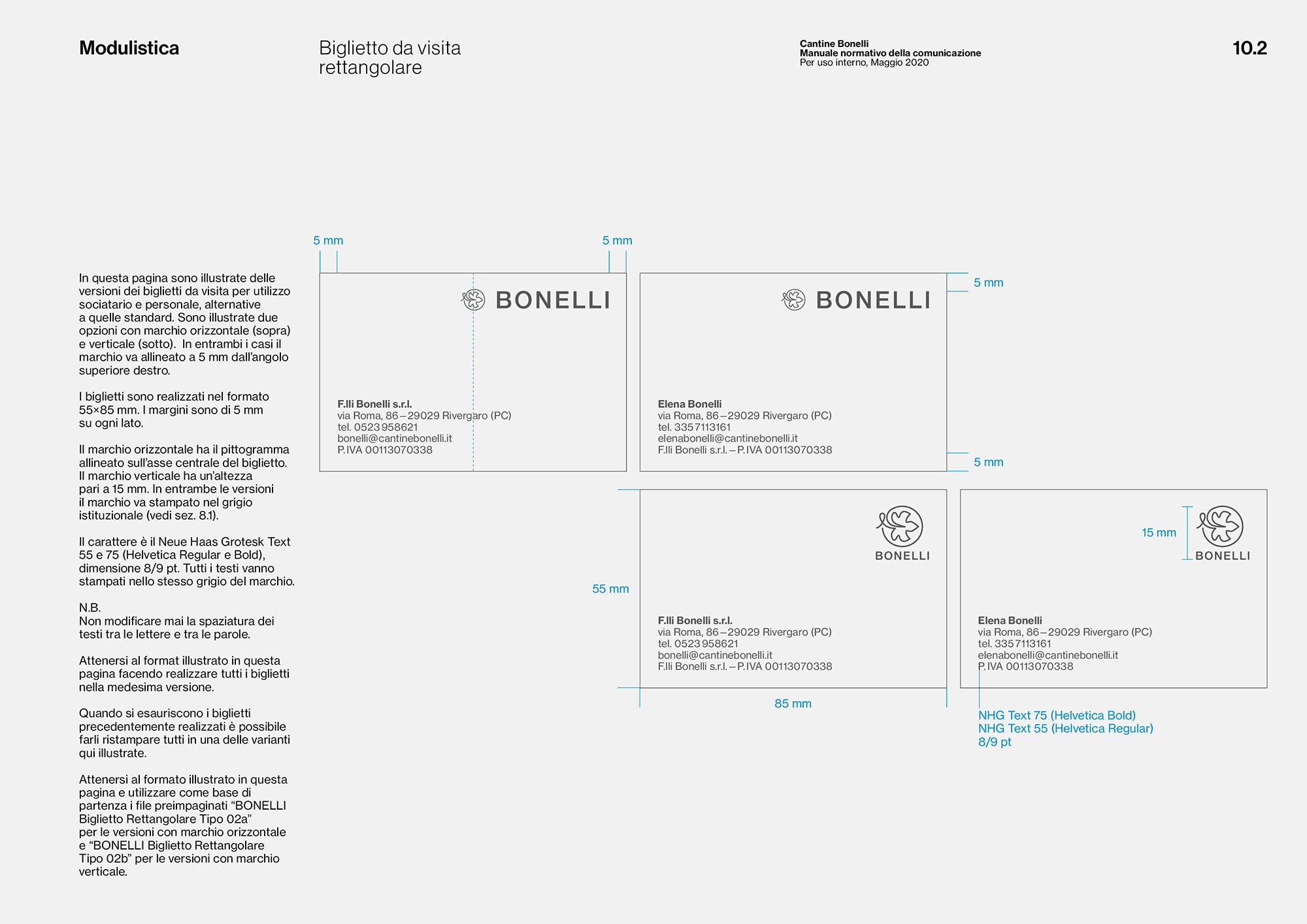
A page from the Stationery Chapter dedicated to the business cards.
2020 © Nicola-Matteo Munari
2020 © Nicola-Matteo Munari
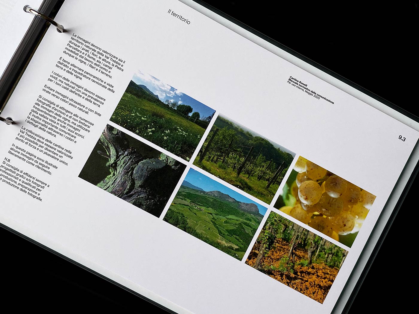
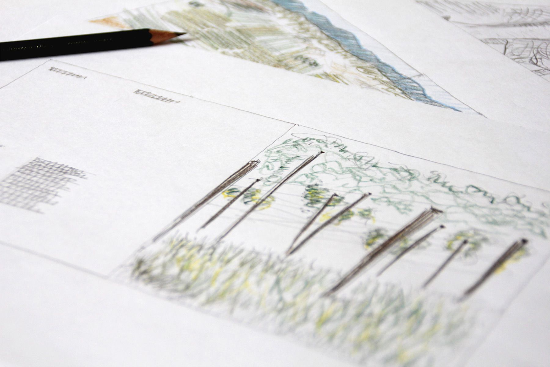
Type, style and production of
images are also carefully defined
by the standards manual.
Ph. © Nicola-Matteo Munari
images are also carefully defined
by the standards manual.
Ph. © Nicola-Matteo Munari
Before starting to layout the contents, a great amount of time was dedicated to the design of a rigorous and articulated modular grid system, made up of 165 modules, that at the same time provide graphic consistency and great flexibility in the composition of the pages.
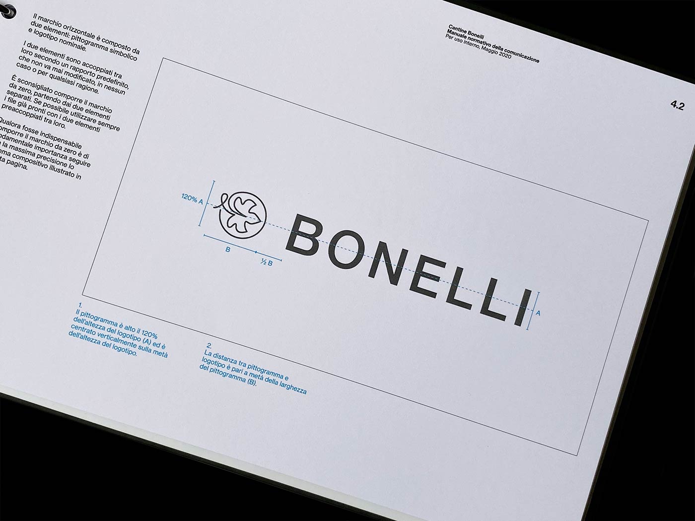
Several sections in the manual have been dedicated to the corporate identity’s fundamental elements, so that the client could become fully aware of their characteristics and master their use in their application.
Some chapters have been also dedicated to typography and iconography, defining the different typologies and the essential criteria for the choice and production of both photographic images and illustrations.
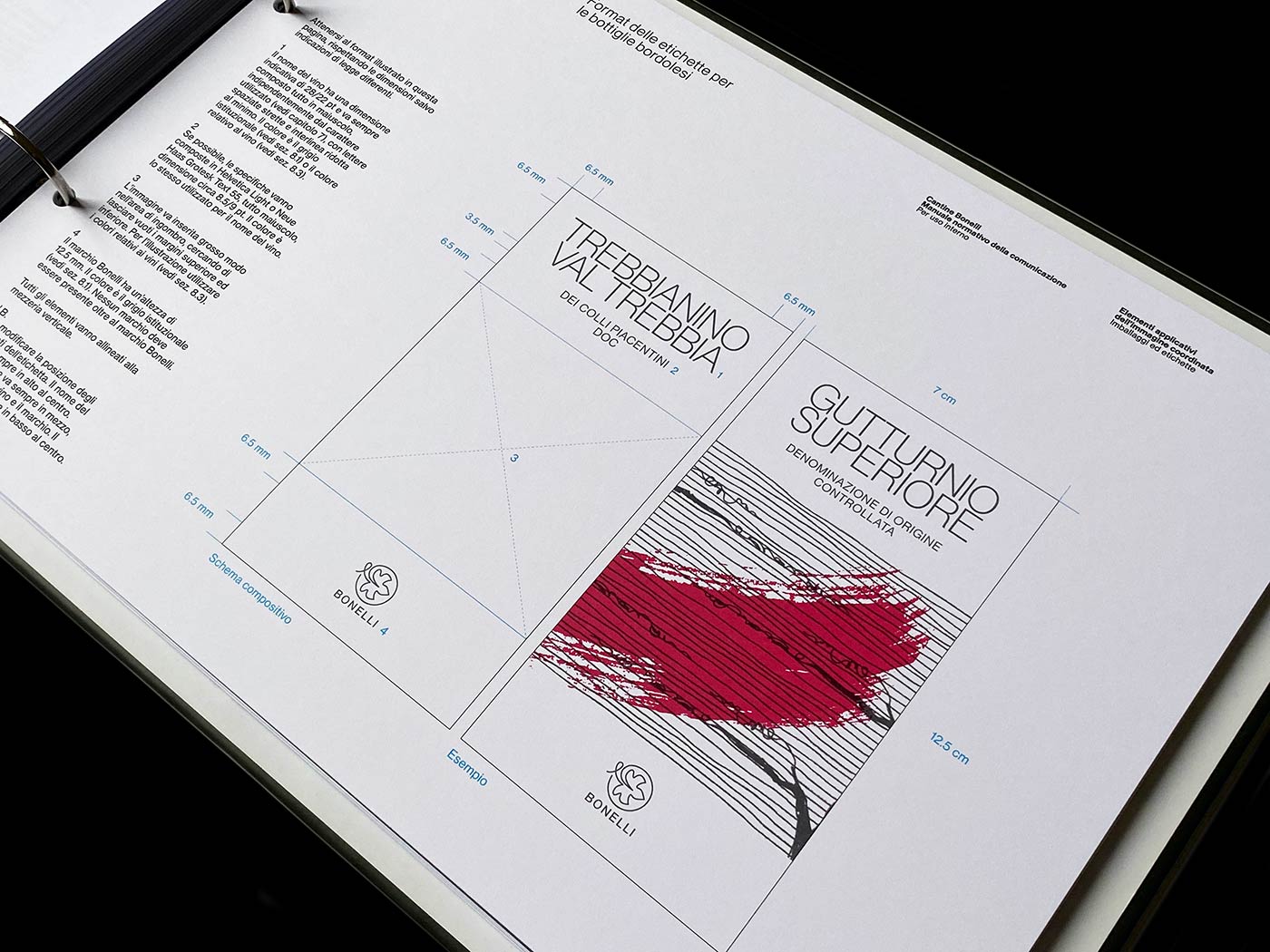
Labels have been redesigned in order
to produce a more consistent layout
and a coordinated image across all the different lines of wines.
Ph. © Nicola-Matteo Munari
to produce a more consistent layout
and a coordinated image across all the different lines of wines.
Ph. © Nicola-Matteo Munari
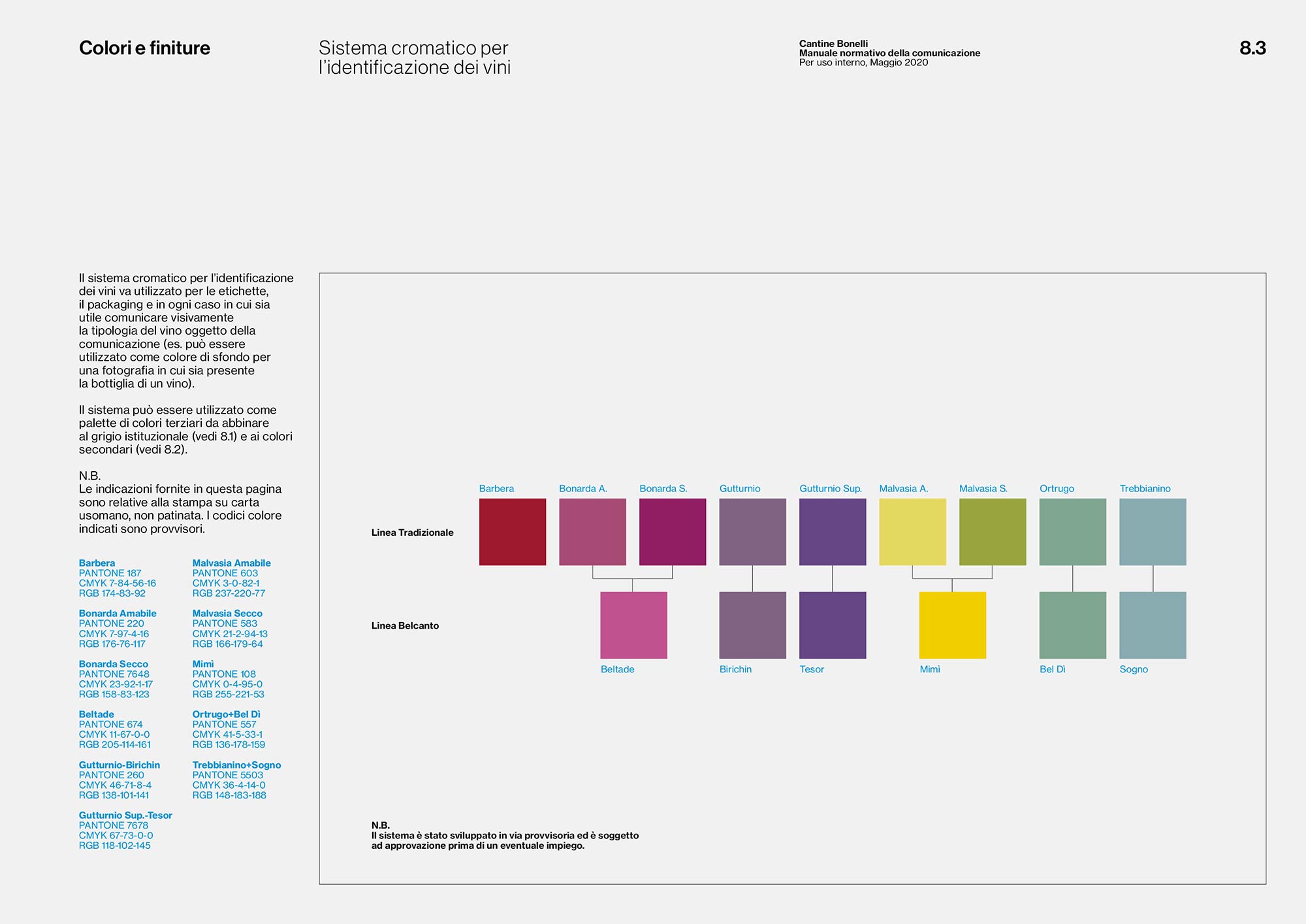
An articulated colour system
has been developed for the
identification of the different
type of wines.
2020 © Nicola-Matteo Munari
has been developed for the
identification of the different
type of wines.
2020 © Nicola-Matteo Munari
To the identification of the various lines of wines is dedicated a major section of the manual. An articulated colour system has been purposely designed in order to distinguish the different type of wines.
Ruby and deep warm colours have been associated to full-bodied wines, like Bonarda and Barbera. Fresher and sunny colours have been associated to sweet and light white wine, like Malvasia and Ortrugo. While a cold violet have been chosen to identify Gutturnio, the darkest among red wines.
Ruby and deep warm colours have been associated to full-bodied wines, like Bonarda and Barbera. Fresher and sunny colours have been associated to sweet and light white wine, like Malvasia and Ortrugo. While a cold violet have been chosen to identify Gutturnio, the darkest among red wines.
 2020 © Nicola-Matteo Munari
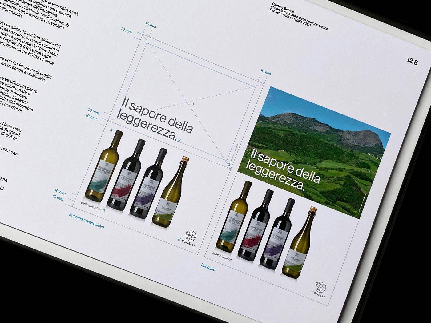 Ph. © Nicola-Matteo Munari
 Ph. © Nicola-Matteo Munari
Besides the fundamental elements of the corporate identity, all the other aspects of corporate communication have been addressed in the manual and illustrated through numerous examples that show possible design solutions for both identification and promotional purposes.
In this way, the manual came to be an instrumental document of great importance to the client, providing awareness about the corporate identity’s coordination criteria and autonomy in the self-production of visual communication.
The contribution given through the manual proved to be of paramount importance in the improvement of the company, that was thus able to renew its public image and reposition its brand reputation, enjoying a stronger competitiveness compared to its competitors.
—Nicola-Matteo Munari
Client
F.lli Bonelli
Design+Text
Nicola-Matteo Munari
Project Date
2019–20
F.lli Bonelli
Design+Text
Nicola-Matteo Munari
Project Date
2019–20