Company and product catalogue for Cantine Bonelli, a distinguished winery of the Colli Piacentini.
Catalogue, 18×18 cm
44 pages
2018 © Nicola-Matteo Munari
A preliminary graphic solution
for the cover, featuring a
monochrome background.
2018 © Nicola-Matteo Munari
for the cover, featuring a
monochrome background.
2018 © Nicola-Matteo Munari
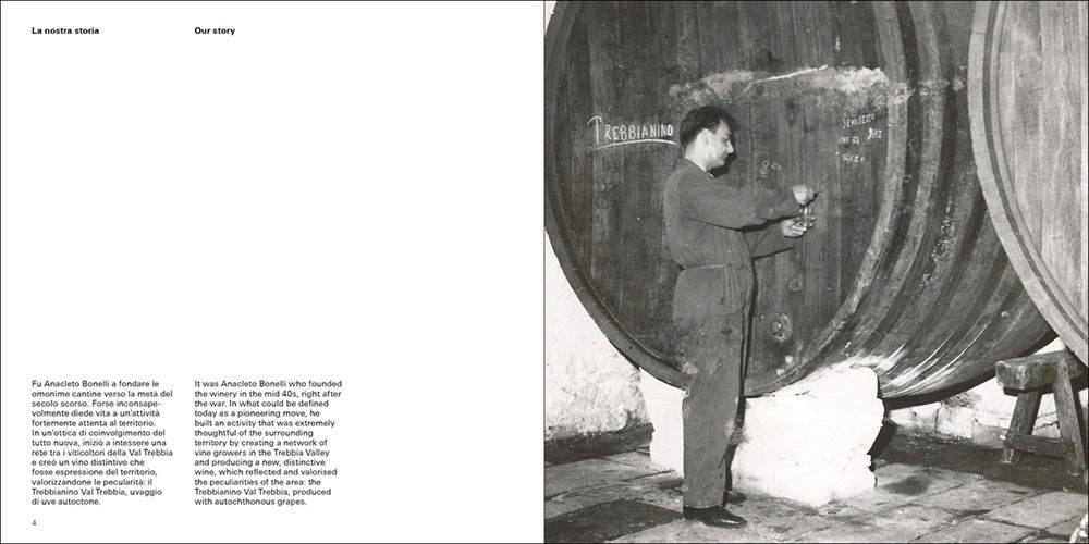
Based at the heart of the wonderful Trebbia Valley, Bonelli is an important producer of Colli Piacentini wines. Founded in 1949 by Anacleto Bonelli, the winery is now lead by the third generation of the Bonelli family, producing more than one million of bottles every year.
The catalogue contributes to the evolution of the company, that in early 2018 has changed the design of its trademark and that of the wine labels.
Following this project, the collaboration with Bonelli continued with the development of the printed advertisements, the analysis and coordination of corporate communications, and the design of a corporate identity standards manual.
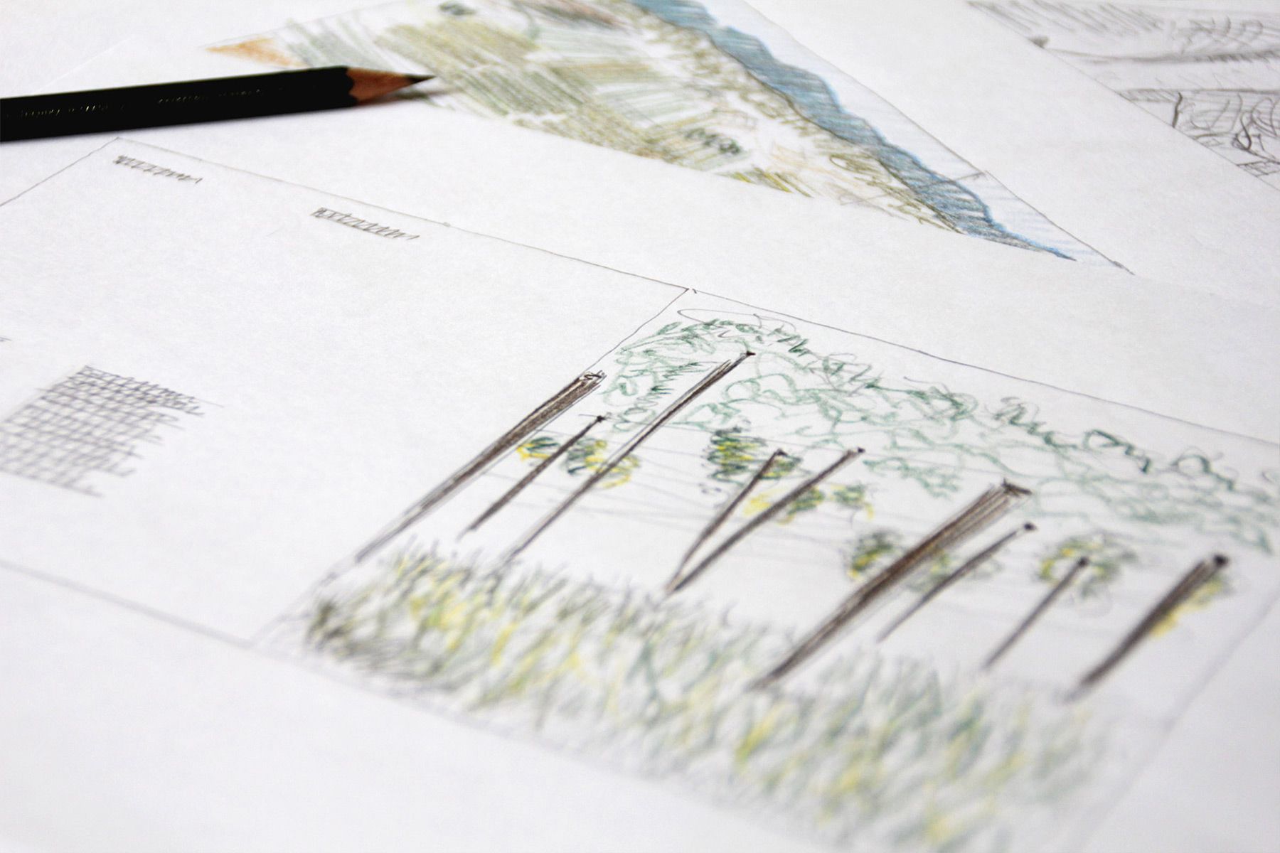
During the first phase of
the design process, the
catalogue has been entirely
drawn by hand.
Ph. © Nicola-Matteo Munari
the design process, the
catalogue has been entirely
drawn by hand.
Ph. © Nicola-Matteo Munari
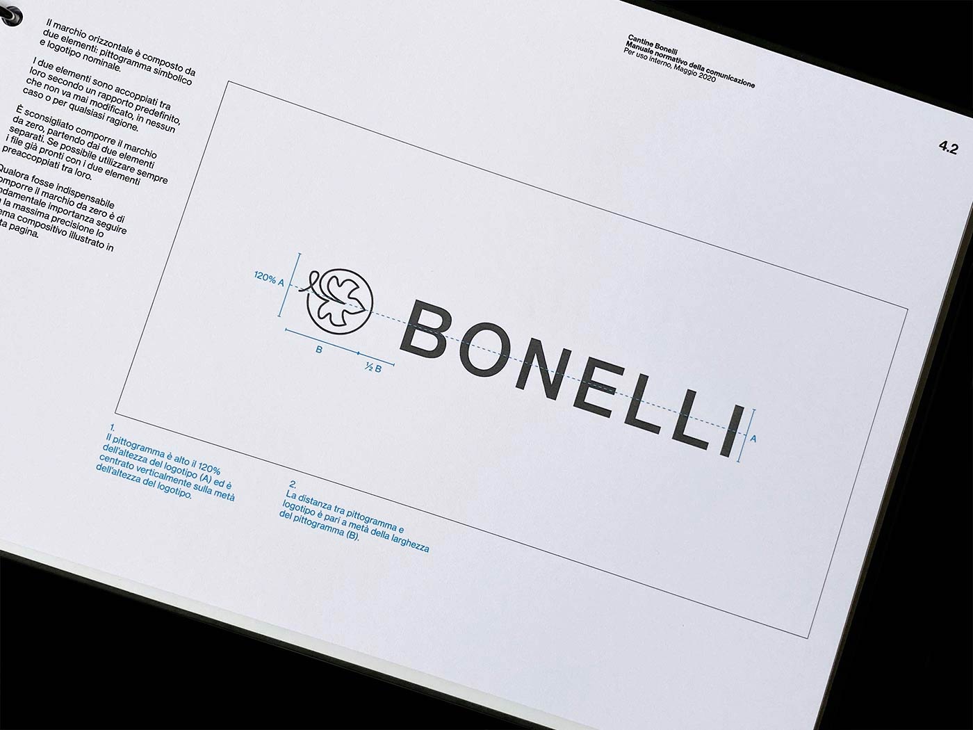
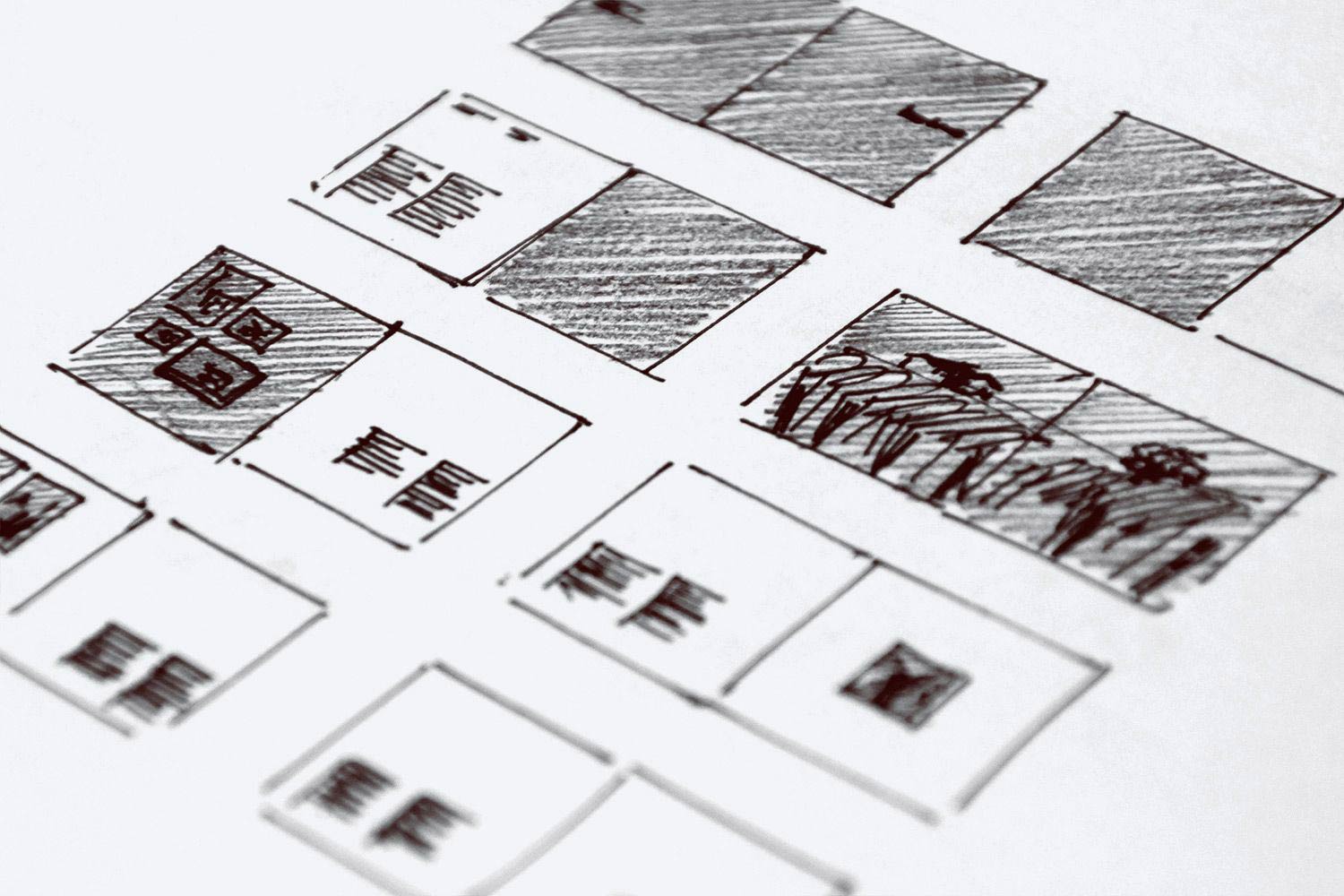
The typographic modular grid
system that has been
designed for the catalogue and
some basic layout sketches.
2018 © Nicola-Matteo Munari
system that has been
designed for the catalogue and
some basic layout sketches.
2018 © Nicola-Matteo Munari
Wine Catalogue
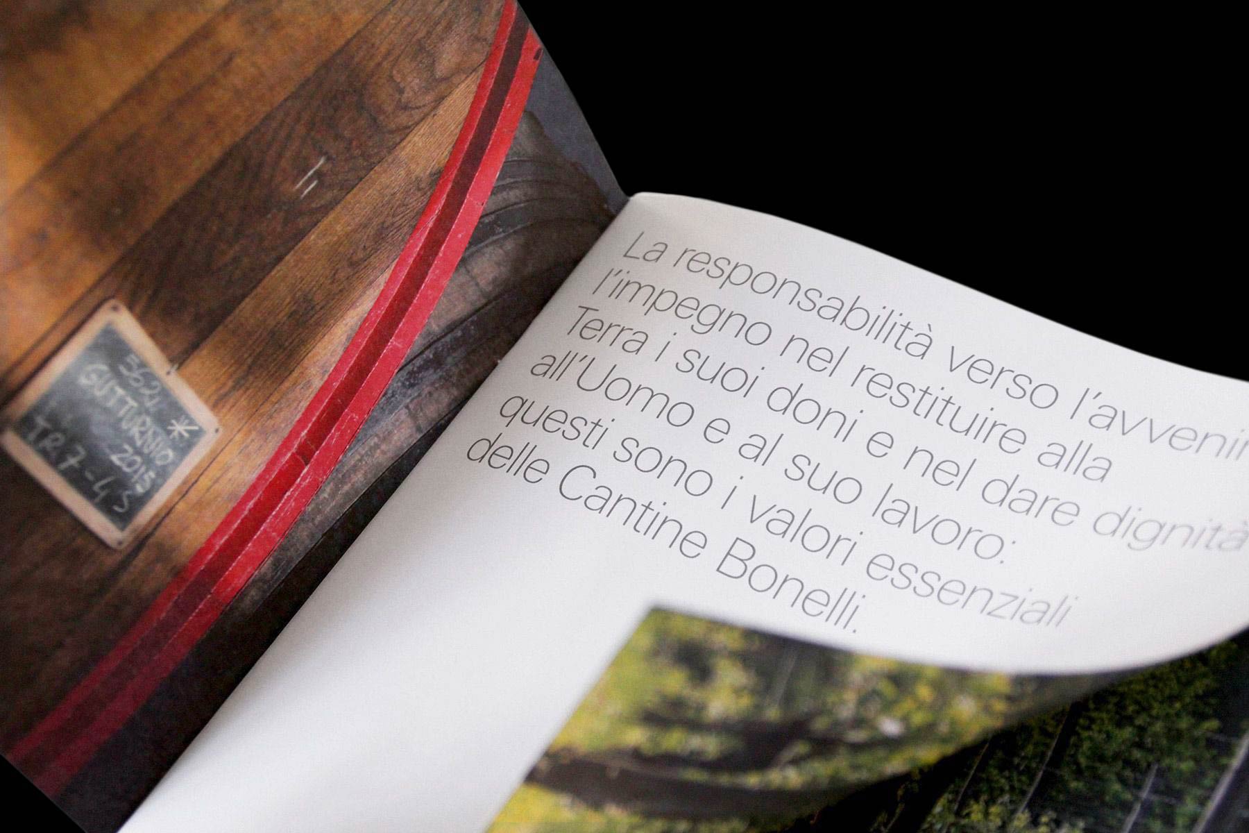
The catalogue emphasises the clarity and elegance that already characterised previous publications of Bonelli Wines, but combines the company prospectus and the wine catalogue in one publication only.
By combining the two catalogues into one publication, it was possible to rationalise the costs and to provide commercial agents with a booklet that is at the same time more thorough and more practical.
 2018 © Nicola-Matteo Munari
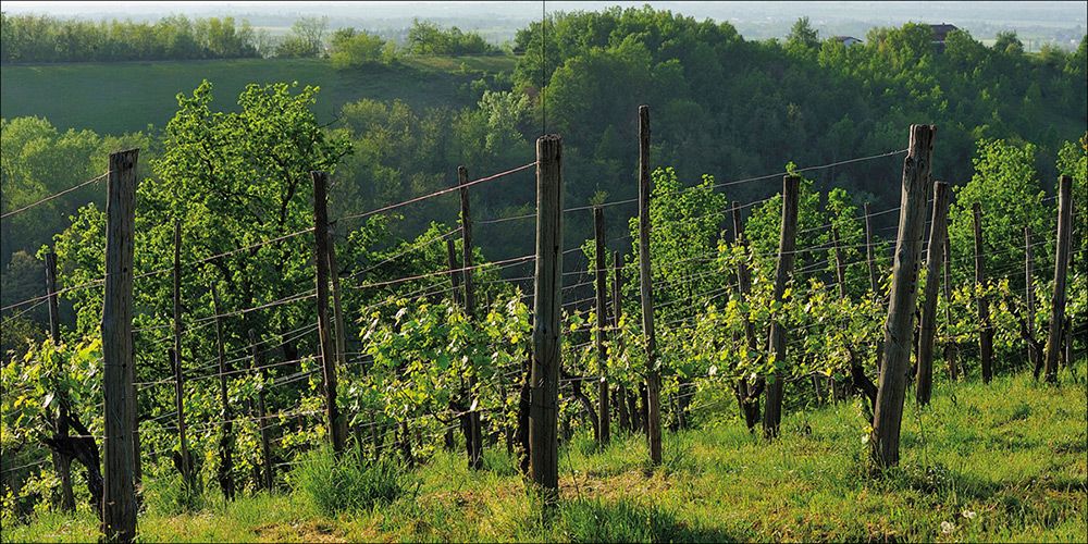 2018 © Nicola-Matteo Munari
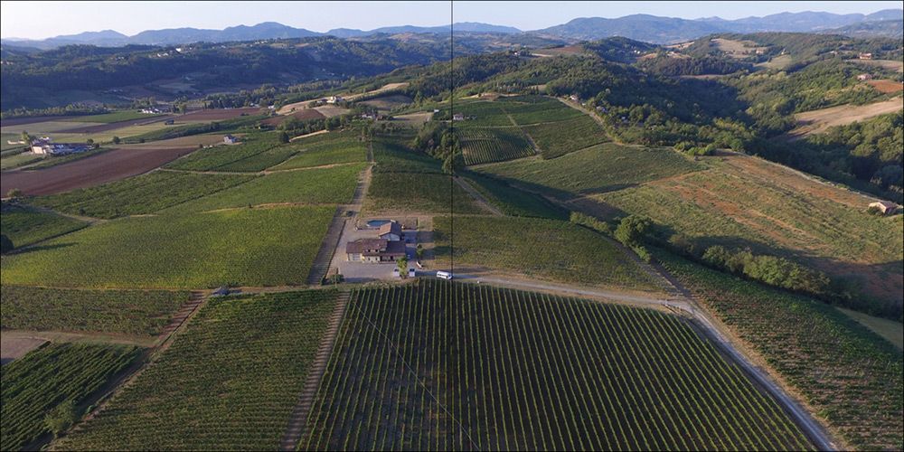 2018 © Nicola-Matteo Munari
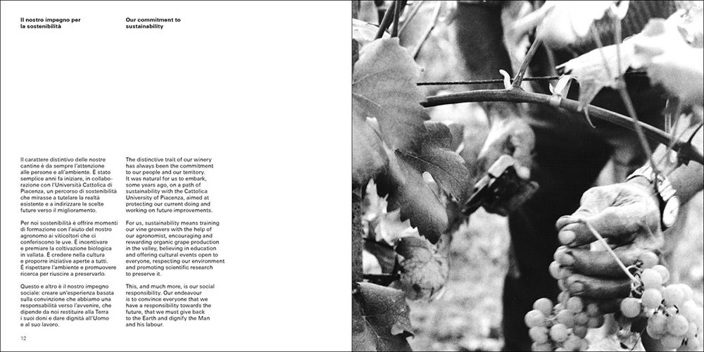 2018 © Nicola-Matteo Munari
The design of the catalogue resulted from a continuous dialogue with the client and also included the definition and partially writing of all texts.
Before starting its technical planning, the catalogue has been entirely drawn by hand in order to better understand how to layout all the contents.
The objective of the graphic design was to focus on the essential by enhancing the images, optimise the page sequence, and carefully calibrate every detail in order to communicate with maximum clarity and consistency.
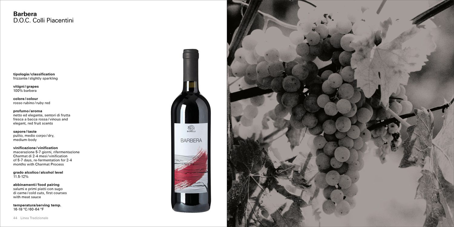
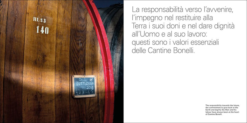
A page with the data
sheet of a wine.
2018 © Nicola-Matteo Munari
sheet of a wine.
2018 © Nicola-Matteo Munari
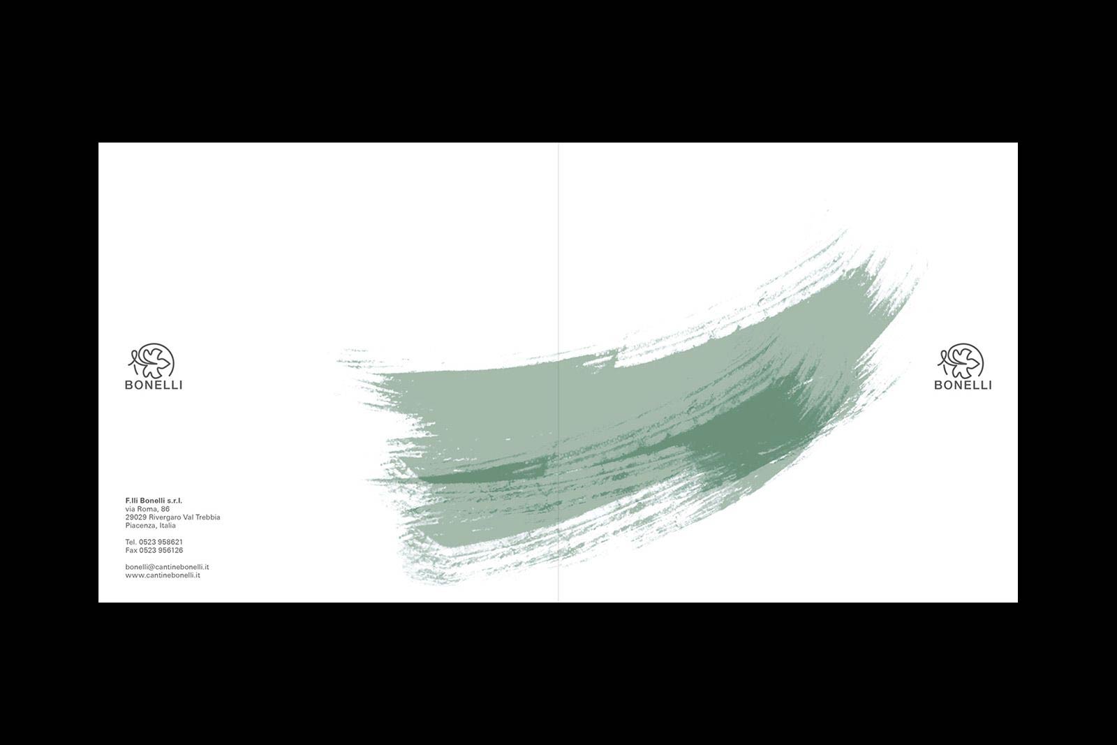
The final cover featuring the
soft brush stroke, originally
made by Beatrice Bellassi, that
was already used on Bonelli’s
wine labels.
2018 © Nicola-Matteo Munari
soft brush stroke, originally
made by Beatrice Bellassi, that
was already used on Bonelli’s
wine labels.
2018 © Nicola-Matteo Munari
“The objective was to focus on the essential by enhance images, optimise the page sequence, and carefully calibrate every detail in order to communicate with clarity and consistency.”
Although the catalogue is organised in chapters, the sequence of the images clearly distinguishes the various chapters without requiring the need of chapter’s title pages.
In order to let images unleash all their beauty, only one image per page has been used, always as a full page image.
The 12 photos that are reproduced in the catalogue—without counting those of the bottles—have been selected among hundreds from the Bonelli archive, only choosing those portraying the company and the territory of the Trebbia Valley with honesty and authenticity.
Photos of wine bottles also follow the scheme of one image per page, with the only exception of the traditional “metodo classico spumante”—the company’s flagship product—that enjoys a double-page spread only for itself.
 2018 © Nicola-Matteo Munari
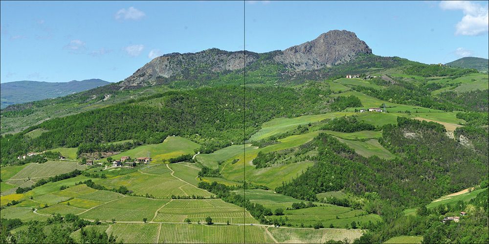 2018 © Nicola-Matteo Munari
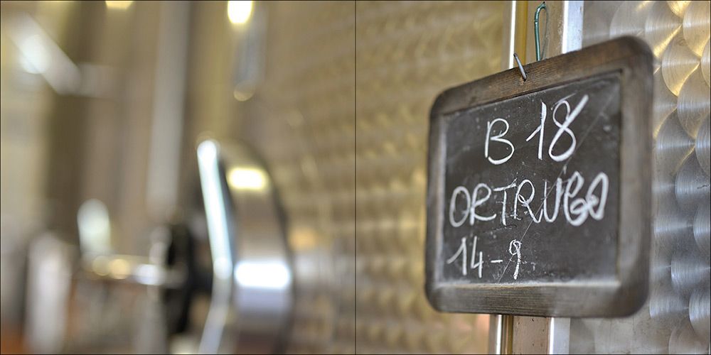 2018 © Nicola-Matteo Munari
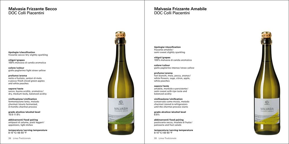 2018 © Nicola-Matteo Munari
The pages of text also have an important aesthetic role, thanks to a simple but uncommon solution.
In fact, texts are not hanged on the top of the pages but on the bottom. In this way, a larger white space on the top half of the page is obtained, thus giving lightness to the pages, enhancing images, and increasing the legibility of texts.
Only one typeface—consistently set in two weights and two sizes—has been used in the catalogue. The only, intenational exception is that of the opening page, showing a single sentence enjoying greater visual emphasis.
 Ph. © Nicola-Matteo Munari
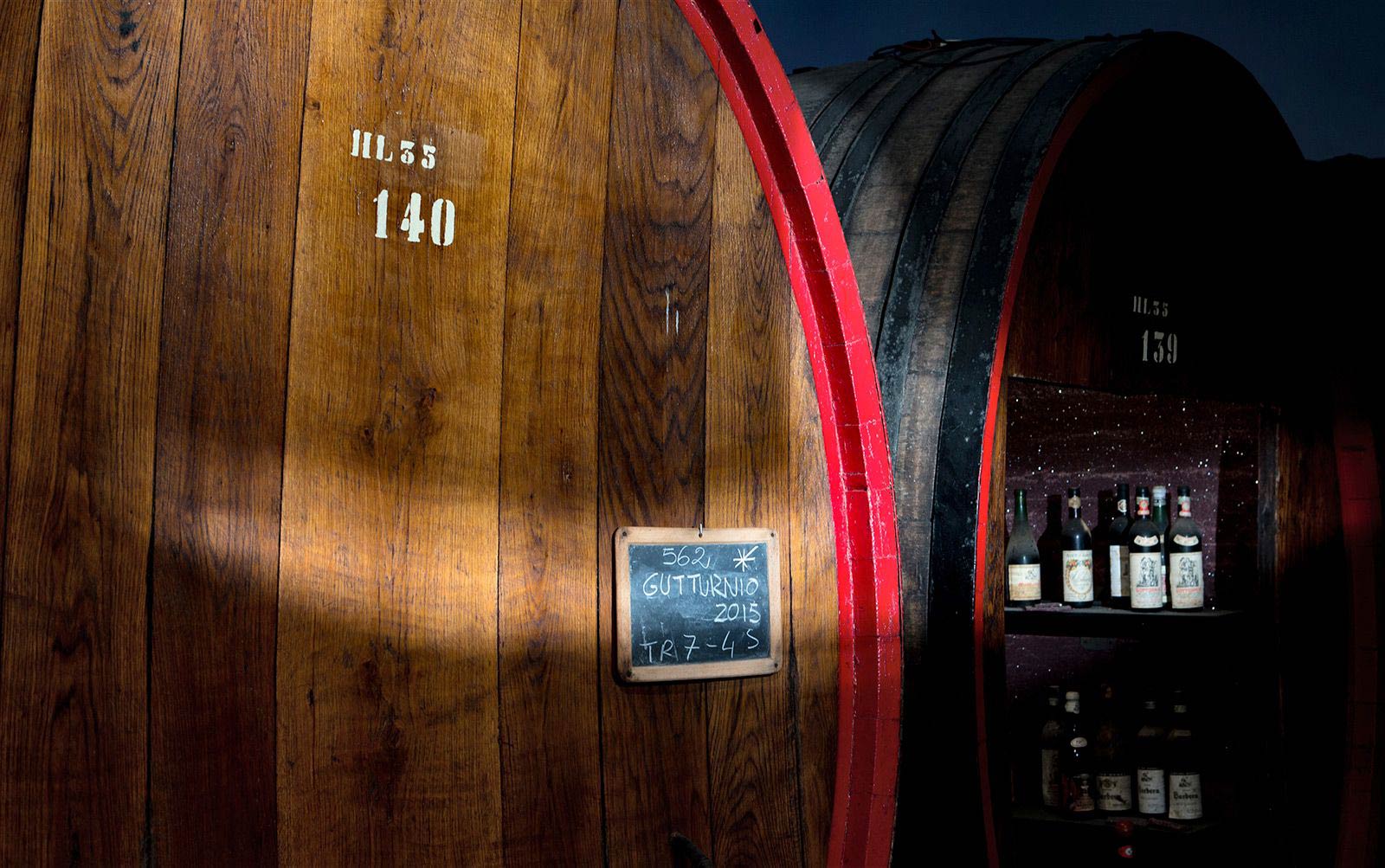 Ph. © Courtesy of Bonelli
The cover has been the last thing to be designed. Conceived to be an expression of understatement, the final version enhances the elements of which it is actually made—the trademark, the soft brush stroke and, above all, the plain white paper, which silently accompanies the reader through all the pages.
By designing a catalogue which is a cultural object in all respect, the publication strongly contributed to enhance Bonelli’s search for quality, that is here expressed through an elegant layout and restrained aesthetics.
—Nicola-Matteo Munari
Client
F.lli Bonelli
Design+Layout
Nicola-Matteo Munari
Project Date
2018
F.lli Bonelli
Design+Layout
Nicola-Matteo Munari
Project Date
2018