Name, logotype, catalogues, and printed matter for UNA, a contemporary art gallery.
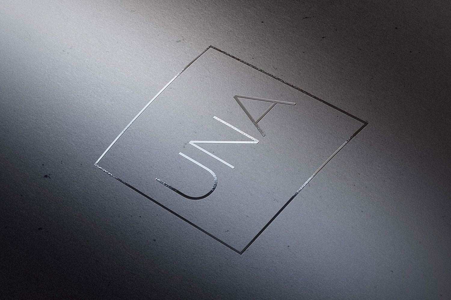
Final version of the logo
designed for UNA.
2018 © Nicola-Matteo Munari
designed for UNA.
2018 © Nicola-Matteo Munari
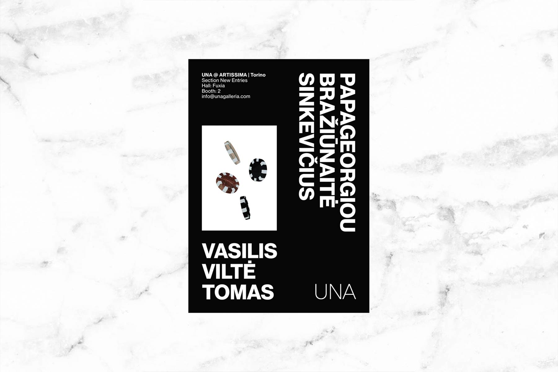
One of the flyers designed to promote UNA stand at Artissima fair.
Ph. © Nicola-Matteo Munari
Ph. © Nicola-Matteo Munari
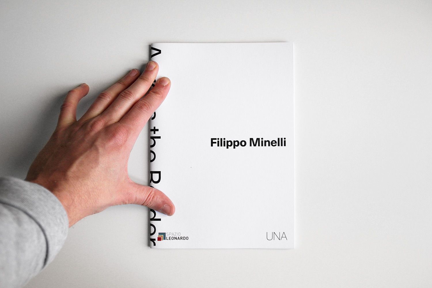
One of the catalogues designed
for exhibitions curated by
UNA for Milan’s Spazio Leonardo.
2019 © Nicola-Matteo Munari
for exhibitions curated by
UNA for Milan’s Spazio Leonardo.
2019 © Nicola-Matteo Munari
Founded by Marta Barbieri and Paola Bonino after a three years experience as managers of Placentia Arte, UNA is a new gallery dedicated to contemporary art focusing on promoting young talents.
Before a logo there is always a name. Sometimes there is both luck and determination to choose and to design the simplest names and logotypes.
At the same time, “una galleria” (literally, a gallery) is the simplest name possible for a gallery and its name par excellence. It says nothing but that a gallery is a gallery, nothing else.
 2018 © Nicola-Matteo Munari
The first logotype designed for
“una galleria” (a gallery), before
the name evolved into UNA.
2018 © Nicola-Matteo Munari
“una galleria” (a gallery), before
the name evolved into UNA.
2018 © Nicola-Matteo Munari
“In a world where everything pretends to be something else, to be true to yourself and stand for what you really are is more valuable than ever.”
Through its name, “una galleria” says that it is what it is. And in a world where everything pretends to be something else, to be true to yourself and stand for what you really are is more valuable than ever.
As its name is the simplest name possibile, so its logotype is the simplest logotype possible, but at the same time it is also a logotype par excellence. The logo is free from any particular characterisation, yet it is extremely characterised from a conceptual standpoint.
However, the logotype immediately evolved into the article “una”—meaning both “a” and “one”—becoming the proper name of the gallery, making it to stand out and distinguish itself from all the other art galleries. Then, anticipating a hypotetical evolution of its name, una galleria became the gallery UNA.
Prototype of a catalogue, featuring
a semi-transparent black
dust-jacket printed in white.
Ph. © Nicola-Matteo Munari
a semi-transparent black
dust-jacket printed in white.
Ph. © Nicola-Matteo Munari
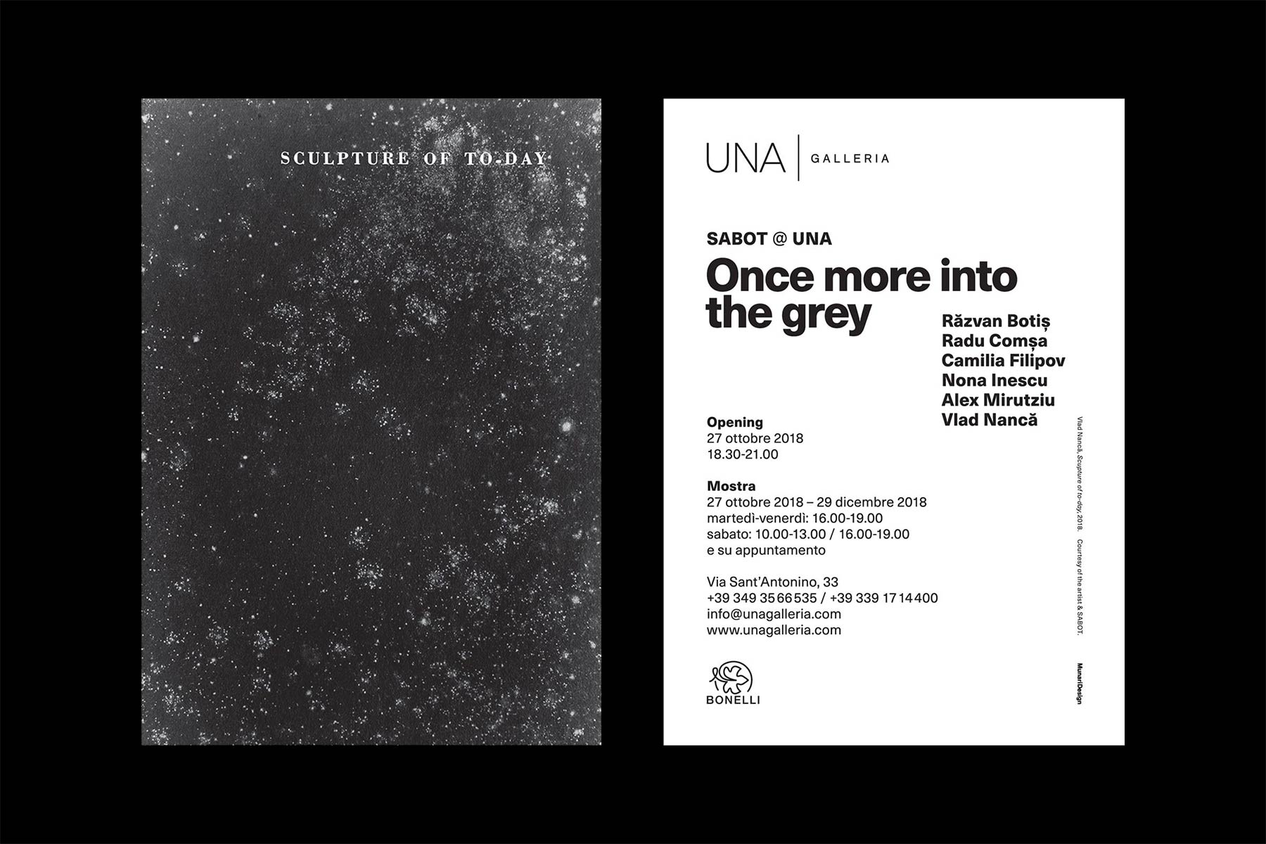
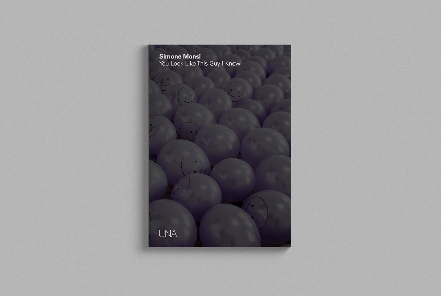
One of the flyers designed
to promote exhibitions
organised by UNA gallery.
2018 © Nicola-Matteo Munari
to promote exhibitions
organised by UNA gallery.
2018 © Nicola-Matteo Munari
Study for the lock-up of logo
and the word “galleria,”
based on square modules.
2018 © Nicola-Matteo Munari
and the word “galleria,”
based on square modules.
2018 © Nicola-Matteo Munari
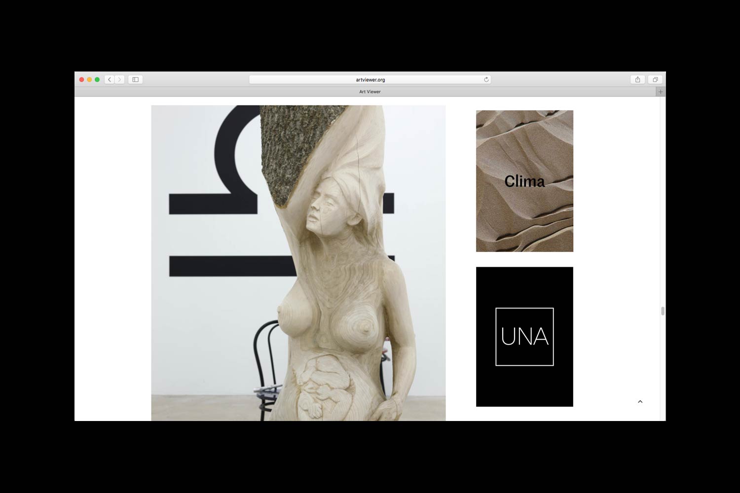
Vertical web banner published
on Art Viewer.
2018 © Nicola-Matteo Munari
on Art Viewer.
2018 © Nicola-Matteo Munari
The three letters that form the logotype feature thin and uniform strokes. This shape softened the authoritarian weight which is typical to capital letters, at the same time enhancing the linear geometry of the letters.
The logotype is further enhanced through the use of a thin square frame, that emphasises its iconic character and the uniqueness of the name.
Through a stylised shape—which is however strongly identificative—the logo stands out for the purity, elegance, and perfection of its line.
—Nicola-Matteo Munari
Client
UNA
Design+Strategy
Nicola-Matteo Munari
Collaborator
Greta Bussandri
Project Date
2018–19
UNA
Design+Strategy
Nicola-Matteo Munari
Collaborator
Greta Bussandri
Project Date
2018–19