Book and flyers for the exhibition Postcards Trilogy of artist and performer Eleonora Marzani.
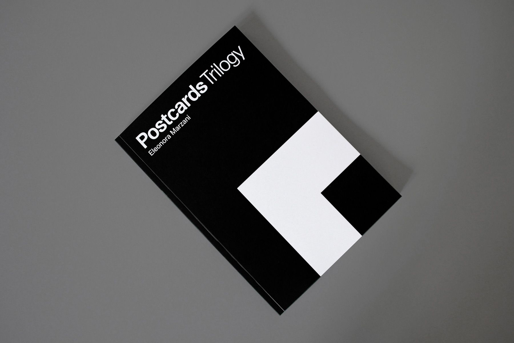
Book, 23.5×16.5 cm
144 pages
Ph. © Nicola-Matteo Munari

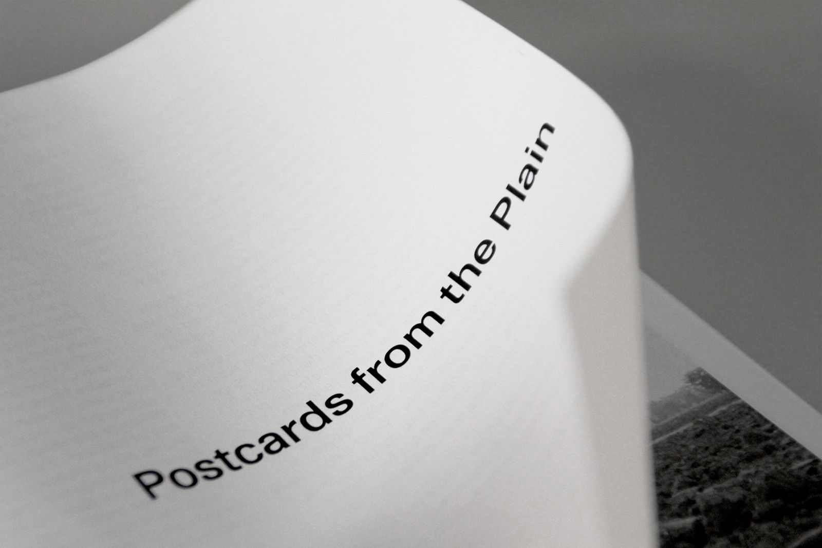
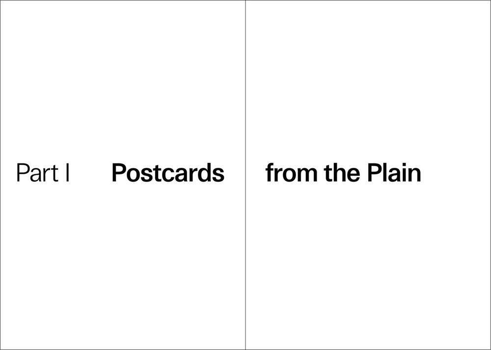
A detail from the opening spread
page of the first chapter.
Ph. © Nicola-Matteo Munari
page of the first chapter.
Ph. © Nicola-Matteo Munari
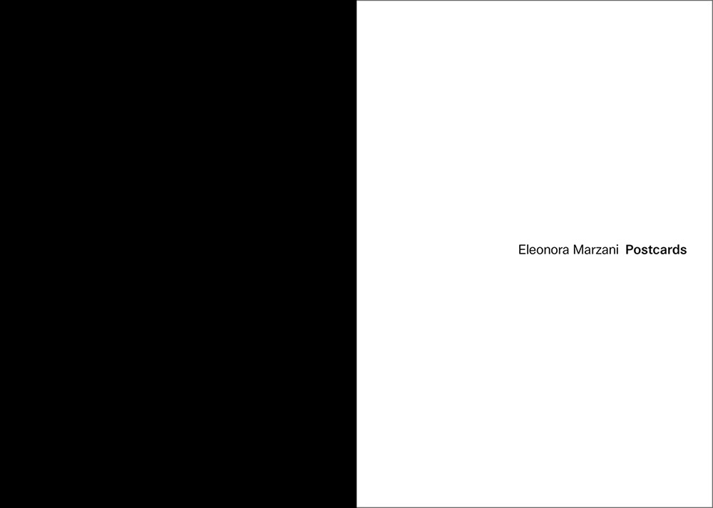
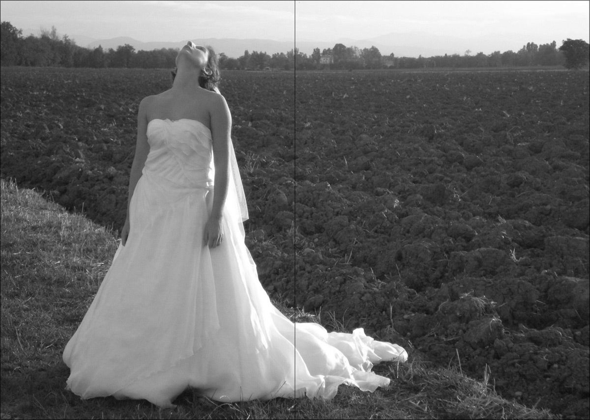
Black and white have been chosen
as a sign of understatement,
in order to enhance the artworks.
2018 © Nicola-Matteo Munari
as a sign of understatement,
in order to enhance the artworks.
2018 © Nicola-Matteo Munari
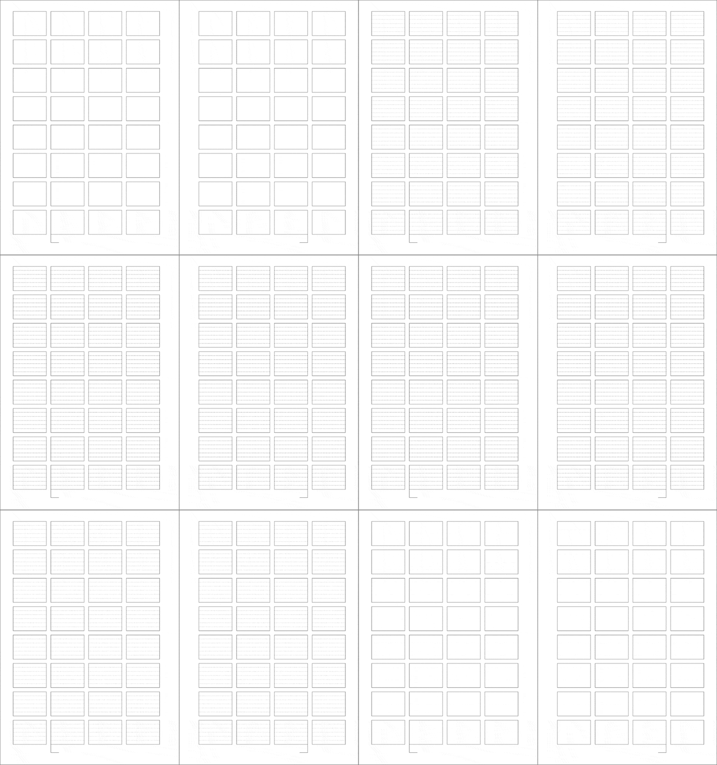
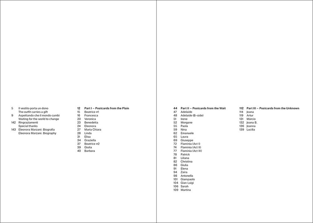
The typographic modular grid
designed for the book.
2018 © Nicola-Matteo Munari
designed for the book.
2018 © Nicola-Matteo Munari
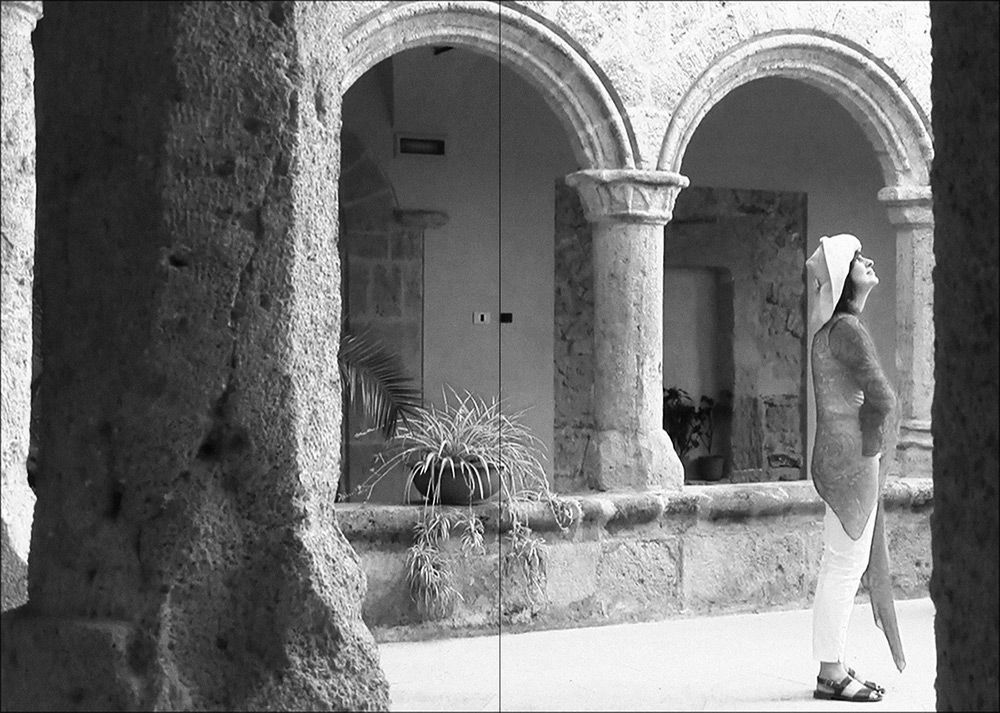
Postcards Trilogy is a video-art project conceived by Italian artist and performer Eleonora Marzani (1982). Produced between 2013 and 2016, the project explores the sensations provoked by the waiting and the influence of clothing.
Each performer who took part in the project was brought in an isolated place and left alone waiting, without knowing what. Once completed the shooting, the artist interviewed the participants, who described the thoughts and the emotions that they had during the waiting.
The project is divided in three parts consisting of 42 videos, 42 texts, and 42 postcards. The book—which has been published on the occasion of an homonymous exhibition at Galleria Biffi in Piacenza—is a collection of all the interviews and the postcards.
 2018 © Nicola-Matteo Munari
 2018 © Nicola-Matteo Munari
 2018 © Nicola-Matteo Munari
 2018 © Nicola-Matteo Munari
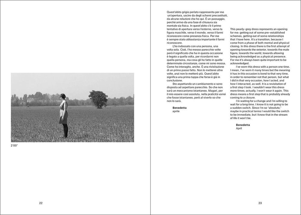
The layout grid was structured after the size of the postcards, that are actually a series of still-frames of the videos.
The artist made a serie of pictures that are so elegant and balanced that there was no need to crop any image.
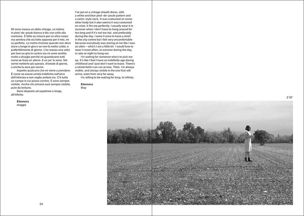
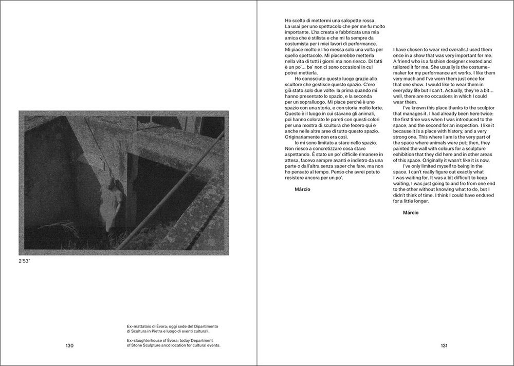
While the need to match every image with two block of texts determined the structure of the layout, made of three elements combined together on each double-page spread.
 Ph. © Nicola-Matteo Munari
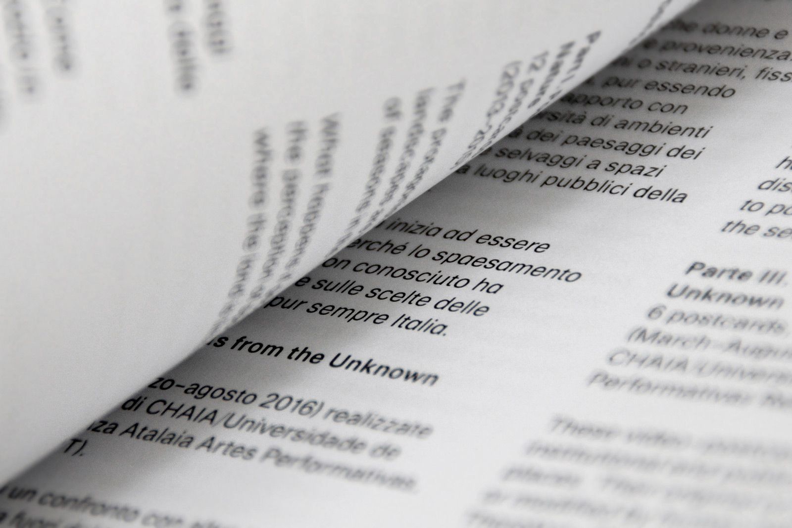
The book is entirely set in one
typeface only, purposely designed
for this specific project.
Ph. © Nicola-Matteo Munari
typeface only, purposely designed
for this specific project.
Ph. © Nicola-Matteo Munari
“The design effectively supported the project of the artist by enhancing both the aesthetic and intellectual quality of her work, through a restrained and elegant graphics.”
Considering that the same scheme—image+text+text—is repeated in the book, page after page, the graphic layout is characterised by an articulated composition that gave dynamism and rhythm to all the pages.
By intentionally not aligning the contents, texts and images seem to slowly move on the space, allowing the pages to look fresh and airy.
At the same time, the multiple alignments trace a visual path on the pages, establishing a relationship between texts and photographs.
 2018 © Nicola-Matteo Munari
 2018 © Nicola-Matteo Munari
 2018 © Nicola-Matteo Munari
 2018 © Nicola-Matteo Munari
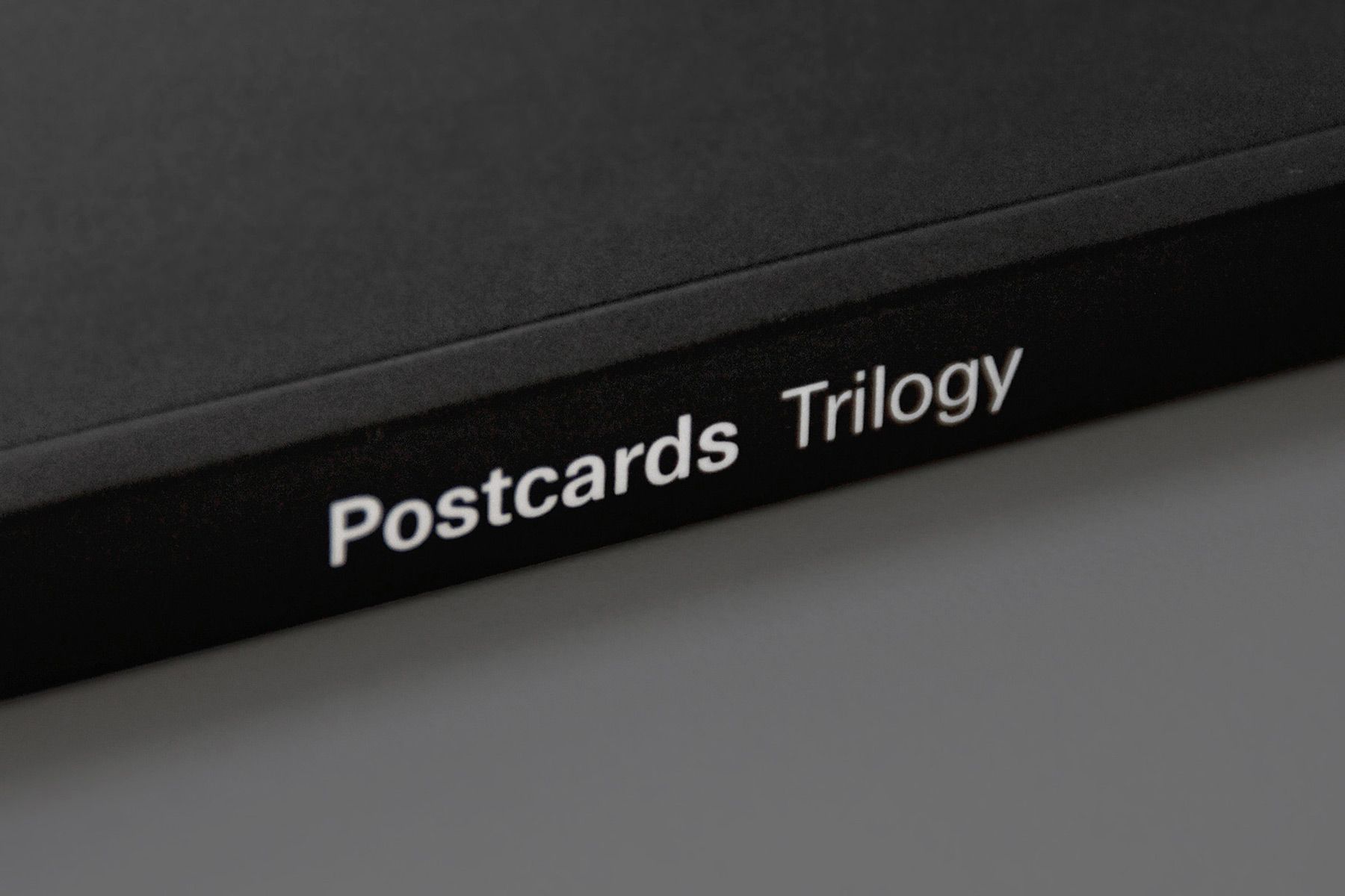
Black and white were chosen as a sign of understatement, in order to enhance the images, which are all very subtle and restrained in their aesthetic expression.
Also, the custom typeface—which is used in two weights, two styles and four sizes fo titles, subtitles, texts, and captions—was purposely designed in order to enhance clarity and discretion.
 Ph. © Nicola-Matteo Munari
More solutions have been designed for the flyers, each one produced in both positive and negative versions.
It was with the flyers—that were actually designed before the book—that the concept of a tripartite structure was introduced through the division of the surface in three areas.
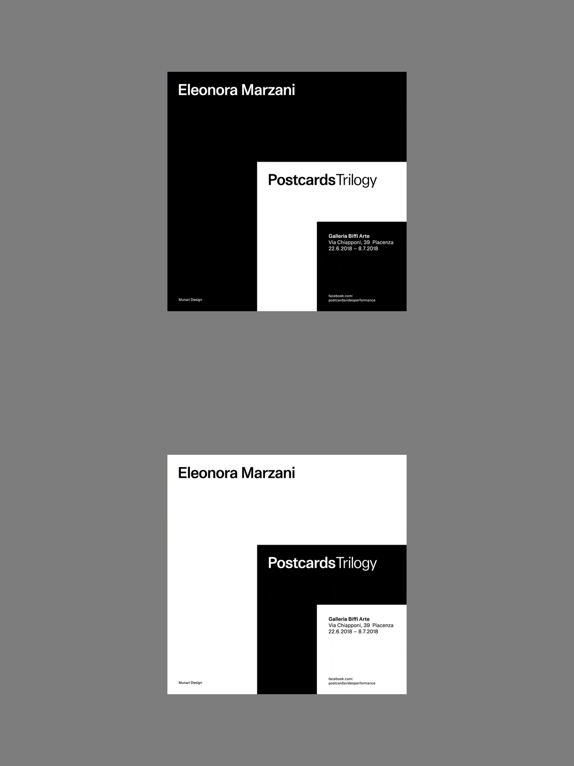
One of the flyers designed to
promote the exhibition, in both
positive and negative versions.
2018 © Nicola-Matteo Munari
promote the exhibition, in both
positive and negative versions.
2018 © Nicola-Matteo Munari
Considering the fact that the design was to be conceived for a travelling exhibition that changes every time (see Postcards: Part 1,2,3), the graphic design was conceived in order to meet the need of producing a unique identity for this specific occasion.
The design of the book effectively supported the project of the artist by enhancing both the aesthetic and intellectual quality of her work through a restrained and elegant graphics.
—Nicola-Matteo Munari
Client
Eleonora Marzani
Design+Layout
Nicola-Matteo Munari
Project Date
2018
Eleonora Marzani
Design+Layout
Nicola-Matteo Munari
Project Date
2018

