A Milestone in the History of Graphic Design.
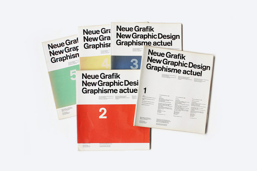
The covers of the first five original
issues of Neue Grafik with the rare coloured bands.
Ph. © Kind Company
issues of Neue Grafik with the rare coloured bands.
Ph. © Kind Company
A New Era in the Field of
Visual Communication
Neue Grafik is a milestone in the history of graphic design. A fundamental anthology of the basic principles of design and a true icon among the enthusiasts of Swiss graphic design.
“International journal for the analysis and discussion of graphic design,” it was published in Zurich from the late 50s to the mid-60s. Massimo Vignelli remembered that “it was the most important magazine of that time, not only for the contents of each issue, but as a flag of a movement which supported a systematic approach towards design instead of a pictorial or illustrative one, like it was before. It marked the dawn of a new era in the visual communication, based on the structure of information rather than emotional values.”*
The magazine originated from the meetings and discussions between four respected Swiss designers, who shared a similar design attitude: Josef Müller-Brockmann (1914-1996), Hans Neuburg (1904-1983), Carlo Vivarelli (1919-1986), and Richard Paul Lohse (1902-1988).
Visual Communication
Neue Grafik is a milestone in the history of graphic design. A fundamental anthology of the basic principles of design and a true icon among the enthusiasts of Swiss graphic design.
“International journal for the analysis and discussion of graphic design,” it was published in Zurich from the late 50s to the mid-60s. Massimo Vignelli remembered that “it was the most important magazine of that time, not only for the contents of each issue, but as a flag of a movement which supported a systematic approach towards design instead of a pictorial or illustrative one, like it was before. It marked the dawn of a new era in the visual communication, based on the structure of information rather than emotional values.”*
* From a conversation with Nicola-Matteo Munari, November 2013.
The magazine originated from the meetings and discussions between four respected Swiss designers, who shared a similar design attitude: Josef Müller-Brockmann (1914-1996), Hans Neuburg (1904-1983), Carlo Vivarelli (1919-1986), and Richard Paul Lohse (1902-1988).
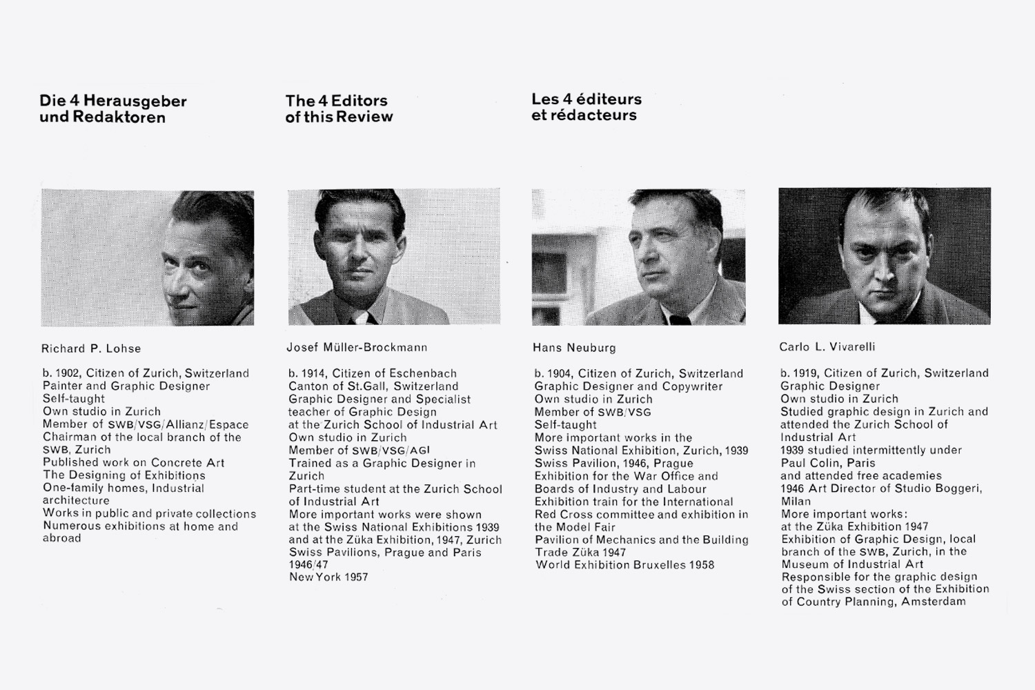
The four editors of Neue Grafik,
from a page of the first issue.
© All rights reserved
from a page of the first issue.
© All rights reserved
The Need for an Evolution
The journal didn’t want to promote the careers of the editors, who were all already well known when the first issue was published, but offer their practical and intellectual contribution to other designers and young designers in particular.
Many among the articles were in fact dedicated to the work of young designers and great attention was given to the education of graphic designers—a theme that Müller-Brockmann also studied in other publications.
The editors, who wrote most of the issues published in the magazine, wanted to promote an evolution in the field of graphic design that could had an equal impact to that of the major expressive trends in the field of art. (Futurism and Constructivism in particular were widely discussed in the magazine.)
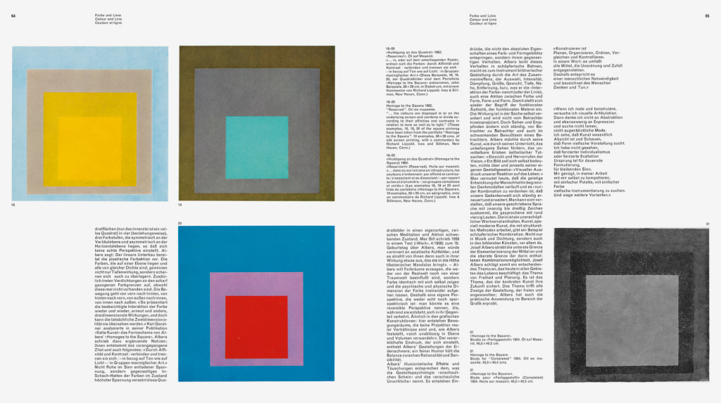
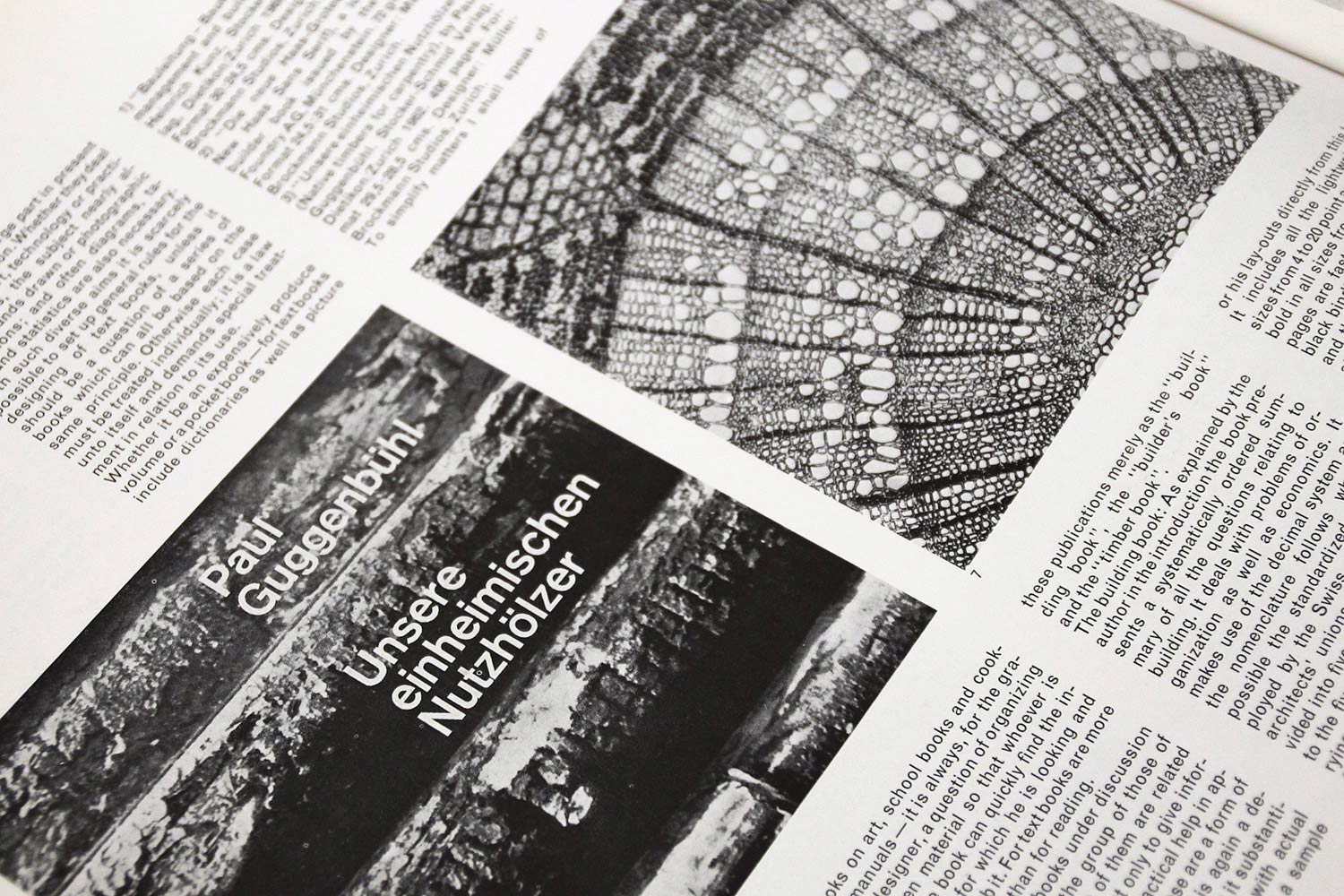
The magazine dedicated many articles
to historic avant-garde and contemporary art expressions.
2014 © Lars Müller Publishers
to historic avant-garde and contemporary art expressions.
2014 © Lars Müller Publishers
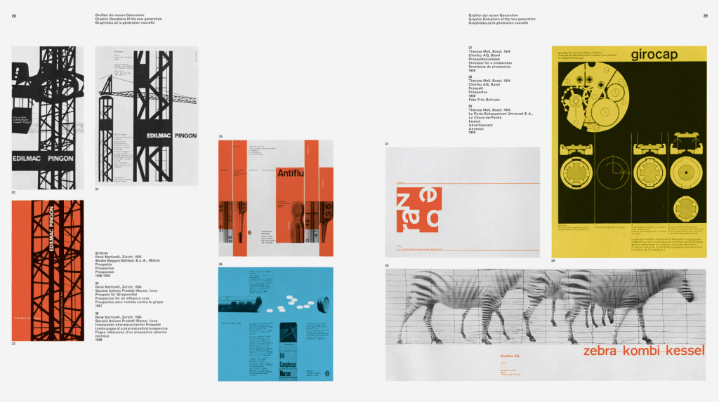
A double-page spread featuring
works by designers René Martinelli
and Therese Moll.
2014 © Lars Müller Publishers
works by designers René Martinelli
and Therese Moll.
2014 © Lars Müller Publishers
For an International Culture
of graphic design
The editor’s letter of the first issue was a real declaration of intents. The editors presented their policy, specifying that the journal wouldn’t be a talent show, but a continuous source of information for all the design enthusiasts.
In this way, the magazine promoted the spread of a collective culture through the creation of an international platform of discussion. In fact, the aim of the publication was not the promotion of a typical Swiss style in graphic design, but the promotion of those common denominators that was characterising the world’s contemporary graphic design production.
The international scope of the magazine is testified by the variety of the contents that were published and also by the ability of the editors to propose the most interesting and unusual combinations of different themes.
In one issue, it was very common to find articles dedicated to such varied themes like the social responsibilities of the designer, the physical properties of light, and the graphics of jazz records. Or again, the sociological role of the designer, concert posters, and labels for beer.
 Ph. © Nicola-Matteo Munari
 Promoting a Logic and
Systematic Design
The international scope of the magazine was also emphasised by the nationality of the authors who wrote on its pages: German, Holland, French, Italian, American and, of course, Swiss.
To the Swiss and to the four editors in particular, we must recognise the merit of having understood and enhanced—as first and better than others—the evolution in the design of a logic and systematic approach. It was a design attitude that revealed itself to be potentially universal by granting a more comprehensible communication to the people, over time and across the world.
Contrary to other graphics journals, Neue Grafik was strictly focused on the promotion of a design characterised by a “mathematic clarity […] not based on the ornament but on the balance and tension between form and colour,” intentionally ignoring all examples that “derived only from a pictorial or illustrational intention.”
The editors, they wrote, “do not prize modernity for its own sake, nor applaud boldness and originality at all costs, but value the attempt to a solution gained by constructive methods, and not through illusory solutions, based on the emotion.”
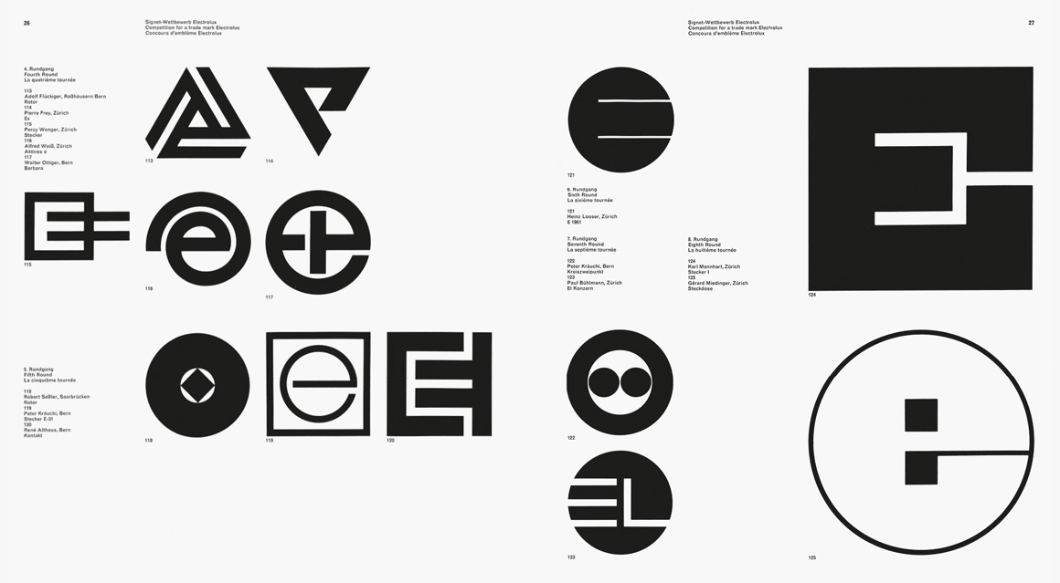
The journal also published
the contest for the design of
the Electrolux trademark.
2014 © Lars Müller Publishers
the contest for the design of
the Electrolux trademark.
2014 © Lars Müller Publishers
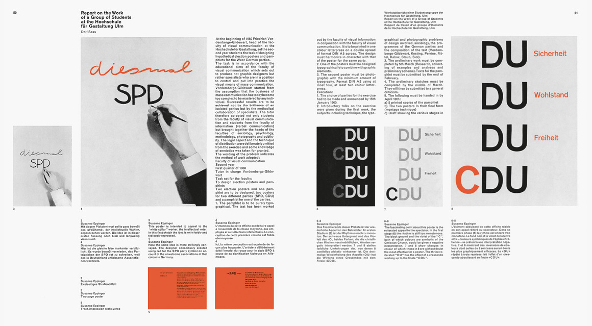
An article about experiments by students of HfG Ulm for the propaganda SPD and CDU parties.
2014 © Lars Müller Publishers
2014 © Lars Müller Publishers
A Cultural Legacy
The outcome was a neutral, uniform, and ordinary graphics. These typical Swiss qualities represent the heart of its design, but virtually offer the main argument of critic to all the enemies of objectivity, who mostly judge only the aesthetics and not the contents.
Rather, I think that the “normal” character of Swiss design and the space for dialogue created by the journal show a strong attitude towards democracy—also evident in other publications by Müller-Brockmann—and towards the respect of the viewers and users’s freedom of interpretation.
The eco of the magazine sound everywhere, deeply reshaping the awareness of design all over the world.
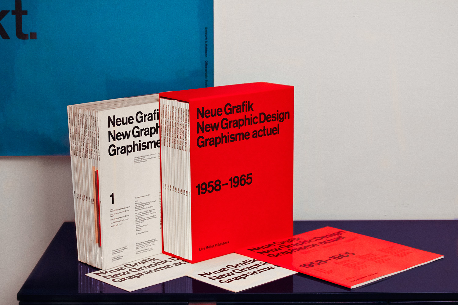
The 18 original issues, facsimile
reprint with the red case,
introduction booklet, and two
original promotional leaflets.
Ph. © Nicola-Matteo Munari
reprint with the red case,
introduction booklet, and two
original promotional leaflets.
Ph. © Nicola-Matteo Munari
The Quintessence
of Graphic Design
Before having the possibility of touching it, and before becoming one of the few owners of the all the original 18 issues, to me Neue Grafik was an idea, the idea of a perfect graphics, just simple and functional. The fact that the magazine belonged to the past, to the history of design, made it even more attractive and at the same more unreachable, thus contributing to its legendary aura.
To me, the magazine became the very quintessence of graphic design, the apotheosis of typographic perfection, the example par excellence of functional simplicity, the ideal combination of aesthetics and culture in the field of communication.
Today, after almost 50 years from the publication of the last issue, many enthusiasts will have the possibility to browse it again, like many among the most important graphic design masters did during their training years.
The merit goes to publisher Lars Müller and the excellent facsimile reprint that he made. This great publishing initiative promotes the possibility of a revival of those principles promoted by the magazine, devoted to a logical, systematic, simple, and functional design, an expression of design integrated to a modern and democratic vision of the society.
© Nicola-Matteo Munari
Originally written,
September 2013
First published by PreText,
June 2014