Symbol and logotype for one of the world’s best-known and most respected international furniture groups.
 2021 © Nicola-Matteo Munari
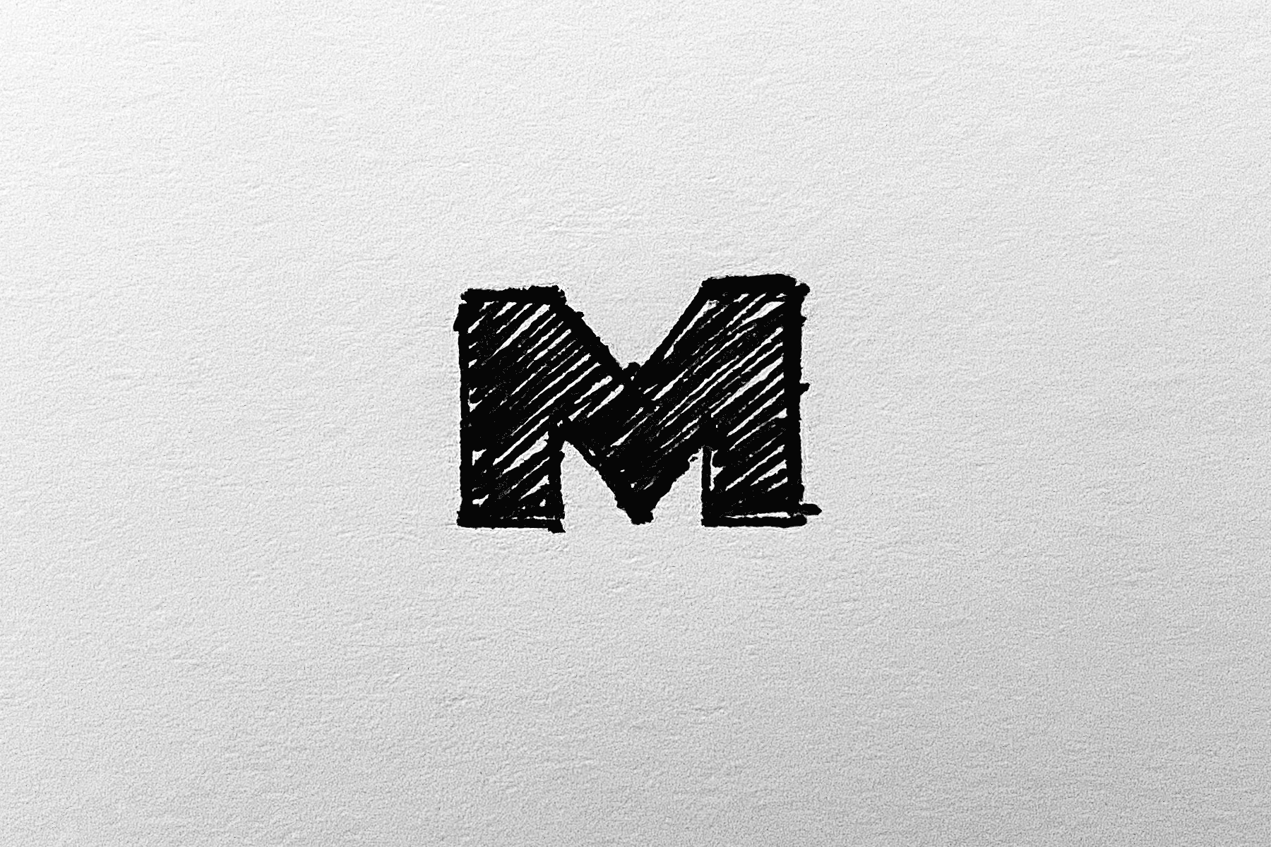
The genesis of the symbol—a capital
M that was cut in two and deprived
of the top half.
Ph. © Nicola-Matteo Munari
M that was cut in two and deprived
of the top half.
Ph. © Nicola-Matteo Munari
 2021 © Nicola-Matteo Munari
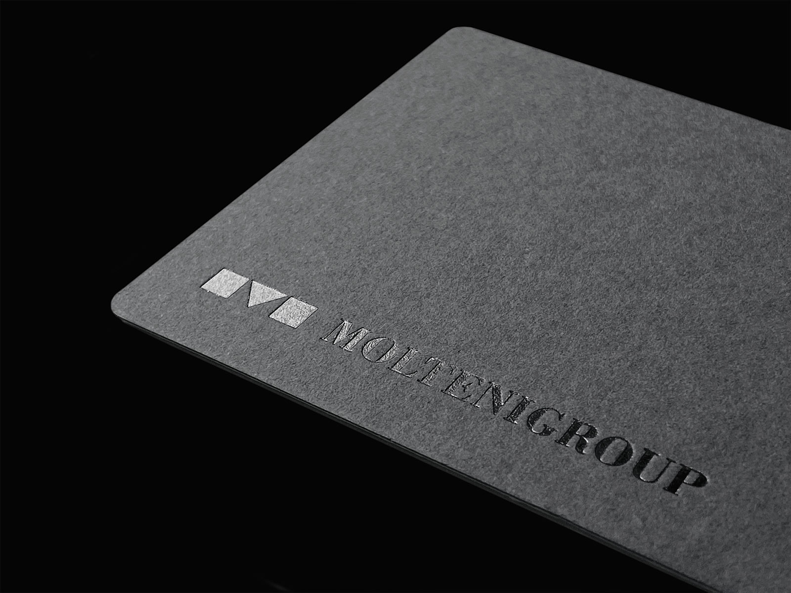 Ph. © Nicola-Matteo Munari
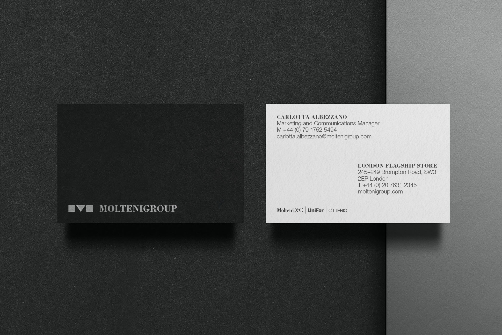
Molteni Group is one of the most important international furniture groups. Established in 1934, it comprises the companies Molteni&C, Dada, UniFor, Citterio and the brand Armani/Dada.
Although each one of the companies belonging to the group distinguished itself by developing its own brand identity, the group never had a corporate visual identity of its own to be represented independently from the sub-brands.
The design therefore originated from a specific request from the client—the creation of a hallmark, a distinctive sign that could become a recognised icon, representative of the group’s founding values and identity.
The genesis of the symbol developed through an exhaustive research process that resulted in over a thousand study drawings, among which was selected a graphically essential sign that was the result of a simple intuition.
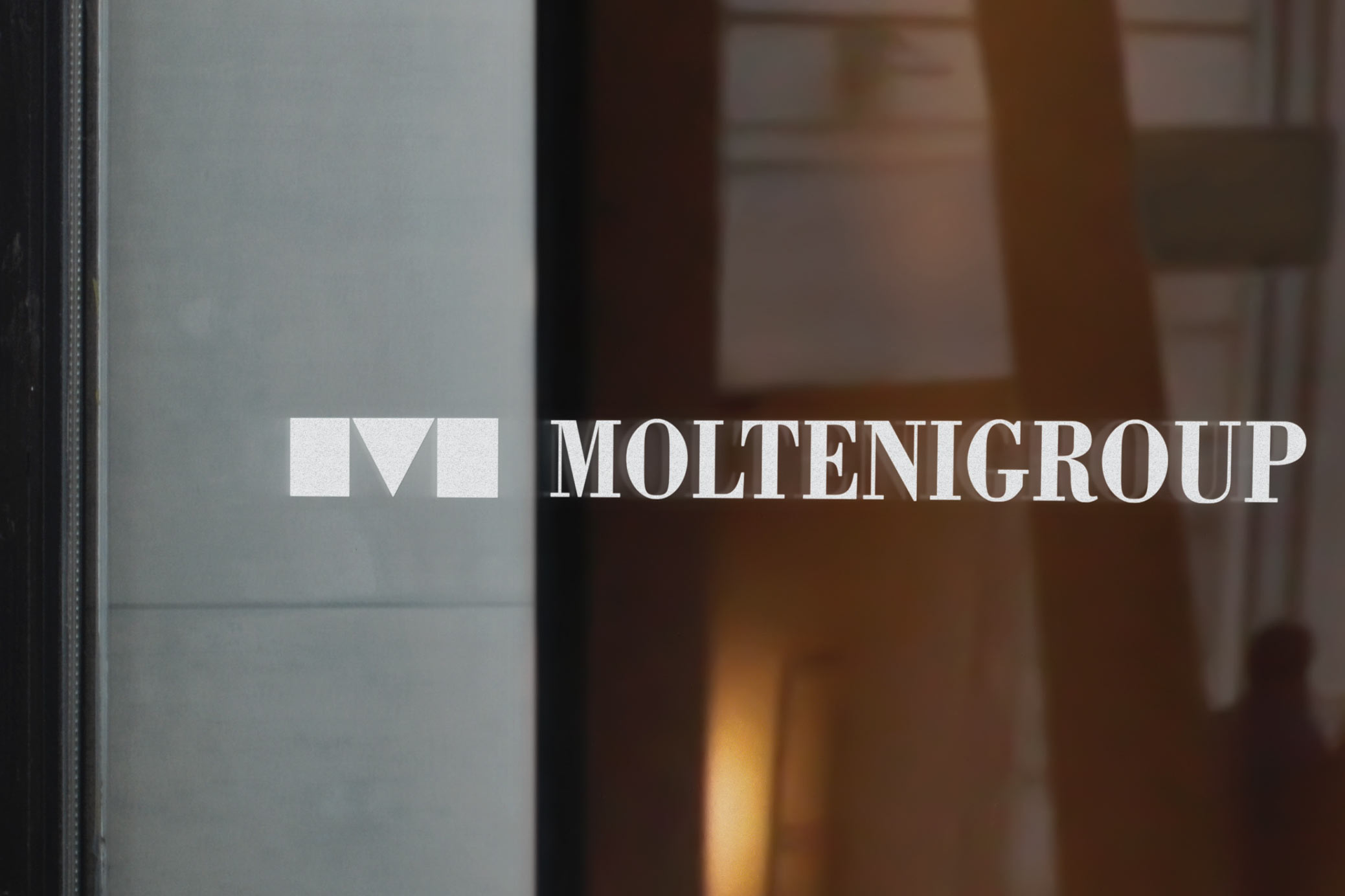
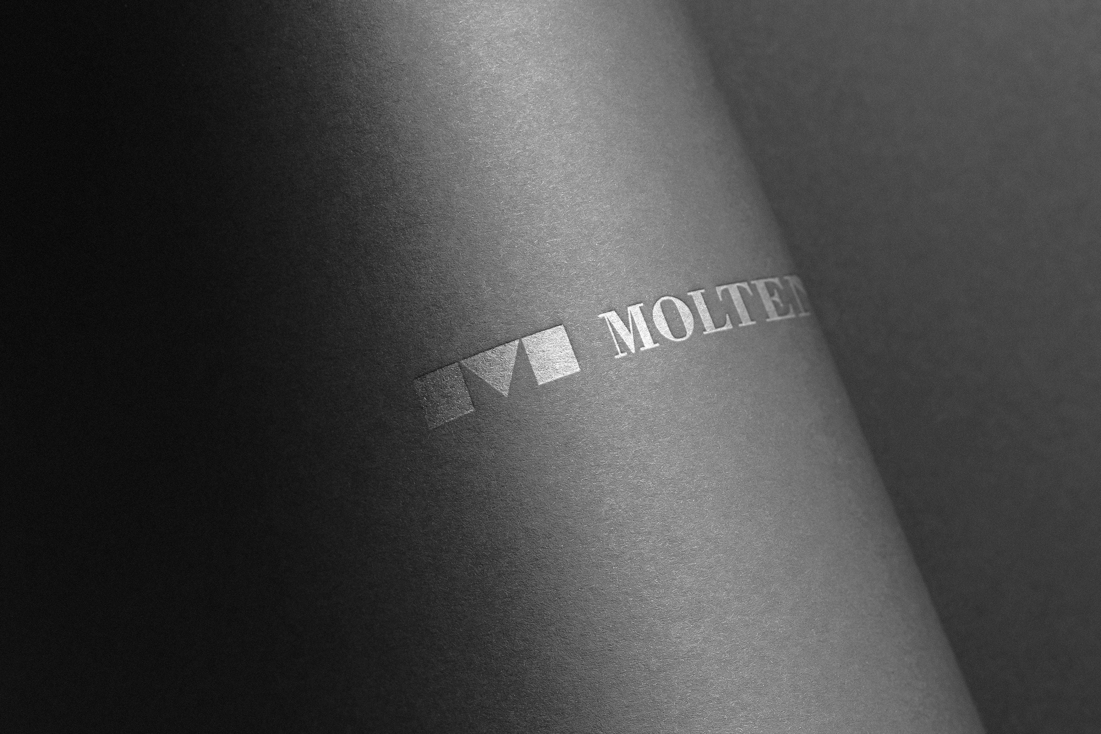
The symbol was in fact designed on the basis of a capital M, that was cut in two and deprived of the top half, thus obtaining a sign that is made of three elementary geometric shapes—a square, a triangle, a square—derived from the initial letter of Molteni.
In this way, the symbol looks like one sign but is made of multiple elements, thus communicating the idea of both cohesion and unity of the group in a visually consistent composition.
The result is an incisive sign matched by a Neoclassical logotype, that was carefully tuned in proportions, in which the two words Molteni Group become a single name—one name for one group.
The refined shapes of the logotype intentionally generate a visual contrast with the rigorous geometry of the symbol, thus producing a graphic ensemble which is at the same time visually strong and aesthetically elegant.
In this way, the result is both evocative of the aesthetic rationality of the Bauhaus, taken from UniFor’s historical symbols, and reminiscent of the Italian typographic tradition, that already characterised Molteni&C’s logotype, which are the two leading companies of the group.
Through its rigorous design, the symbol of Molteni Group established itself as a visually powerful icon—a seal of quality, authenticity, and sense of belonging representing the founding values of the group.
—Nicola-Matteo Munari
Although each one of the companies belonging to the group distinguished itself by developing its own brand identity, the group never had a corporate visual identity of its own to be represented independently from the sub-brands.
The design therefore originated from a specific request from the client—the creation of a hallmark, a distinctive sign that could become a recognised icon, representative of the group’s founding values and identity.
The genesis of the symbol developed through an exhaustive research process that resulted in over a thousand study drawings, among which was selected a graphically essential sign that was the result of a simple intuition.
The symbol was in fact designed on the basis of a capital M, that was cut in two and deprived of the top half, thus obtaining a sign that is made of three elementary geometric shapes—a square, a triangle, a square—derived from the initial letter of Molteni.
In this way, the symbol looks like one sign but is made of multiple elements, thus communicating the idea of both cohesion and unity of the group in a visually consistent composition.
The result is an incisive sign matched by a Neoclassical logotype, that was carefully tuned in proportions, in which the two words Molteni Group become a single name—one name for one group.
The refined shapes of the logotype intentionally generate a visual contrast with the rigorous geometry of the symbol, thus producing a graphic ensemble which is at the same time visually strong and aesthetically elegant.
In this way, the result is both evocative of the aesthetic rationality of the Bauhaus, taken from UniFor’s historical symbols, and reminiscent of the Italian typographic tradition, that already characterised Molteni&C’s logotype, which are the two leading companies of the group.
Through its rigorous design, the symbol of Molteni Group established itself as a visually powerful icon—a seal of quality, authenticity, and sense of belonging representing the founding values of the group.
—Nicola-Matteo Munari
Client
Molteni Group
Design
Nicola-Matteo Munari
Design Assistant
Jana Stürmlin
Assistant
Daniela Arabia
Project Date
2021
Molteni Group
Design
Nicola-Matteo Munari
Design Assistant
Jana Stürmlin
Assistant
Daniela Arabia
Project Date
2021