Redesign of the national and international editions of contemporary art magazine, Flash Art.
Prototype, 28.5×22.5 cm
80 pages
2017 © Nicola-Matteo Munari
Draft graphics of the new
logo, designed in order to
make the two words as one.
2017 © Nicola-Matteo Munari
logo, designed in order to
make the two words as one.
2017 © Nicola-Matteo Munari
Founded in Rome by Giancarlo Politi in 1967, Flash Art is one of the best-known contemporary art magazines in the world.
In 2017, on the occasion of the 50th anniversary of the magazine, it was request to develop a redesign project with the purpose of renovating the magazine’s image through a more dynamic and consistent graphic design.
 Ph. © Nicola-Matteo Munari
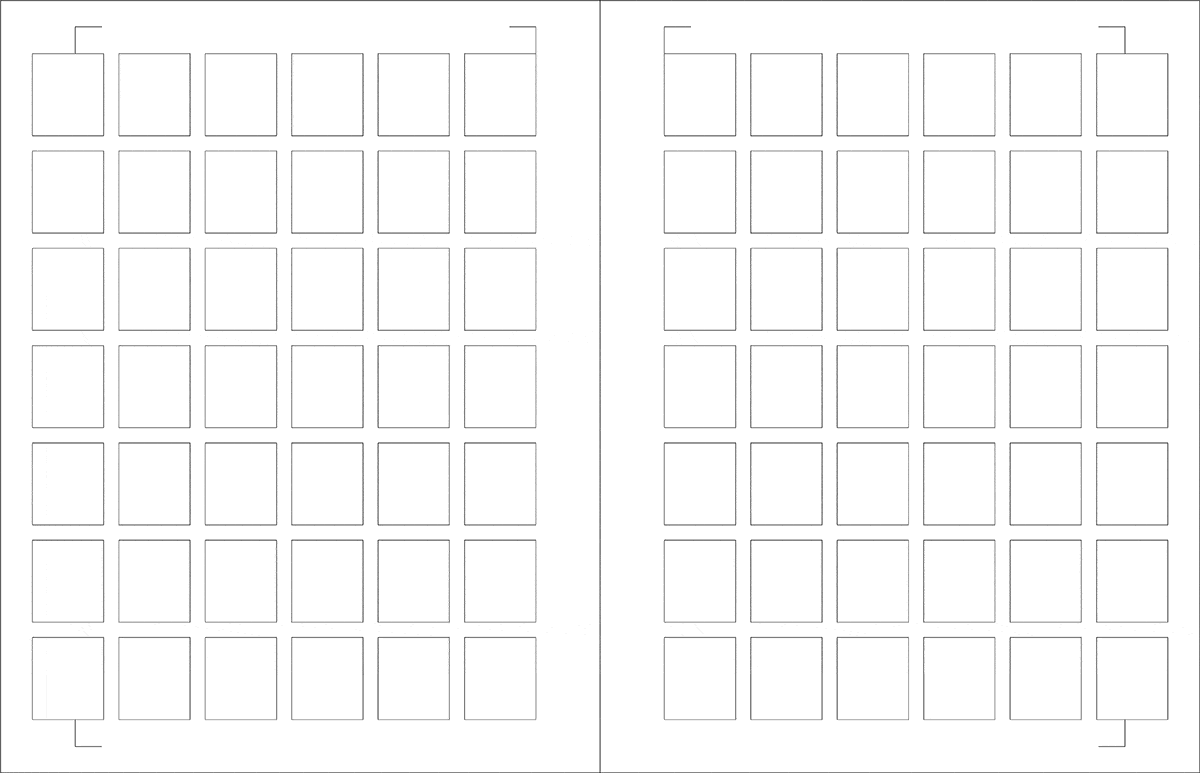
The typographic grid with
multiple textures that has been
designed for the magazine.
2017 © Nicola-Matteo Munari
multiple textures that has been
designed for the magazine.
2017 © Nicola-Matteo Munari
The redesign project was conceived for both the Italian and international edition, and included both the layout design of the magazine and the redefinition of part of the editorial structure of the contents.
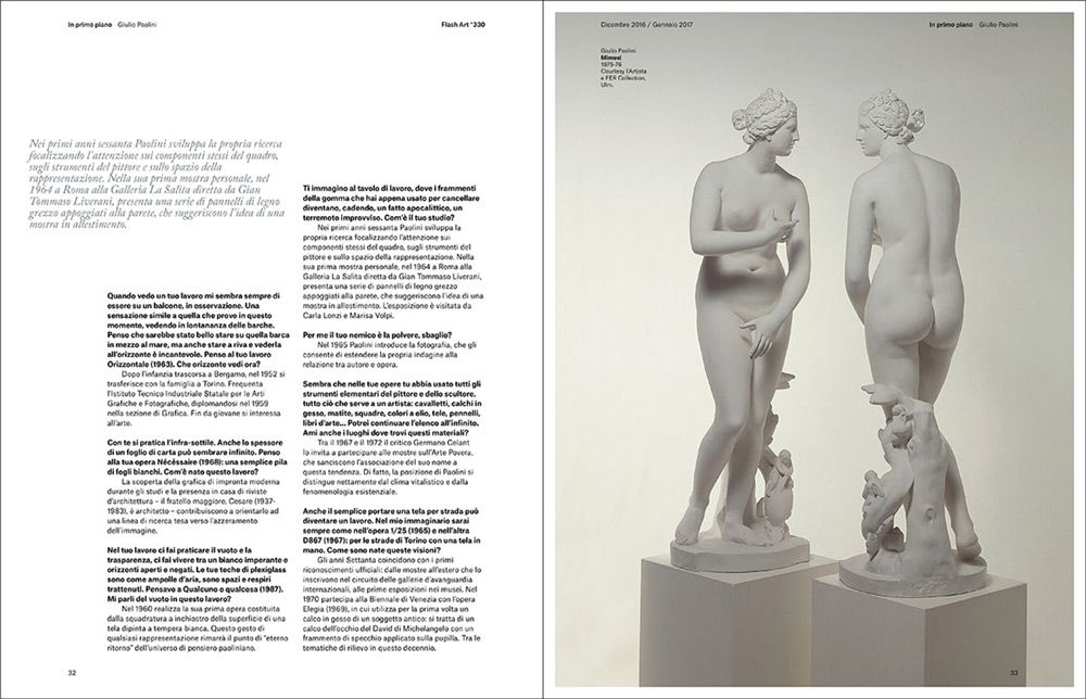
The project was approached in a methodical way, starting from the contents—from which to structure the layout—and, only later, taking into consideration the appearance of typographic and iconographic contents.
 2017 © Nicola-Matteo Munari
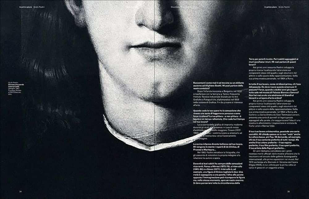 2017 © Nicola-Matteo Munari
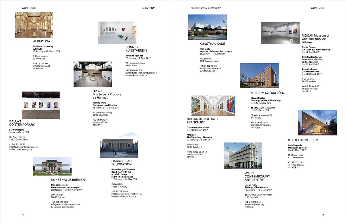 2017 © Nicola-Matteo Munari
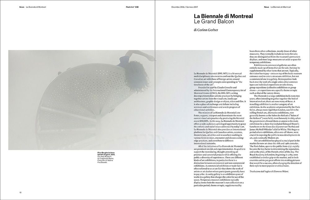 2017 © Nicola-Matteo Munari
Considering the quantity and variety of the contents, before proceeding to the layout of the graphics, 16 different typographic grids were designed in order to find the one that offered the wider and more balanced range of solutions.
The importance of doing such a thorough work was to achieve maximum consistency and flexibility, in order to stimulate the interest of the readers page after page and issue after issue.
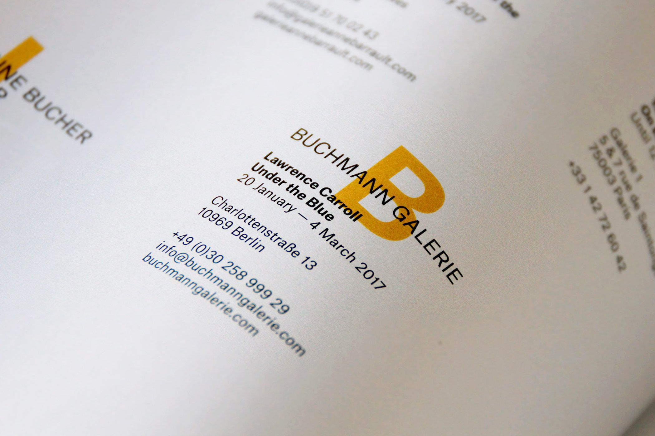
Detail of the page dedicated to
the openings of art galleries.
Ph. © Nicola-Matteo Munari
the openings of art galleries.
Ph. © Nicola-Matteo Munari
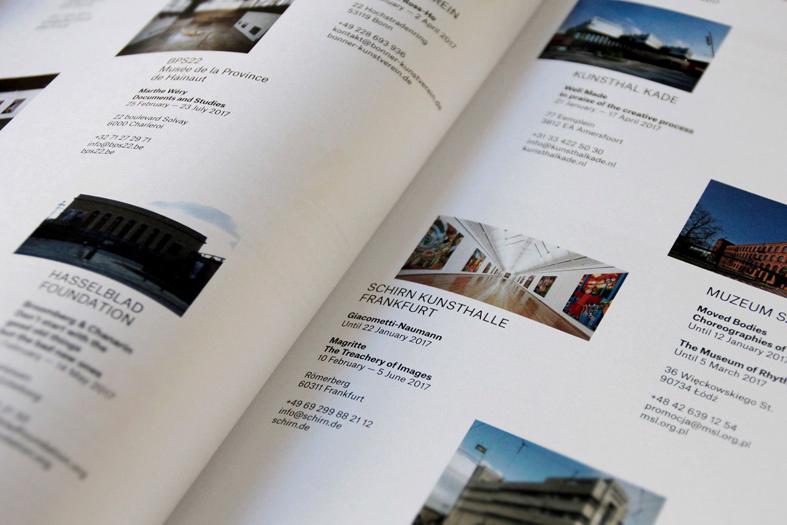
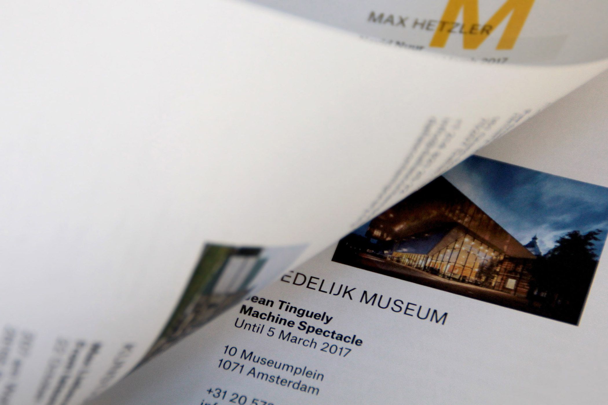
Detail of the double-page dedicated
to museums’ exhibitions.
Ph. © Nicola-Matteo Munari
to museums’ exhibitions.
Ph. © Nicola-Matteo Munari
“The redesign offers a new identity to the magazine, orientated towards dynamism and experimentation—conceived as a key interpretation of contemporary art.”
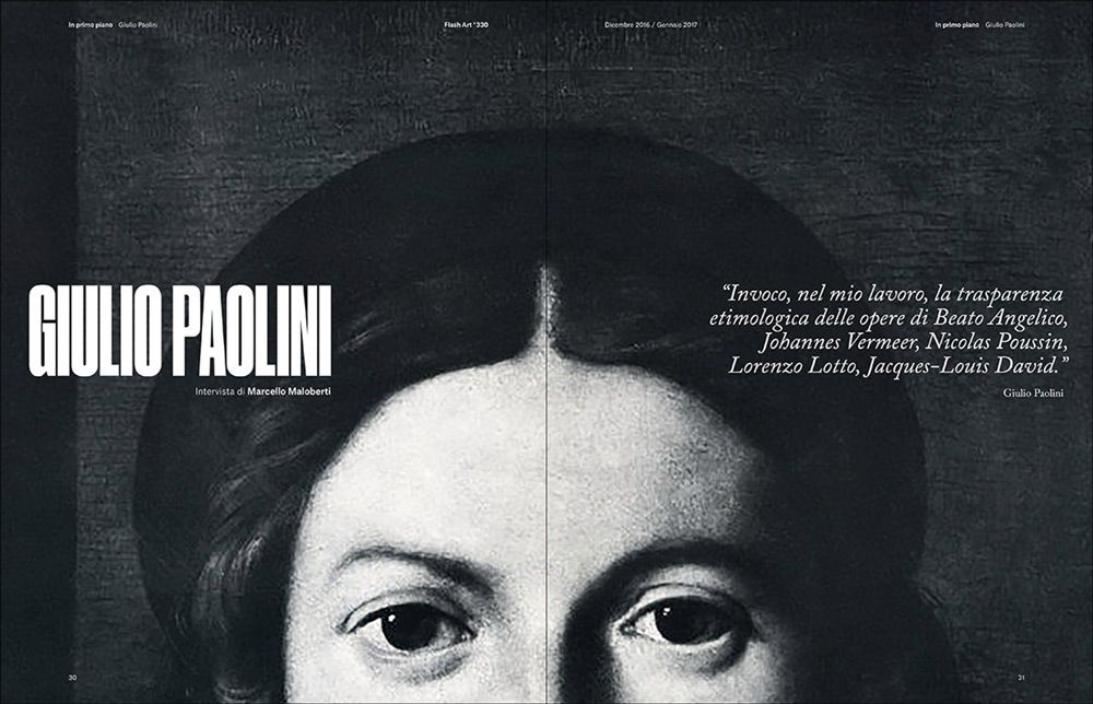
The prototype magazine that has been produced is characterised by the dynamic composition of the pages, that seem to be animated by overlapping texts and images.
This solution suggests the presence of multiple visual levels, each one characterised by its own rhythm and movement.
In this way, text blocks and images seem to slowly slide on the pages, evoking a perception of typography which is closer to that of the video screen than that of printed paper.
 <2017 © Nicola-Matteo Munari
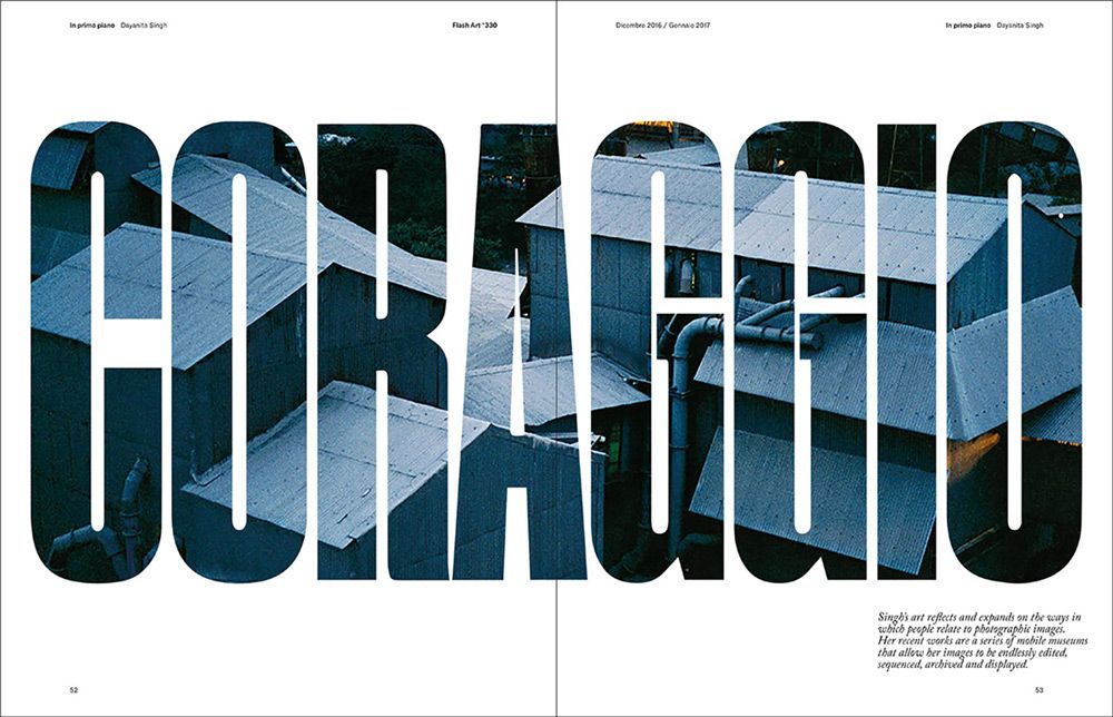 2017 © Nicola-Matteo Munari
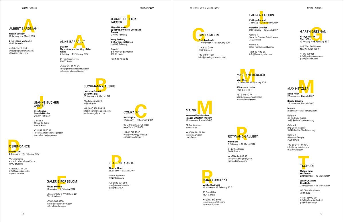 2017 © Nicola-Matteo Munari
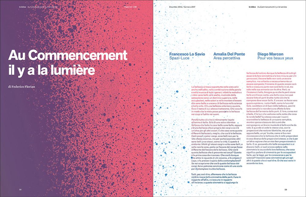 2017 © Nicola-Matteo Munari
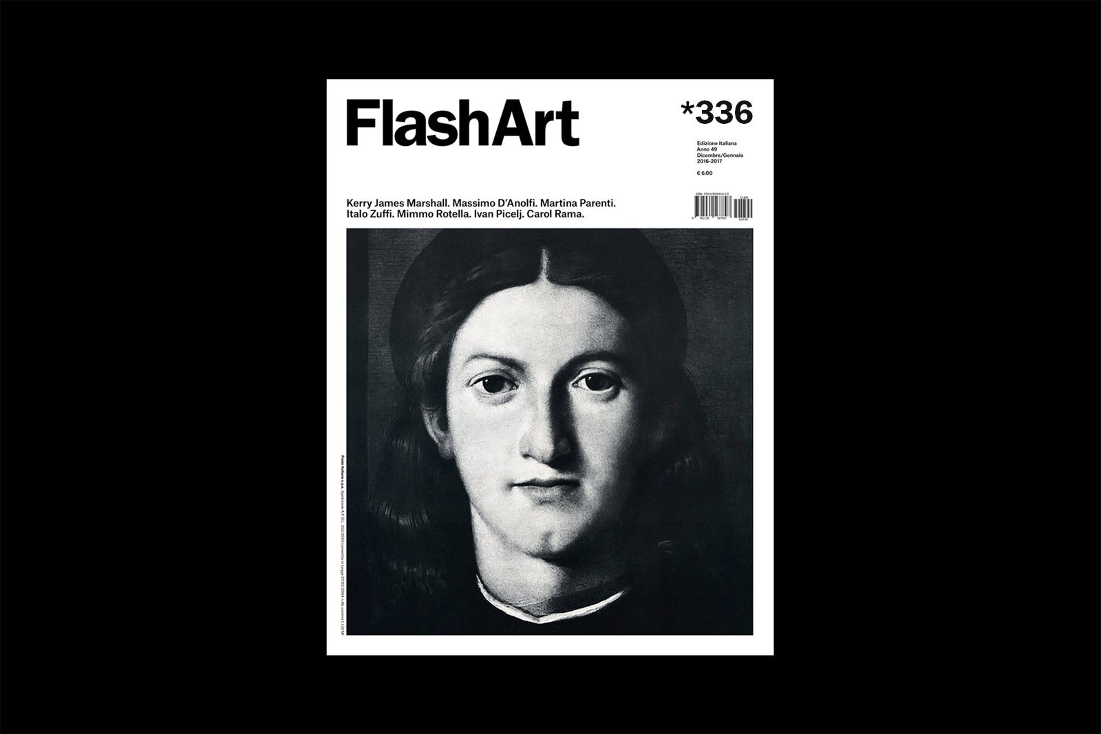
The covers have been entirely redesigned by carefully calibrating each detail and by keeping only the essential elements in order to enhance images.
Standard covers are characterised by the image framed within a square—the iconic solution that is typical to Flash Art and that here becomes an exact square—while special covers, featuring a full-page image with stronger visual impact, have also been conceived.
 Ph. © Nicola-Matteo Munari
 Ph. © Nicola-Matteo Munari
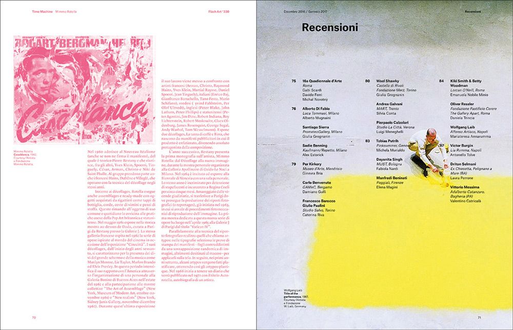 2017 © Nicola-Matteo Munari
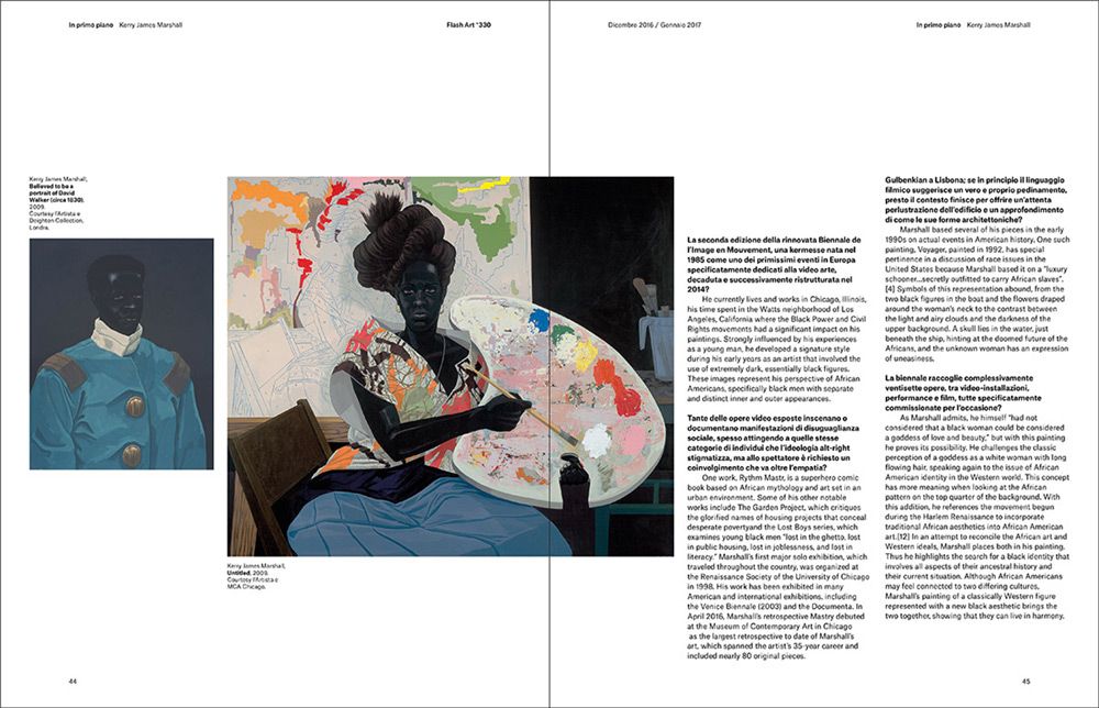 2017 © Nicola-Matteo Munari
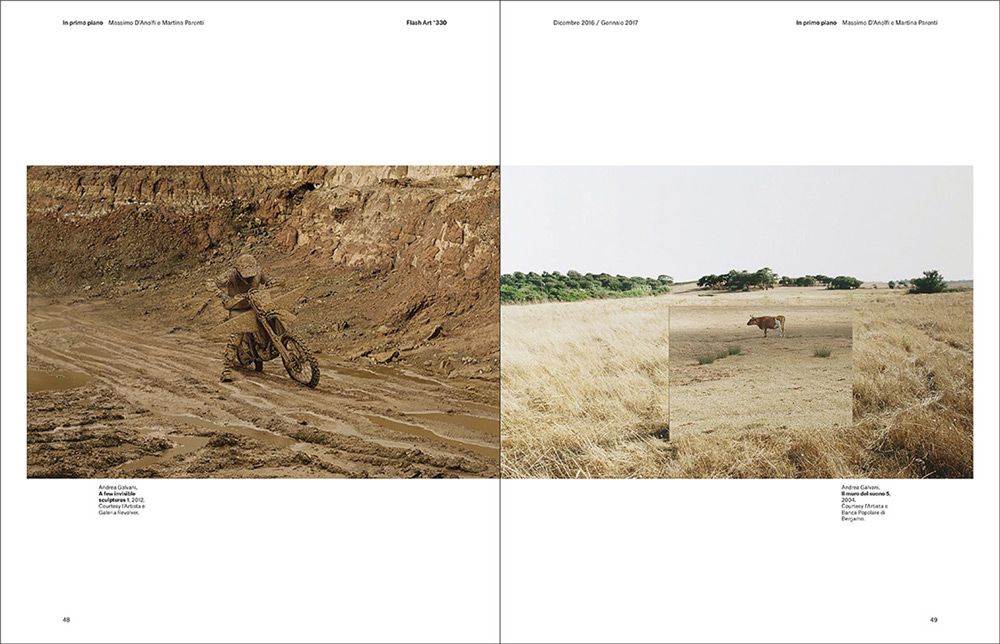 2017 © Nicola-Matteo Munari
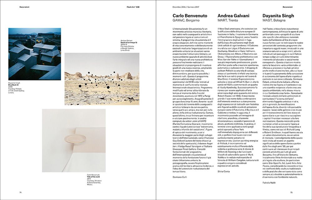 2017 © Nicola-Matteo Munari
Even if it was only a draft proposal, also the masthead was redesigned by changing letterforms and eliminating the space between the two words in order to reinforce the perception of the name as one element.
Serif typefaces that was typical to the magazine have been kept on the inside pages but completely dropped from the cover, in order to communicate a renewed and more contemporary image.
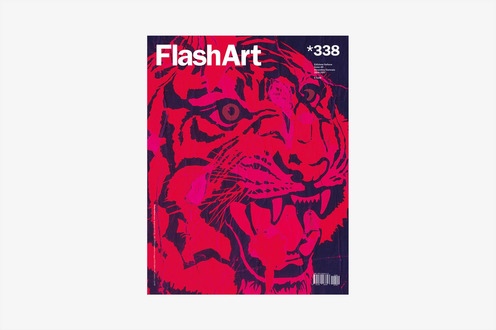
Prototype of a cover for special issues, featuring a full-page image.
2017 © Nicola-Matteo Munari
2017 © Nicola-Matteo Munari
Through the new layout and complete reviewing of typography, the redesign project offers a wide overview of graphic variations, iconographical solutions, and typographical alternatives.
By dropping the static appearance that characterised it before, the magazine found a new identity oriented towards dynamism and experimentation, both conceived as a key interpretation of contemporary art.
The project was developed as a proposal in the context of a preliminary consultation for the magazine’s art direction, but never implemented.
—Nicola-Matteo Munari
Client
Giancarlo Politi Editore
Design+Layout
Nicola-Matteo Munari
Assistant
Greta Bussandri
Project Date
2017
Giancarlo Politi Editore
Design+Layout
Nicola-Matteo Munari
Assistant
Greta Bussandri
Project Date
2017