Corporate identity program from the Center for Finance and Insurance of the University of Zurich.
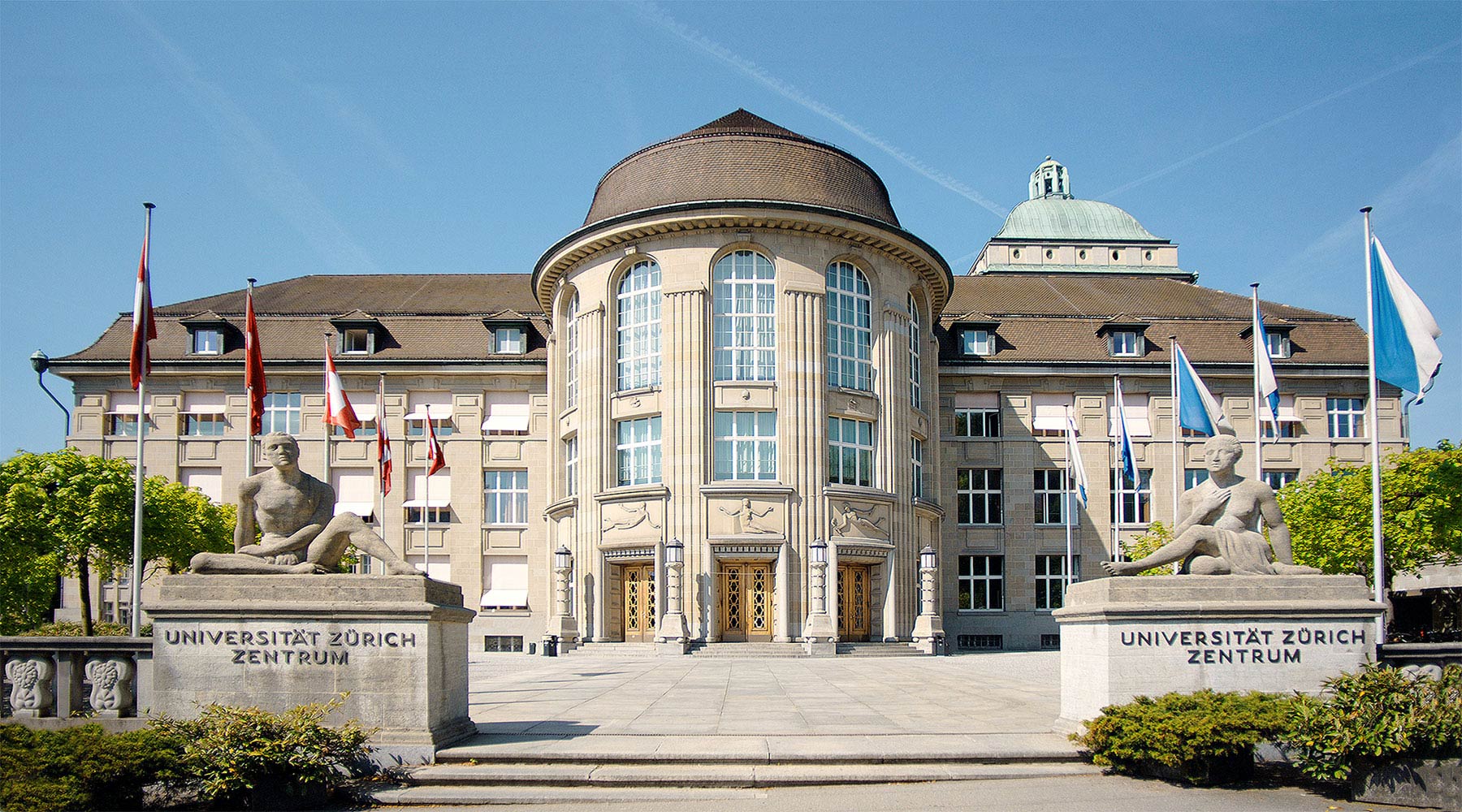
The headquarters of the
Zurich University.
Ph. © All rights reserved
Zurich University.
Ph. © All rights reserved
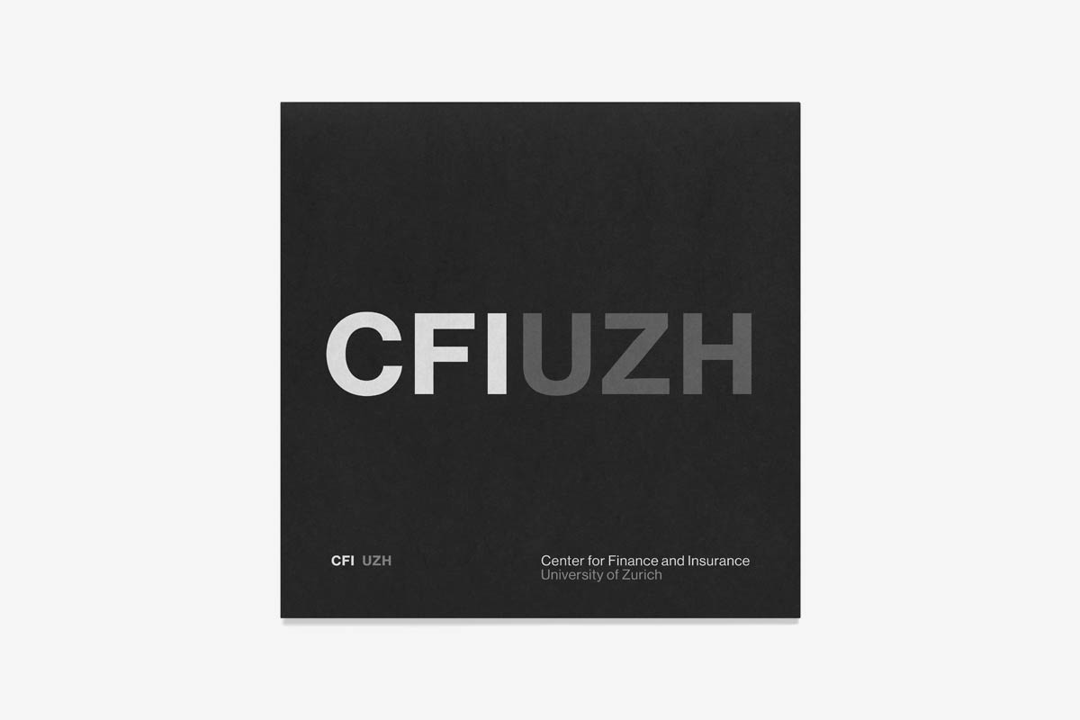
Cover of the prospectus with the
logo in the acronym version.
2015 © Nicola-Matteo Munari
logo in the acronym version.
2015 © Nicola-Matteo Munari
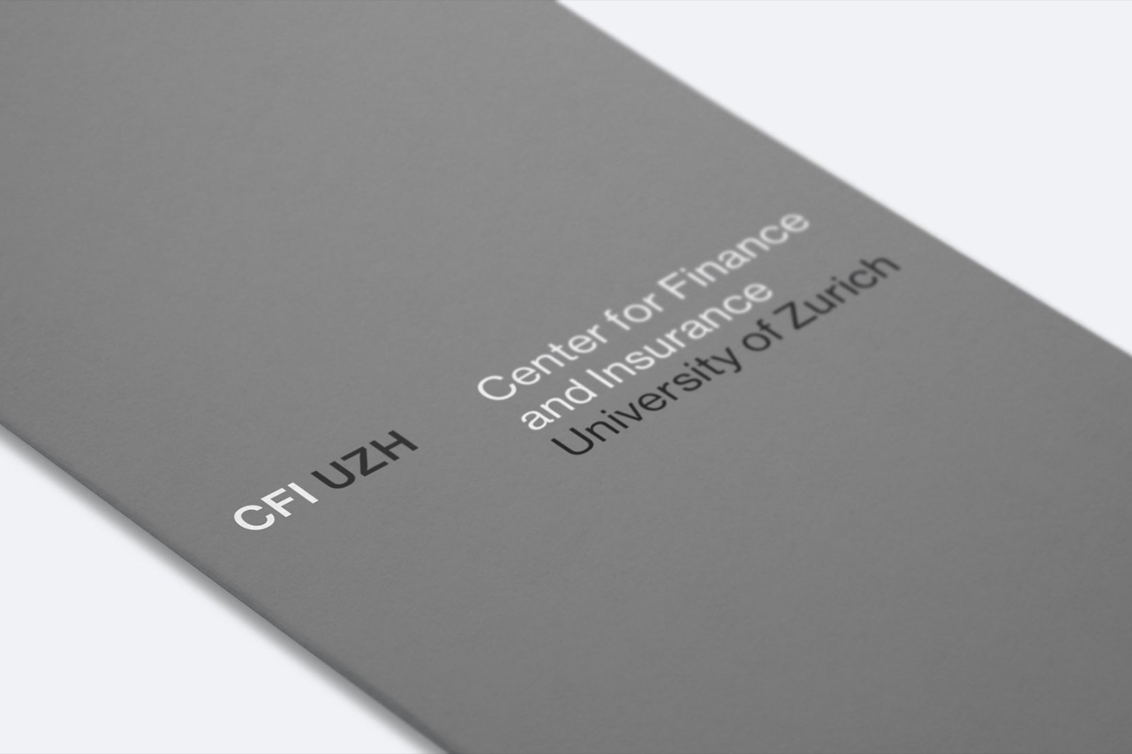
Detail of a brochure featuring the logotype on a grey background.
2016 © Nicola-Matteo Munari
2016 © Nicola-Matteo Munari
To design the identity program for the Center for Finance and Insurance (CFI UZH) of the University of Zurich’s Banking & Finance Department, the form was defined starting from the content it should communicate.
The Center has the duty to be, and therefore to appear, competent, serious, and trustworthy. To clearly communicate these qualities it was of paramount importance to develop an appropriate and professionally consistent communication.
The easiest and most effective way to visually translate the representative values of the Center was to make its communication appear accurate, normal, and clear by developing an identity that was able to last over time as a symbol of solidity of the Center itself.
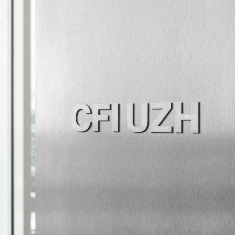
A metal sign designed for the
entrance to the Center.
2016 © Nicola-Matteo Munari
entrance to the Center.
2016 © Nicola-Matteo Munari
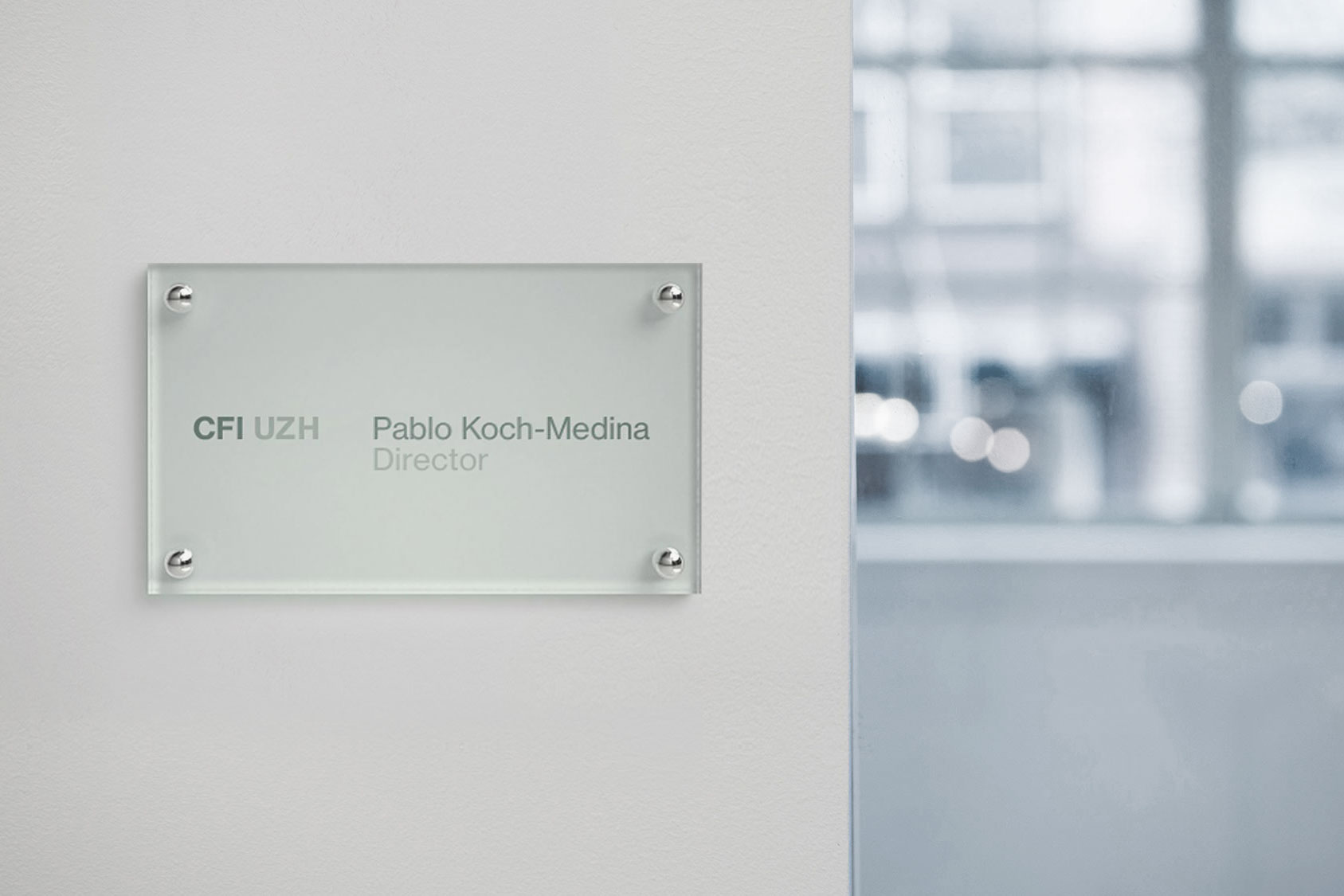
One of the glass plaques for the
internal offices featuring pre-spaced decals applied on the back.
2015 © Nicola-Matteo Munari
internal offices featuring pre-spaced decals applied on the back.
2015 © Nicola-Matteo Munari
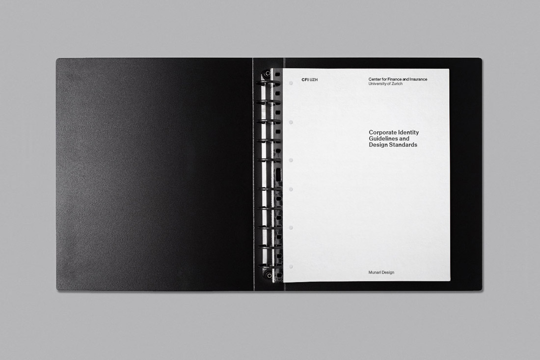
The guidelines dedicated
to the corporate identity
and the design standards.
2016 © Nicola-Matteo Munari
to the corporate identity
and the design standards.
2016 © Nicola-Matteo Munari
The element that most characterises the visual identity designed for CFI UZH is the colour grey, that was chosen to effectively communicate an idea of seriousness.
Grey is the quintessential colour of understatement. It is positioned right at the centre of every colour system, halfway between each colour and its complementary. In this way, grey at the same time possesses a great visual strenght and a great calm, resulting a timeless colour.
To properly enhancing the colour, grey has been matched by two support colours that naturally tend to its extremes—black and white—thus communicating seriousness and accuracy.
The exclusive use of these three colours contributed to produce a pragmatic and effective communication that avoids any kind of visual distraction, focusing on the contents.
 2015 © Nicola-Matteo Munari
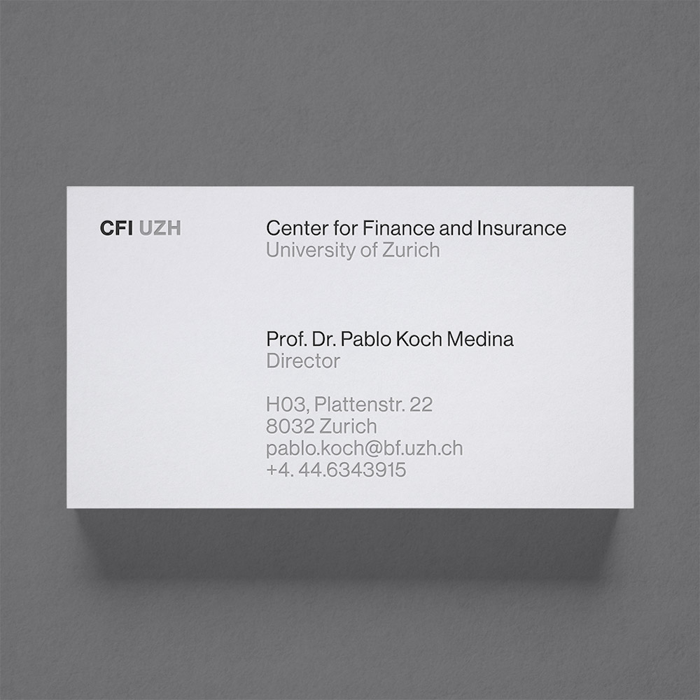 2015 © Nicola-Matteo Munari
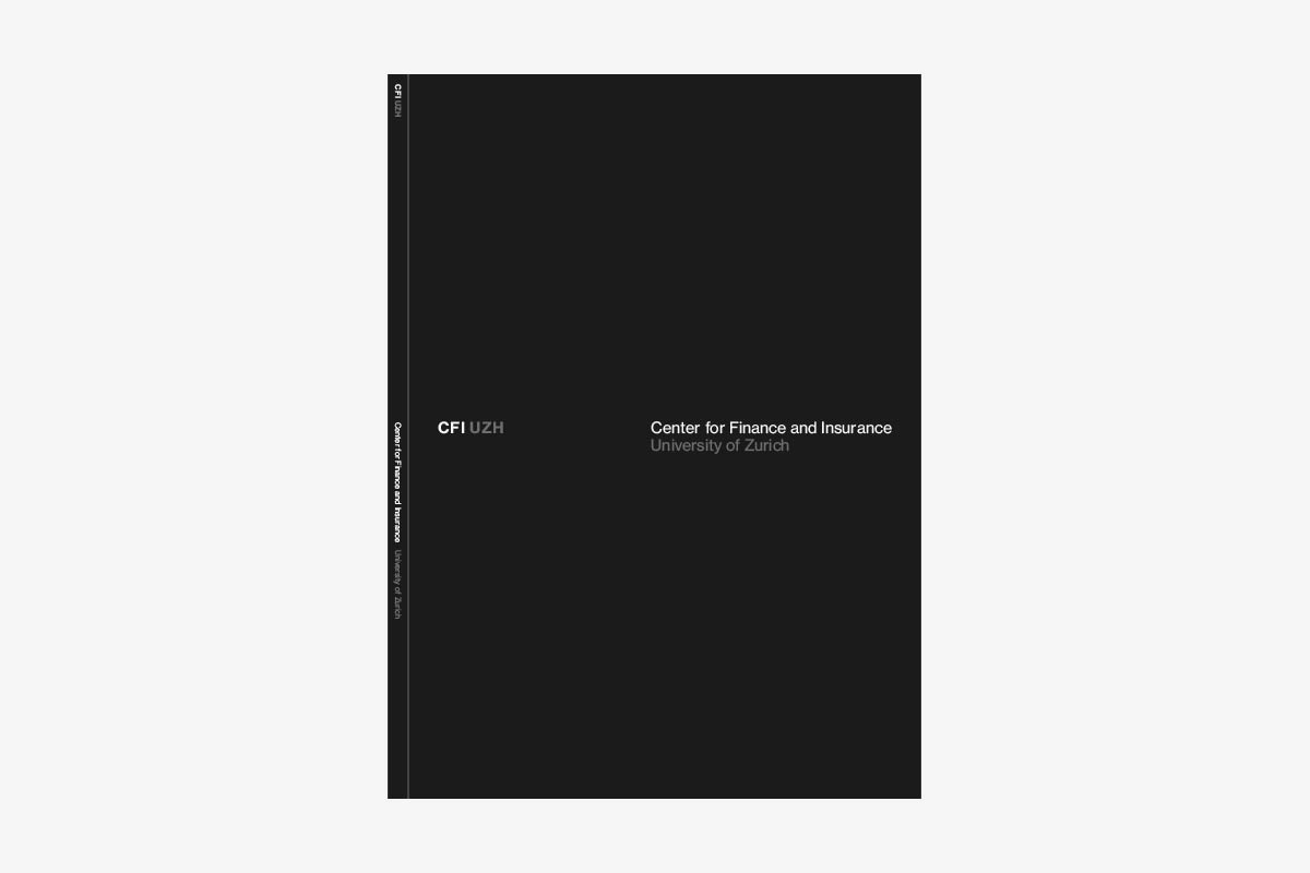 2015 © Nicola-Matteo Munari
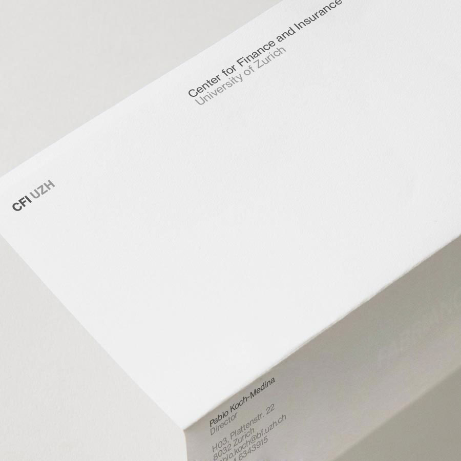
Instead of a logotype with a fixed and peculiar shape, the sobriety required by the identity of the Center suggested the use of plain typography, defined by a flexible system of text descriptors, so that the name could work both in the extended form or as an acronym (CFI UZH), arranged on the horizontal or the vertical axes, in English as well as in other languages.
The typeface visually represents the voice with which the Center speaks to its audience. To avoid unnecessary graphic refinement, instead emphasising the idea of seriousness, the typeface that was chosen is Helvetica, the Swiss typeface par excellence and one of the most familiar typefaces to the eyes of the public.
Familiarity with the typeface minimises the impact of the letters on vision, allowing readers to focus on the content of the communication and not on the form of the letters.
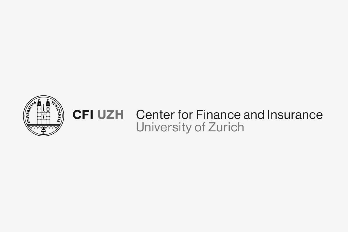
The extended form of the logotype completed with the official emblem
of the University of Zurich.
2015 © Nicola-Matteo Munari
of the University of Zurich.
2015 © Nicola-Matteo Munari
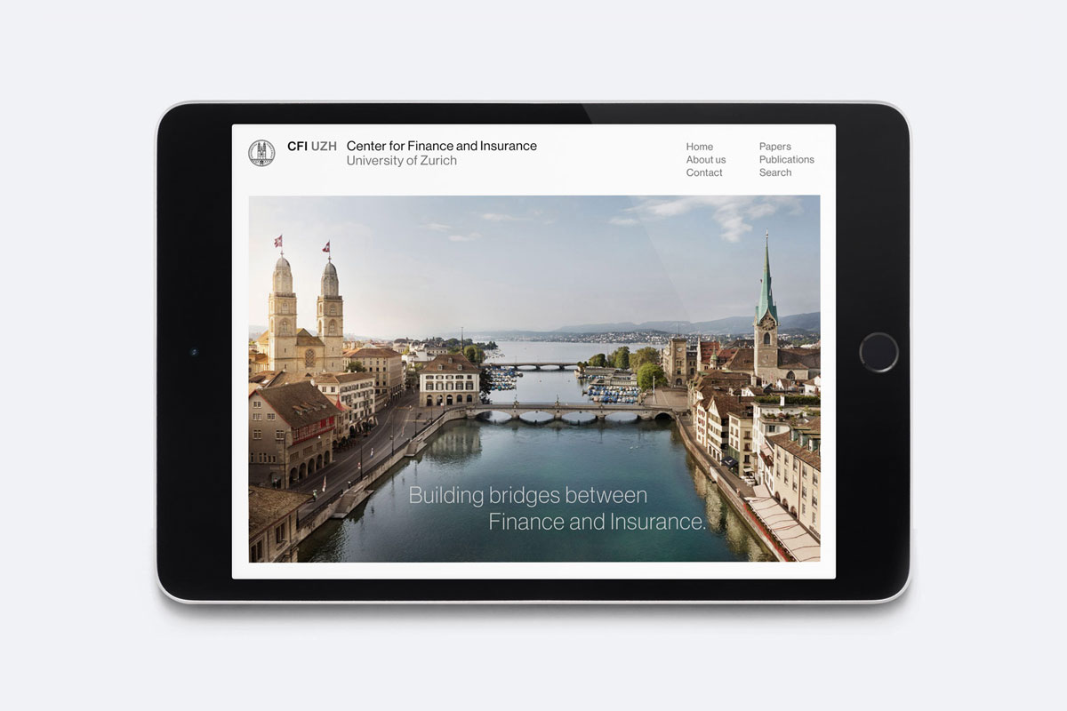
The homepage of the website
designed for CFI UZH.
2015 © Nicola-Matteo Munari
designed for CFI UZH.
2015 © Nicola-Matteo Munari
By carefully orchestrating all the details of communication and rigorously characterising each application through the same aesthetics, it was possible to design a visually strong and recognisable identity that is an integrated part of a comprehensive communication strategy.
—Nicola-Matteo Munari
Client
Center for Finance and Insurance, University of Zurich
Design+Strategy
Nicola-Matteo Munari
Project Date
2015–16
Center for Finance and Insurance, University of Zurich
Design+Strategy
Nicola-Matteo Munari
Project Date
2015–16